
by Chris Kimble | Apr 16, 2015 | Kimble Charting
CLICK ON CHART TO ENLARGE Rumor has it that Blackrock (BLK) has a few assets under management. This morning BLK is down a couple of percent in price. No big deal other than it could be making a run at breaking support today. Do you believe the “So goes the...

by Chris Kimble | Jul 10, 2014 | Kimble Charting
CLICK ON CHART TO ENLARGE Are European banks in trouble? If so, could weakness in the European financial sector spill over into stock markets around the world? European Financial ETF EUFN has formed a bearish rising wedge over the past few months and a few days...

by Chris Kimble | Jun 16, 2014 | Kimble Charting
CLICK ON CHART TO ENLARGE At this time the trend in banks is UP, as they are above key long-term moving averages and support lines. Noting bearish has taken place in this sector so far. I am keeping my eyes on the patterns banks have formed since the first of...

by Chris Kimble | May 5, 2014 | Kimble Charting
CLICK ON CHART TO ENLARGE So Goes the Banks, So Goes the Broad Market? Well… this is not a perfect analogy, yet more often than not, what banks do (strong or weak) does seem to have an important impact on the broad markets. The above 3-pack reflects that...

by Chris Kimble | Apr 8, 2014 | Kimble Charting
CLICK ON CHART TO ENLARGE If you own Bio Tech or Social Media stocks of late, its been a bumpy ride (-15%+). However, if you own the banks they have held up well compared to some hard hit sectors. The above charts reflect that the Bank Index and Regional Bank...
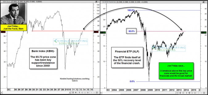
by Chris Kimble | Dec 6, 2013 | Kimble Charting
CLICK ON CHART TO ENLARGE The KBW Banking index is nearing a price zone that has been key to it as support and resistance for over a decade. The Financial ETF (XLF) finds itself at the 50% Fibonacci recovery price of the 2007-09 Financial crisis Both of these key...

by Chris Kimble | Oct 16, 2013 | Kimble Charting
CLICK ON CHART TO ENLARGE The chart below reflects how strong the banks were from 2000 to 2007, gaining 58%, while the S&P 500 was flat during that time period….in hindsight the S&P 500 was creating a large “Double Top!” So Goes the...

by Chris Kimble | Sep 23, 2013 | Kimble Charting
CLICK ON CHART TO ENLARGE The chart below reflects how strong Financials have been over the past year, as XLF is up 80% more than the S&P 500 and Citigroup is even stronger, up over 150% more than SPY. The chart above reflects that XLF & Citigroup both created...
