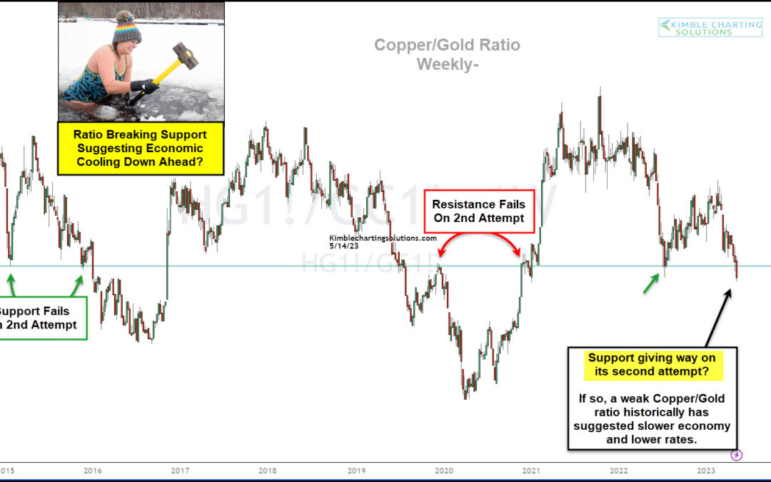
by Chris Kimble | May 15, 2023 | Kimble Charting
The world is full of economic concerns. Inflation, economic slowdown, global trade, and international war. So what’s next? Today’s chart might just might share a glimpse into the future. Below is a “weekly” chart of the Copper to Gold price ratio. Typically, when this...
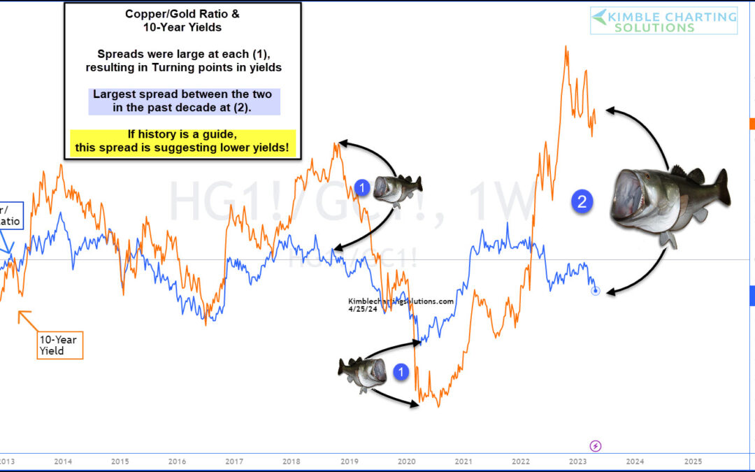
by Chris Kimble | Apr 26, 2023 | Kimble Charting
The past two years have seen headlines dogged by inflation and the Federal Reserve’s fight to end inflation. That fight has seen the Federal Reserve raise interest rates over and over again… and 10-year treasury bond yields have followed suit and risen sharply. One...
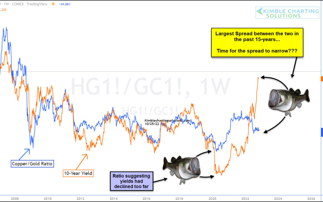
by Chris Kimble | Oct 26, 2022 | Kimble Charting
The price of copper to gold has been a correlation that has followed 10-Year US Treasury bond yields (in trend) fairly closely. This correlation has been one that I’ve followed to see if bond yields are changing trend, or if the trend has become overdone. Today, this...
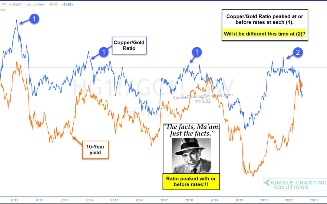
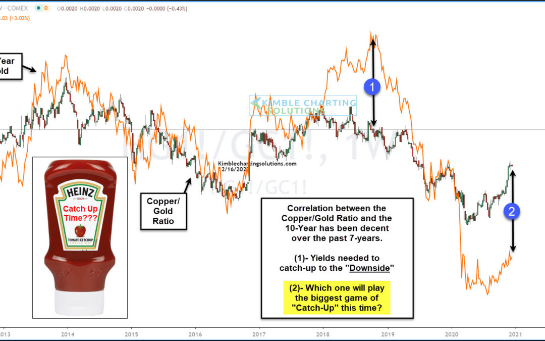
by Chris Kimble | Jul 22, 2022 | Kimble Charting
One of the most important themes during the first half of 2022 is rising interest rates. And with the Federal Reserve focused on stopping inflation, it’s a legitimate concern. But is there also a case for falling interest rates in the back half of 2022? With several...
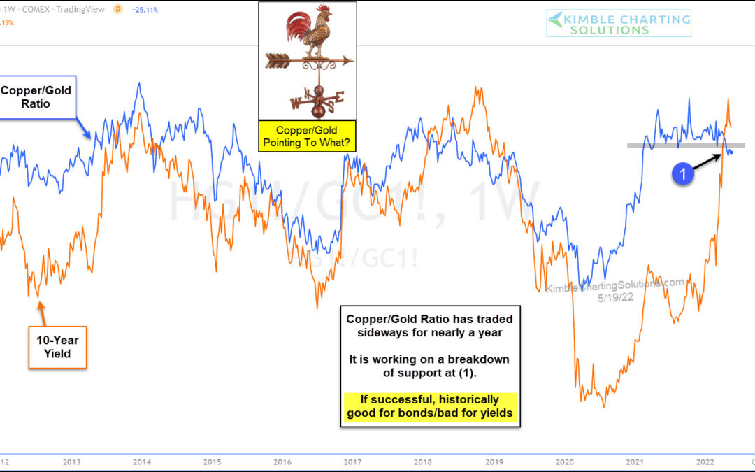
by Chris Kimble | May 19, 2022 | Kimble Charting
Higher commodity prices have seeped into everyday costs (food and energy), and at the same time, interest rates have also been rising. That’s a bad combination for everyday America. But perhaps there is some relief on the horizon… at least in the form of lower...
by Chris Kimble | Dec 18, 2020 | Kimble Charting
Commodities prices have been very strong for the past several months. And this has many investors eyeing the prospects of a new wave of inflation and the potential for rising interest rates. One commodity that has been particularly strong in 2020 is Copper. In fact,...
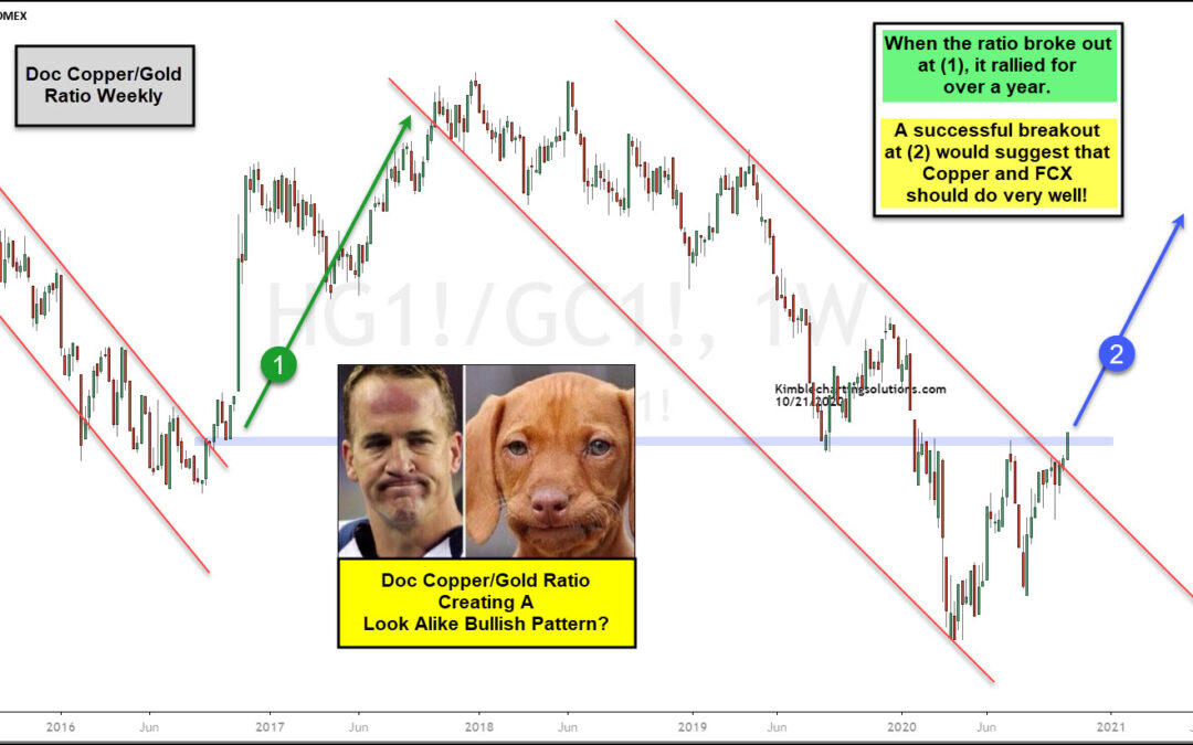
by Chris Kimble | Oct 21, 2020 | Kimble Charting
The Doc Copper/Gold ratio broke above a 2-year falling channel back in 2016 at (1). Following this breakout, it rallied for the next year. During that year, Copper related assets did very well! The ratio peaked in the summer of 2018 and created a series of lower highs...
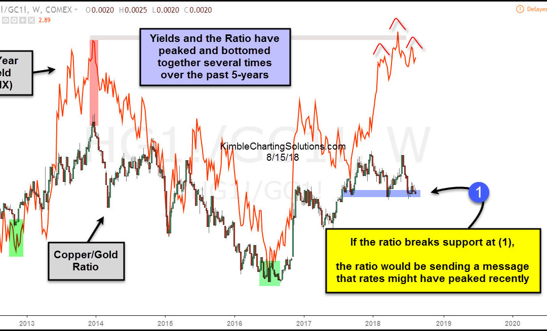
by Chris Kimble | Aug 16, 2018 | Kimble Charting
If you spend time researching market relationships you can better understand money flows, rotation, and reasons why money flows rotate. This can be very helpful in identifying trend changes as well. Today, we’ll look at the relationship between 10 Year US Treasury...
