
by Chris Kimble | Sep 30, 2014 | Kimble Charting
CLICK ON CHART TO ENLARGE Well October is almost here and its time for the baseball post season to start today. Speaking of baseball, is a “New Deflationary Ball Game” starting in a variety of assets? This 5-pack reflects that a variety of long-term...

by Chris Kimble | Sep 17, 2014 | Kimble Charting
CLICK ON CHART TO ENLARGE The Gold Bugs index remains above support that dates back 10-years. Over the past year and a half, the index has created a pennant pattern, a series of lower highs and high lows, teasing both the bulls and bears. As you can see,...

by Chris Kimble | Sep 9, 2014 | Kimble Charting
CLICK ON CHART TO ENLARGE When it comes to the metals complex, its not been that great of a year for Gold or Silver. On the flip side, Palladium has had a good year, as it was up near 25% YTD a couple of weeks ago. Of late, Palladium is breaking a support...

by Chris Kimble | Aug 20, 2014 | Kimble Charting
CLICK ON CHART TO ENLARGE The GDXJ/GDX ratio may have created a bullish inverse head & shoulders pattern over the past year. Of late the ratio could be forming a bullish falling wedge. Two thirds of the time this pattern leads to higher prices. If the ratio...

by Chris Kimble | Jul 24, 2014 | Kimble Charting
CLICK ON CHART TO ENLARGE From the early 2000’s to 2011, Silver continued to create bullish “Ascending Triangles” as it rallied from $4 to $50, highlighted in green above. After peaking at $50, Silver has started creating the opposite...

by Chris Kimble | Jul 16, 2014 | Kimble Charting
CLICK ON CHART TO ENLARGE The above chart is the Silver/Gold ratio. Strong rallies in both metals often take place when this ratio breaks above key falling resistance over the past 15-years. At this time the ratio remains inside of a three year falling channel....

by Chris Kimble | Jul 9, 2014 | Kimble Charting
CLICK ON CHART TO ENLARGE A major shift in the Gold Bugs/SPY ratio could be taking place! The Gold Bugs/SPY ratio has fallen on hard times as stocks have outperformed the Gold bugs index over the past few years by a wide margin, pushing this index down a...
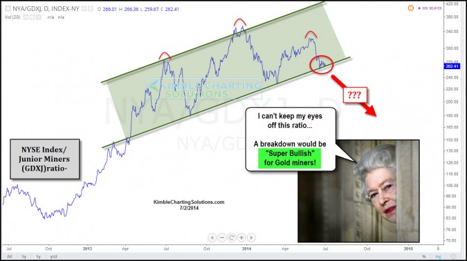
by Chris Kimble | Jul 2, 2014 | Kimble Charting
CLICK ON CHART TO ENLARGE This ratio compares the NYSE Composite Index to the Junior miners ETF (GDXJ). When the ratio is moving higher the NYSE is reflecting relative strength to the small mining stocks. Over the last year the ratio has stayed with a uniform...
