by Chris Kimble | Dec 5, 2019 | Kimble Charting
Health Care (XLV) ETF has lagged the S&P for the past few years. Is the lagging trend about to end? It sure could and we should find out very soon! This chart looks at the Health Care/S&P Ratio (XLV/SPY), which reflects that it has created a series of lower...
by Chris Kimble | Apr 13, 2016 | Kimble Charting
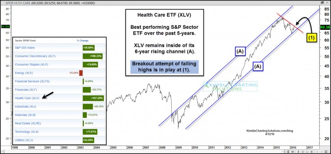
Over the past 5-years, Health Care stocks have done well. Actually they have done very well, as they are the leading performing sector, of the 9 key sectors that make up the S&P 500 (see lower left inset table). CLICK ON CHART TO ENLARGE Health Care ETF (XLV)...
by Chris Kimble | May 27, 2015 | Kimble Charting
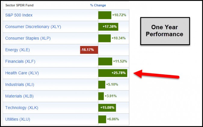
CLICK HERE TO ENLARGE When one looks back over the past year, Health Care ETF (XLV) has been a good place to be. The above table looks at the 9 key sectors of the S&P 500, which reflects that XLV has done really well, grabbing the #1 spot over this time frame....

by Chris Kimble | Aug 13, 2014 | Kimble Charting
CLICK ON CHART TO ENLARGE Health Care ETF (XLV) has done really well the past few years, as its outpaced the S&P 500 by a large margin. The only Sector (lower left corner) that is ahead of Health Care over the past five years is Consumer Discretionary...

by Chris Kimble | Jun 20, 2013 | Kimble Charting
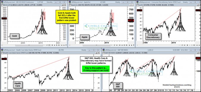
CLICK ON CHART TO ENLARGE The right side of Eiffel tower patterns can be a little bit painful if you are bullish! Gold is down near $100 today, most likely continuing to feel the impact of its Eiffel tower pattern that peaked in August of 2011. Don’t overlook...
by Chris Kimble | Jun 12, 2013 | Kimble Charting
CLICK ON CHART TO ENLARGE Several times the Power of the Pattern has shared that Eiffel tower patterns can be very important to your portfolio construction & management. At the time when most investors were in love with Gold & Apple, I shared that Eiffel tower...

by Chris Kimble | Mar 13, 2013 | Kimble Charting
CLICK ON CHART TO ENLARGE Many questions seem to surround the new health care system in the United States. Is Obama Care causing these stocks to be so strong? The answer to that question is above my pay grade! One thing that is not in question is the...

by Chris Kimble | Jul 2, 2012 | Kimble Charting
CLICK ON CHART TO ENLARGE This past Friday Healthcare ETF (IYH) pushed above its sideways channel in the chart above and IYH has been reflecting relative strength compared to the 500 index over the past couple of months. Did the supreme courts ruling impact health...
