
by Chris Kimble | May 13, 2013 | Kimble Charting
CLICK ON CHART TO ENLARGE The world’s worst performing stock market index over the past 30-years, happens to be the hottest asset over the past 12-months. Which is more important at this time, 30-year track record or the past year’s performance? From...
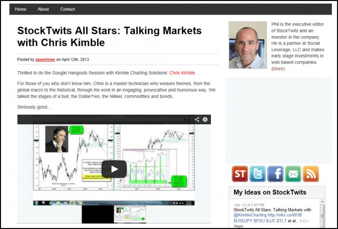
by Chris Kimble | Apr 13, 2013 | Kimble Charting
CLICK HERE TO WATCH INTERVIEW I was deeply honored to do a live interview with Phil Pearlman, Executive Editor of StockTwits yesterday. Thanks for the opportunity to share some of my thoughts and current charts with you and your viewers Phil! See us here on...

by Chris Kimble | Mar 21, 2013 | Kimble Charting
CLICK ON CHART TO ENLARGE 35% of the blogs viewership is from outside of the United States, reflected in the chart below. I am deeply humbled by the global viewers that come to the blog daily. Thank you. The above 6-pack reflects that the DAX, CAC-40 &...

by Chris Kimble | Mar 17, 2013 | Kimble Charting
CLICK ON CHART TO ENLARGE The Nikkei has been very strong over the past 5 months, gaining more than most stock markets, anywhere in the world. The rally of late, now has the index near the 50% Fibonacci level, of its large decline from 2007 to 2009. If this...

by Chris Kimble | Feb 27, 2013 | Kimble Charting
CLICK ON CHART TO ENLARGE From a portfolio construction standpoint, when the yield on the 10-year note and Australian Dollar decline in price, history has suggested to underweight allocations towards risk assets. Check out the price situation for both of these...
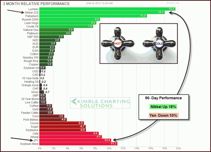
by Chris Kimble | Jan 22, 2013 | Kimble Charting
One of the more popular discussions in the new year revolves around the efforts of Japan’s New prime minister (Shinzo Abe) to print money and drive down the Yen/ push up the Nikkei 225 index & risk assets in Japan. (see print money for the whole...
