
CLICK ON CHART TO ENLARGE
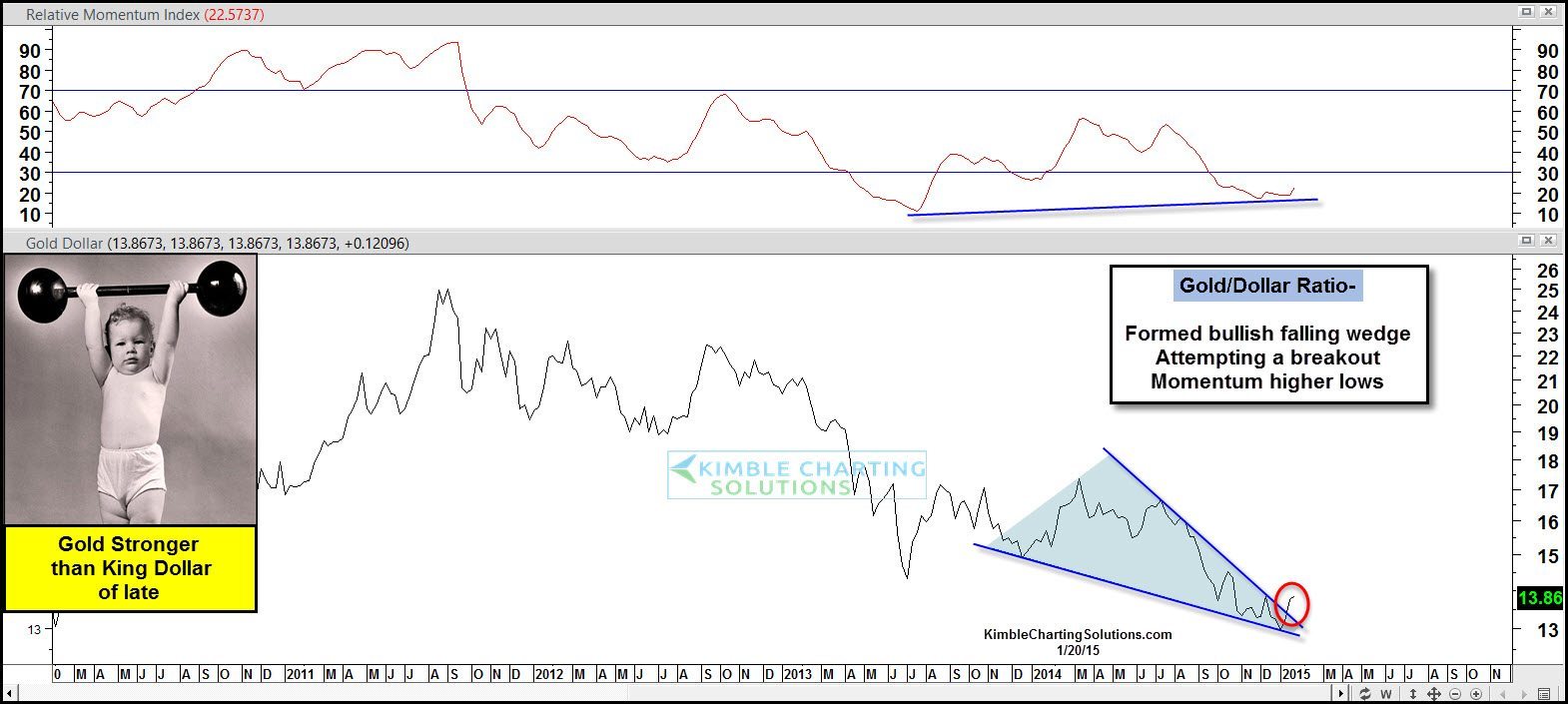
When one looks back over the past few years, King Dollar has been much stronger than Gold & Silver by a big percentage. The above ratio of the Dollar compared to Gold, reflects a strong trend downward (Dollar stronger than Gold). It’s been best to own the Dollar over the metals since 2011.
CLICK ON CHART TO ENLARGE
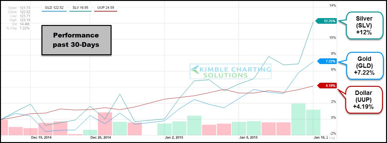
The above chart is a 30-day performance comparison of the metals to the US$. As you can see gold has almost been twice as strong as the Dollar and Silver is almost three times as strong. Want to make this clear at this point…30-days does NOT make a trend.
Is a reversal in play and investors should now own Gold & Silver over King Dollar?
CLICK ON CHART TO ENLARGE
Miners have been rather impressive of late, actually the most impressive in the history of miners. ETF Trends shares that GDX, has just experienced the best three weeks since it was created (Record performance here)
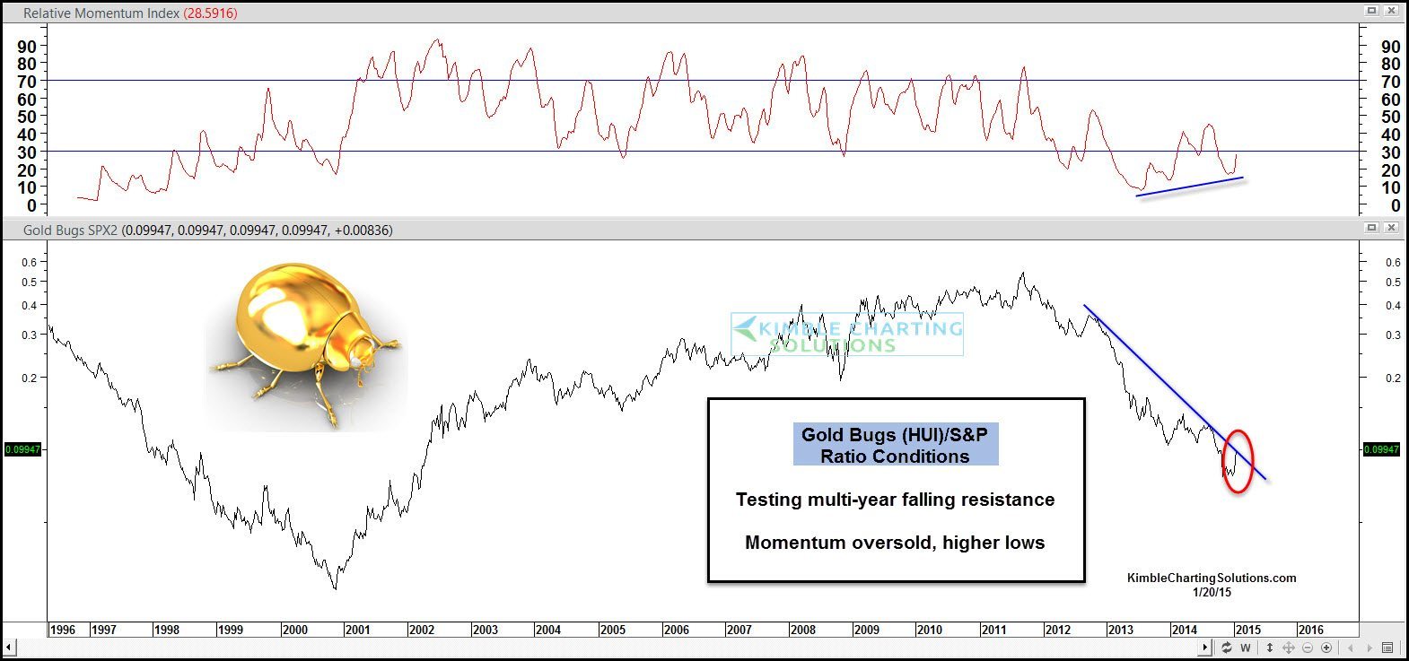
The Gold Bugs (HUI)/S&P 500 ratio has been sinking fast over the past few years as well. The ratio above is now facing a big test of resistance, as its up against a two-year falling line as momentum is deeply oversold and could be creating higher lows.
New trends have to start from somewhere! Are new trends actually in play now? The Power of the Pattern started sharing 6 weeks ago with metals members that positive conditions for a Metals and miners rally looked to be forming.
A further breakout of the Gold/Dollar ratio and new breakout by the Gold Bugs/SPY ratio would be encouraging signs for the hard hit metals complex. From a sentiment perspective the conditions are ripe for a change as 90% of investors are bullish King Dollar at the time. If King Dollar would turn into Queen Dollar for a while, the metals complex would like it!
If you would like weekly updates and special alerts to opportunities in the metals complex, I would be honored to have you as a metals member.
–
–
More details on our research can be found at Kimble Charting Solutions (HERE)
–
