
CLICK ON CHART TO ENLARGE
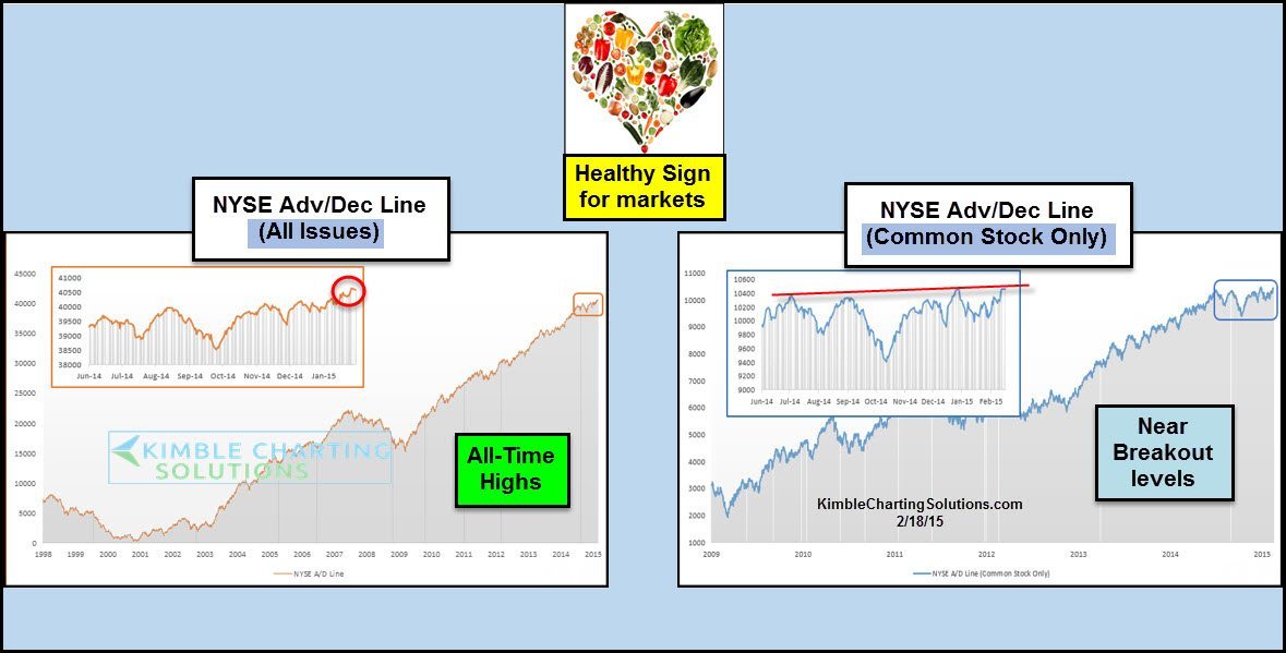
The above charts are two different ways to look at the Advance/Decline line on the NYSE.
The chart on the left is the typical version, which is “all issues” on the NYSE. This has been the most common way to look at the A/D line for years. Some have said this is not a good way to look at the A/D line because it includes some closed end bond funds.
The chart on the right takes a look at just “common stocks” in the NYSE. As you can see the “All Issue” A/D line has been at all-time record levels for a long period of time. The “Common Stock Only” A/D line has been choppy since June of last year. At this time it is attempting a breakout.
Using history as a guide, its usually healthy for the broad markets when these are attempting to hit all-time high levels.
–
I share these each week in the Global Dashboards report…Click below for details

–
