
Today’s post is from my good friend Ryan Detrick. He had some unique thoughts and stats on the 200-day moving average, Thank You Ryan for your contributions!
We hear a lot about the S&P 500 and its 200-day moving average. It is trading above or below this long-term trendline? I’ve long said what matters more is the overall trend of the 200-day moving average. With that, as of August 21, the 200-day moving average for the S&P 500 has started to point lower. In other words, is the bigger trend now lower? Trend followers would probably make that argument. So I decided to take a closer look.
Here’s a chart going back to 1928. Again, the 200-day moving average is officially pointing lower and has been for nearly three weeks.
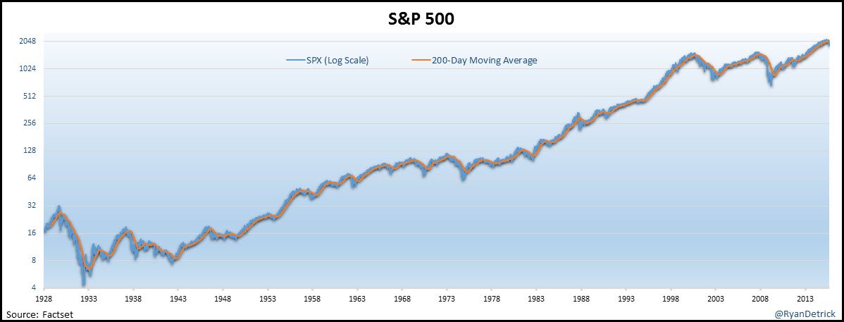
CLICK ON CHART TO ENLARGE
The 200-day moving average had been trending higher for an incredible 870 days. The streak started clear back in March 2012 and was the second longest streak of a higher trending 200-day moving average ever. I wondered what happened after long streaks ended. Starting in ’28, there were seven previous times the 200-day moving average was pointing higher for more than 500 days. As you can see below, the returns after are very poor. Down 8% on average a year later and flat two years later are very weak returns. Even going clear out five years, the average gain is only 16%. Considering the average return with dividends is about 10% a year, this could suggest very weak returns going out several years.
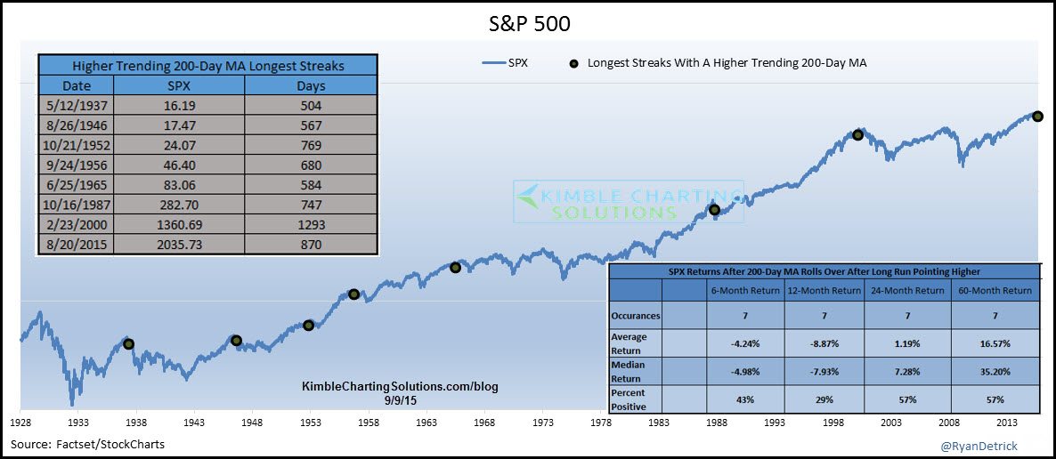
CLICK ON CHART TO ENLARGE
Next I broke things down several different ways. I was surprised that above (or below) the 200-day moving average produced more (or worse) results than the way the 200-day was trending. I always thought the trend mattered more, guess just being above or below is more important. Lastly, I looked at what happened when the S&P 500 was above (or below) the 200-day moving average and it was trending higher (or lower). What is worth noting here is the returns when it is both below the 200-day moving average and the trendline is pointing lower, the returns are pretty poor. This is what is happening now, a lower 200-day moving average and beneath the long term trendline. Also this scenario produces the largest standard deviation. So wild moves are the norm. Sound familiar?
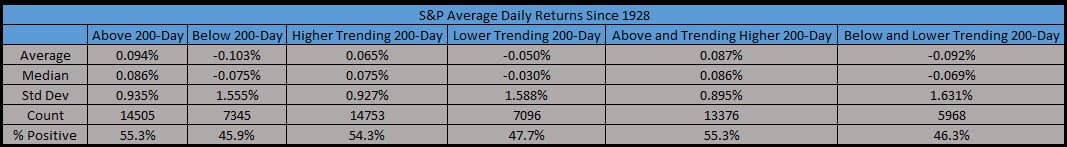
CLICK ON CHART TO ENLARGE
What’s it mean?
As Chris noted last week (long-term bull market is still alive) and yesterday (Dow Theory says bull market still in tact) , the bigger trends are still higher.
The results above are clearly a concern, but it doesn’t mean the end of the world is near either. Sure, the worst bear markets take place when the 200-day is pointing lower and price is beneath that trendline also, but that doesn’t mean things have to crash here. Be on alert, but also consider the fact that the past 12 months the S&P 500 is exactly flat. Price very well could simply be correcting through time versus price. After all, the Dow is up six years in a row. Going back 115 years, it was green seven straight years only once and that was during the ’90s.
If one of your investment goals is to stay on top of long-term trends, you might find out Global Dashboards report of interest, because that is the goal of this weekly report (find trends and ride them and trade the markets few times). To find out more details on the Global Dashboards weekly report click HERE
—
