
by Chris Kimble | Jan 3, 2013 | Kimble Charting
CLICK ON CHART TO ENLARGE The yield on the 30-year bond and the price of the S&P 500 both peaked in September on the day of announcement of the QE3 program (see injection gamble here). Yesterday the government came to an agreement to avert the “Fiscal...
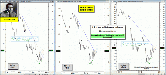
by Chris Kimble | Oct 26, 2012 | Kimble Charting
CLICK ON CHART TO ENLARGE Short to longer-term Yields look to have created “Bullish Inverse Head & Shoulders” patterns over the past few months. (this is bullish for yields and bearish for govt.bond prices) In the past couple of days the 5 &...
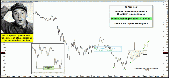
by Chris Kimble | Oct 24, 2012 | Kimble Charting
CLICK ON CHART TO ENLARGE The yield on the 30-year bond (TYX) may have created a double bottom in July, matching the financial crisis low in yields (see inset chart above). Since then the 30-year yield may have created a “Bullish inverse head &...
