
by Chris Kimble | Mar 12, 2015 | Global Dashboard, Kimble Charting
CLICK ON CHART TO ENLARGE This 4-pack looks at the Advance/Decline line of 4 key markets. As you can see each are above long-term support lines and testing short-term support right now. No key divergences are taking place. Historically this has been a positive for...

by Chris Kimble | Aug 19, 2014 | Kimble Charting
CLICK ON CHART TO ENLARGE The NYSE weekly advance/decline line declined a little last month, yet it did not break short-term rising support (right chart). The small push higher of late has it back near all-time high levels. The NYSE index (left chart) finds...

by Chris Kimble | Dec 31, 2013 | Kimble Charting
CLICK ON CHART TO ENLARGE Is the NYSE Index creating a “Double Top” six years later? As we are ending another year, its easy to look back on the broad based index and see that its at the same price as it was 6-years ago, prior to a rather large decline. Is...
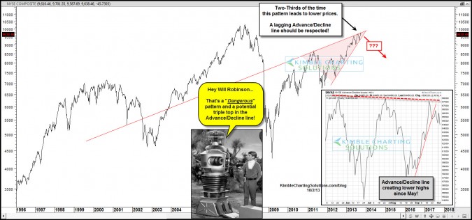
by Chris Kimble | Oct 2, 2013 | Kimble Charting
CLICK ON CHART TO ENLARGE Bearish rising wedge patterns two-thirds of the time lead to falling prices. The NYSE composite has created a bearish rising wedge that is about to come to an end. At the same time this pattern is coming to completion, the Advance/Decline...

by Chris Kimble | Aug 14, 2013 | Kimble Charting
CLICK ON CHART TO ENLARGE Twice in the past 13-years the NYSE created a double top at one resistance line at (1) above and then the “sky fell”…. as it declined 50%…. twice. Now the NYSE could have created another double top at a parallel...

by Chris Kimble | Aug 6, 2013 | Kimble Charting
CLICK ON CHART TO ENLARGE Advance/Decline breadth has often been a key leading indicator to important tops & bottoms in the broad market. The NYSE Advance/Decline line hit an all-time high in May and now has rallied back to reach the May high a towards the end of...
