
by Chris Kimble | May 5, 2014 | Kimble Charting
CLICK ON CHART TO ENLARGE So Goes the Banks, So Goes the Broad Market? Well… this is not a perfect analogy, yet more often than not, what banks do (strong or weak) does seem to have an important impact on the broad markets. The above 3-pack reflects that...

by Chris Kimble | Apr 17, 2013 | Kimble Charting
CLICK ON CHART TO ENLARGE The above chart reflects a ratio I created a few years ago for Premium Members. The blended ratio has been awesome for picking major highs and lows in the banking industry. I then apply a unique relative momentum index to the blended...
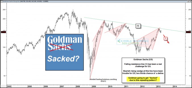
by Chris Kimble | Apr 17, 2013 | Kimble Charting
CLICK ON CHART TO ENLARGE Goldman Sachs has really struggled with resistance line (1) over the past few years, topping out, creating a series of lower highs and bearish rising wedges….resulting in pretty steep declines. Now GS is back at line (1) again and has...

by Chris Kimble | Mar 11, 2013 | Kimble Charting
CLICK ON CHART TO ENLARGE Bank strength is usually a good sign for the economy and broad market. The above 4-pack reflects a break of multi-year resistance breakout in JP Morgan (JPM). Now Bank of America (BAC) and Citigroup (C) are attempting to follow...

by Chris Kimble | Jan 18, 2013 | Kimble Charting
CLICK ON CHART TO ENLARGE “So Goes the Banks, So Goes the Broad market” was pretty true in the window from 2007- 2009 as they both went down together. Last year this quote seemed to apply, as Banks were a leading sector and the broad market did well...
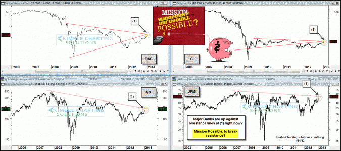
by Chris Kimble | Jan 14, 2013 | Kimble Charting
CLICK ON CHART TO ENLARGE Key Banks are all up against multi-year resistance lines at (1) above. The chart below reflects that some banks did very well compared to the S&P 500 in 2012. CLICK ON CHART TO ENLARGE If this phrase is correct ( So Goes the Banks,...
