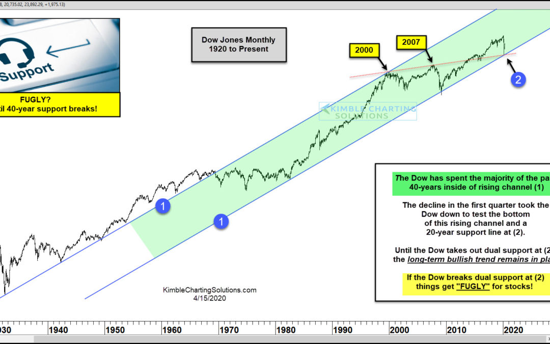
by Chris Kimble | Apr 16, 2020 | Kimble Charting
The Dow Jones Industrial Average fell nearly 40 percent during the March market crash. But it seemed to recover from a familiar technical price level. In today’s chart, we highlight a key confluence of support where the Dow Industrials reversed higher off of… and why...

by Chris Kimble | Feb 16, 2018 | Kimble Charting
Below looks at the Dow Jones Industrials average over the past couple of years CLICK ON CHART TO ENLARGE The Dow has experienced a quality rally over the past 16-months inside of rising channel (A). The Dow started acting heavy and rapid selling took place as it was...

by Chris Kimble | Feb 12, 2018 | Kimble Charting
Back in December, before any market weakness started, we were featured in a CBS MarketWatch article entitled “A Dow Crash? Another 25% Jump? No, Here’s The Case For A Market Freeze In 2018.“ At that time, our research showed that the Dow Jones Industrial...
by Chris Kimble | Feb 2, 2018 | Kimble Charting
Below looks at a chart on the Dow since the early 1900’s on a monthly basis, with momentum applied in the upper part of the chart. CLICK ON CHART TO ENLARGE The Dow at this time is attempting a breakout of this 70-year channel at (3) as the trend is strongly...

by Chris Kimble | Dec 19, 2017 | Kimble Charting
As the Dow is quickly approaching the 25,000 level, some might find it hard to remember that in the very near past, the Dow traded sideways for 21 months! Any reason the Dow didn’t make any progress for over a year and half? Could part of the reason be a key...
