
by Chris Kimble | May 12, 2014 | Kimble Charting
CLICK ON CHART TO ENLARGE Three years ago this month Silver was hitting it’s 1980’s high, reflected in the chart below. Around the same time, Gold was becoming a crowded trade, so crowded the Gold ETF (GLD) became the largest ETF in the world!...

by Chris Kimble | May 5, 2014 | Kimble Charting
CLICK HEAR TO READ ARTICLE My friend Josh Brown shared the headline above, asking if “Gold could lose $500 per ounce?” This idea was based upon a Power of the Pattern chart I shared with him. At the time of this posting Gold was trading at...

by Chris Kimble | Apr 4, 2014 | Kimble Charting
CLICK ON CHART TO ENLARGE The Junior Gold mining ETF (GDXJ) finds itself at key price point right now. The ETF broke above falling resistance and it is now testing it as support, for the first time. At the same time this support test is taking place, GDXJ could...
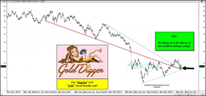
by Chris Kimble | Apr 2, 2014 | Kimble Charting
CLICK ON CHART TO ENLARGE A breakout from a bullish falling wedge after testing old resistance as support could be taking place in ABX today. The Power of the Pattern is “digging” this action is ABX can create more space above support! –...

by Chris Kimble | Mar 7, 2014 | Kimble Charting
CLICK ON CHART TO ENLARGE I shared the above chart three weeks ago with members…suggesting to “Rent Rallies in Silver, not own them!” Why Rent? The above long term chart focuses on “Ascending and Descending Triangles” in...
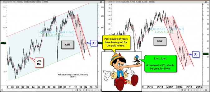
by Chris Kimble | Mar 6, 2014 | Kimble Charting
CLICK ON CHART TO ENLARGE Its been a great couple of years for the gold miners! Well we all know that’s not the truth. It has been a great couple of months for them though, as $GDX is up 25% YTD. I shared with members the first of the year...

by Chris Kimble | Mar 3, 2014 | Kimble Charting
CLICK ON CHART TO ENLARGE Would you call a 300% decline a crash? Come on….How can something drop 300%??? The S&P 500/Gold bugs ratio declined 300% over the past couple of years. Would anyone call that a crash? You pick the terms…kind of painful...

by Chris Kimble | Feb 18, 2014 | Kimble Charting
CLICK ON CHART TO ENLARGE Gold is off to a nice start in 2014, after losing a third of its value over the past 16 months. The rally of late could well be forming a bullish cup & handle pattern. If this pattern read is correct, the handle needs to be...
