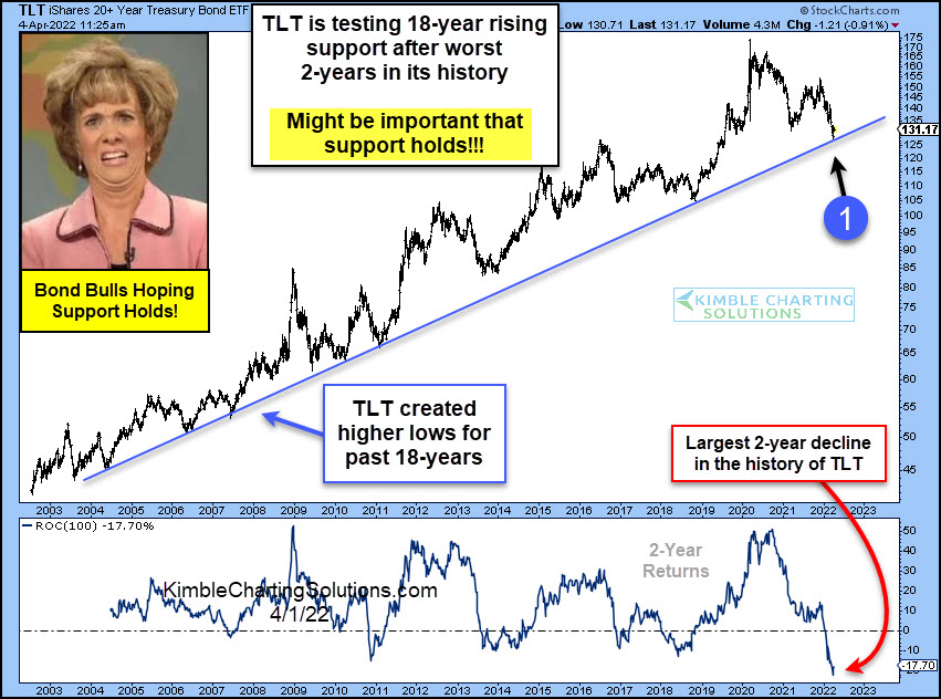
by Chris Kimble | Apr 5, 2022 | Kimble Charting
Treasury bonds have left a bad taste in investors’ mouths for the past couple of years. And this collective “UGH!” comes after years of solid returns. Will the bull market continue? Or is this the beginning of the end? Today’s chart takes a look at the 20+ Year...
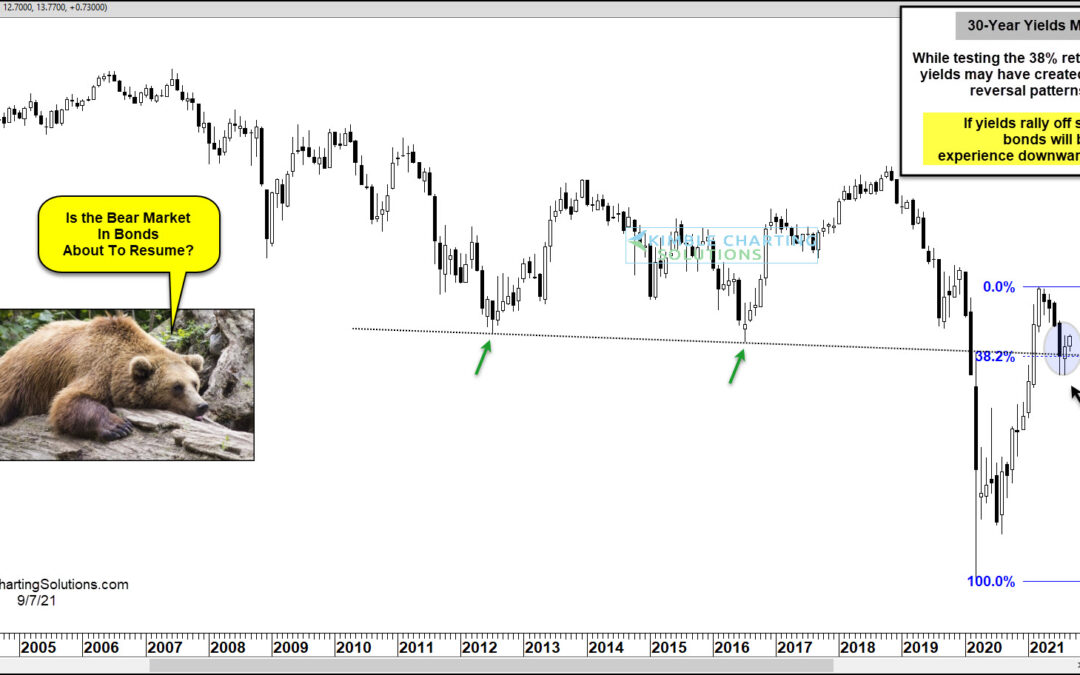
by Chris Kimble | Sep 8, 2021 | Kimble Charting
US Treasury bonds experienced a bear market and added selling pressure following the coronavirus flash crash as bond yields bottomed in early 2020 and took flight. The move higher in yields peaked early this year, taking some pressure off bonds. But if yields should...
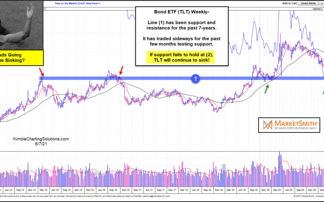
by Chris Kimble | Jun 8, 2021 | Kimble Charting
US government bonds have come under pressure over the past year. And that decline has come to an important inflection point. Time to bounce higher? Or will government bonds continue to sink lower? That is the theme of today’s “weekly” chart from Marketsmith.com, of...
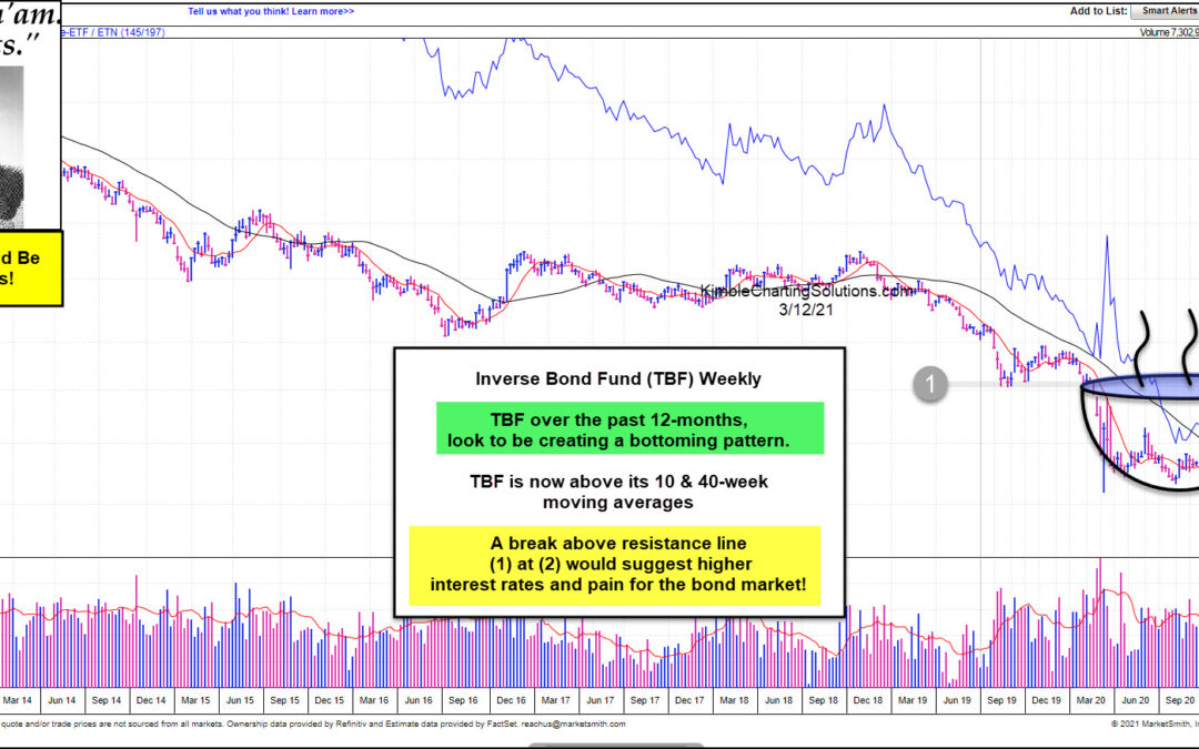
by Chris Kimble | Mar 12, 2021 | Kimble Charting
The bond market has had a bad 12-months, as interest rates bottomed in March of 2020. Popular Government Bond ETF (TLT) has lost more than 15% in the past year! Are bonds about to receive more bad news? Sure could!!! This chart from Marketsmith looks at the Inverse...
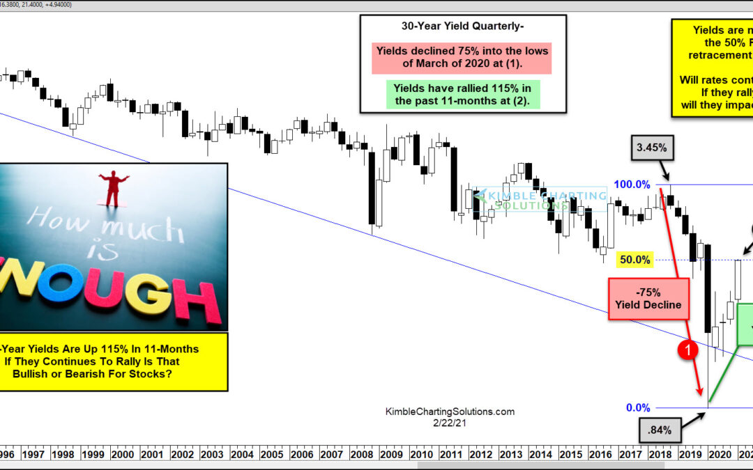
by Chris Kimble | Feb 22, 2021 | Kimble Charting
Interest rates on the 30-year bond fell 75% from November of 2018 until March of 2020 (1). They have rallied 115% in the past 11-months, after hitting lows in March 2020 at (2). As yields have risen 115% off the 2020 lows, the S&P is up nearly 65% at the same...
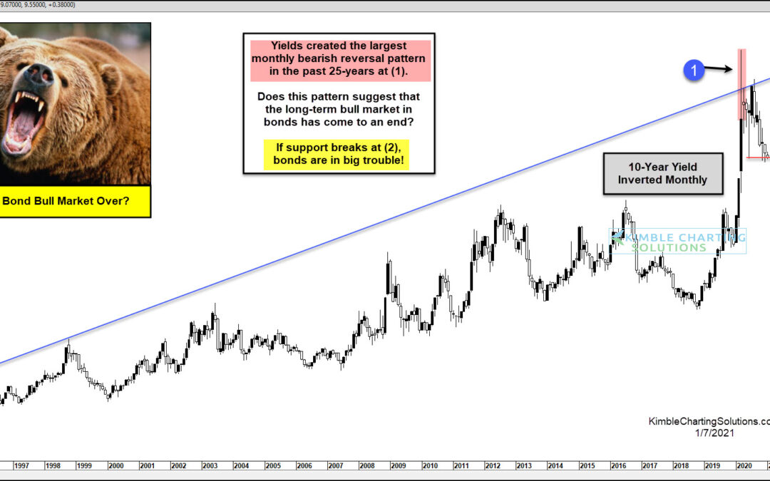
by Chris Kimble | Jan 7, 2021 | Kimble Charting
For the past three decades, one thing investors could count on was lower yields and rising bond prices (due to inverse relationship). The Federal Reserve was dovish and a competitive market (due to the rise of technology) kept prices and inflation under control. And...
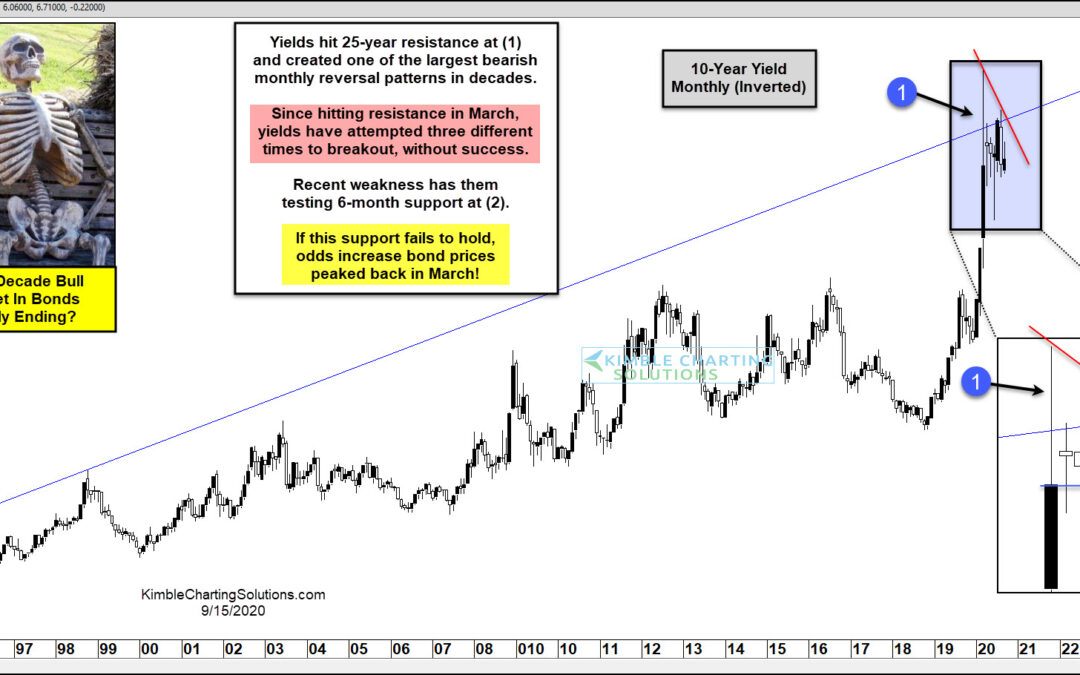
by Chris Kimble | Sep 15, 2020 | Kimble Charting
Bonds have been in a bull market for decades and it has been a costly idea to bet against them! Is the bond bull market about to end? An important support test is at hand, that will go a long way in answering this important question. This chart looks at the yield on...
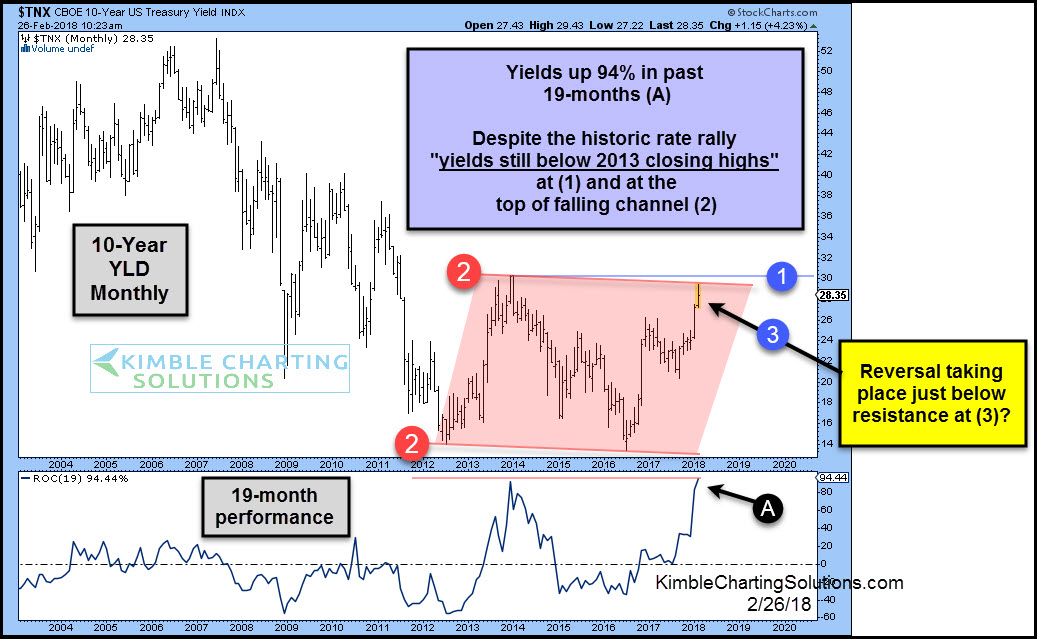
by Chris Kimble | Feb 26, 2018 | Kimble Charting
CLICK ON CHART TO ENLARGE The top part of the chart above looks at the 10-year yield on a monthly basis going back 14-years. The bottom section looks at the 19-month performance since 2004. Yields are up 94% in the past 19-months, which is the largest 19-month rally...
