
by Chris Kimble | Apr 3, 2013 | Kimble Charting
CLICK ON CHART TO ENLARGE Junk Bond ETF (HYG) has created a bearish rising wedge over the past few years. Weakness of late has HYG breaking support at (1) in the chart above. Effective yields on the high yields are hitting the lowest levels in 15 years,...

by Chris Kimble | Feb 4, 2013 | Kimble Charting
CLICK ON CHART TO ENLARGE High yield ETF’s (JNK & HYG) are both on 16-month support lines in the 2-pack above. Each time these declines have taken place of late, it reflected a buying opportunity? Different this time? An FYI- as mentioned in the...
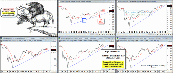
by Chris Kimble | Nov 12, 2012 | Kimble Charting
CLICK ON CHART TO ENLARGE High yield funds (aka- “stocks in drag”) have moved sideways to down over since the stock market highs of mid September. 3 of the 5 high yield funds this past week broke below their 50SMA lines in the 5 pack above. Each of...

by Chris Kimble | Oct 16, 2012 | Kimble Charting
CLICK ON CHART TO ENLARGE High Yield funds have a great track record, per leading the stock market in both directions. Of late the high yield funds continue to reflect relative strength over the past 2 weeks and month (See inset above). While the 500 index hit its...

by Chris Kimble | Sep 4, 2012 | Kimble Charting
CLICK ON CHART TO ENLARGE The Junk Bond complex can be a great leading indicator for the next major move in the stock market. Junk Bond ETF’s (JNK & HYG) peaked at the end of February this year, the 500 peaked about a month later, then all three declined...

by Chris Kimble | Aug 16, 2012 | Kimble Charting
Over the past 3 weeks… Junk bonds are flat/stable and quality corporate and Government bonds performance has been fairly weak….some might say pretty junky! CLICK ON CHART TO ENLARGE Could stable junk bond prices and weak government bonds be a reflection...

by Chris Kimble | Jul 25, 2012 | Kimble Charting
CLICK ON CHART TO ENLARGE Last fall when investors were way too bearish and running for the hills, driving the VIX sky high and piling into cash (see post here), high yields were reflecting relative strength and the Power of the Pattern was suggesting that this...

by Chris Kimble | May 1, 2012 | Kimble Charting
CLICK ON CHART TO ENLARGE Over the past 30 days, high yield funds and high yield ETF (JNK) have reflected relative strength, when compared to the S&P 500. CLICK ON CHART TO ENLARGE The above 4-pack reflects that high yield mutual funds have remained above...
