by Chris Kimble | Apr 4, 2018 | Kimble Charting
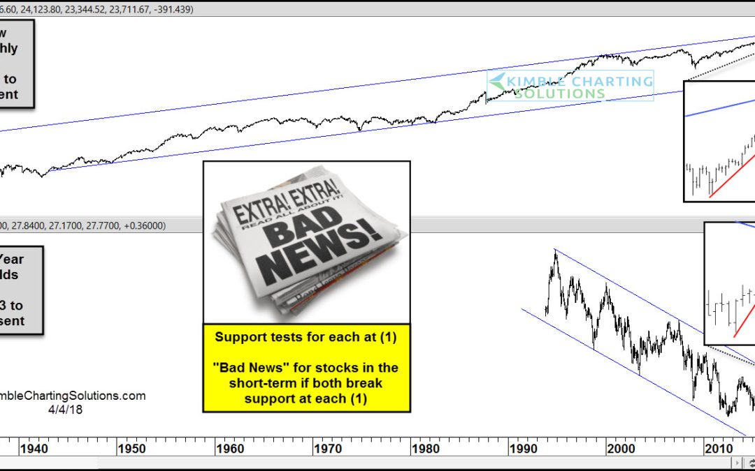
CLICK ON CHART TO ENLARGE The top chart above highlights that the Dow has spent the majority of the past 70-years inside of a rising channel. The bottom chart highlights that the 10-year yield has spent the majority of the past 25-years inside of a falling channel....

by Chris Kimble | Dec 20, 2016 | Kimble Charting
Is Crude poised to make a giant leap higher in prices? What would the world look like if Crude was to rally 50% from current prices? Below looks at Crude Oil over the past 30-years and highlights that Crude has a big test of resistance in play. CLICK ON CHART TO...
