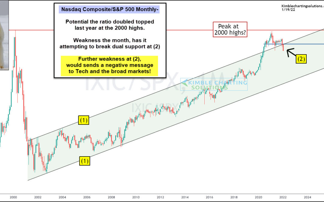
by Chris Kimble | Jan 19, 2022 | Kimble Charting
One theme over the past several months has been tech stock’s under-performance. And 2022 seems to be amplifying this theme as we kick off the new year. Today’s chart focus is on the ratio of the Nasdaq Composite to the S&P 500 Index. We have shared this...

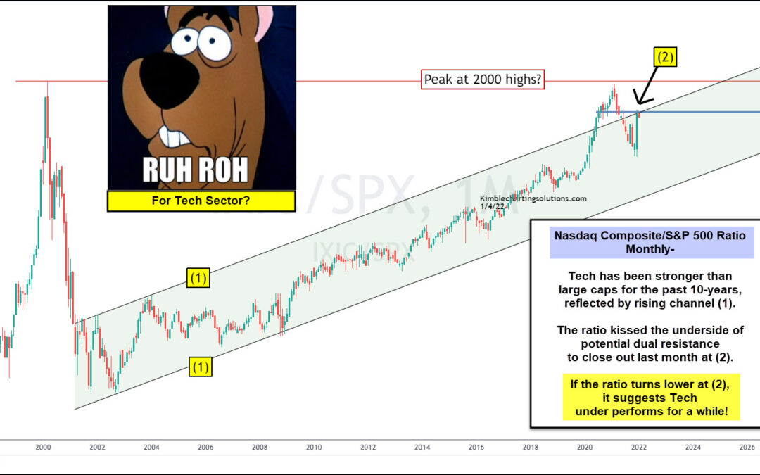
by Chris Kimble | Jan 5, 2022 | Kimble Charting
Tech stocks began under-performing the broader market several months ago when the ratio of the Nasdaq Composite to S&P 500 Index peaked out at the 2000 high. This is worth noting because this tech ratio has been in a rising up-trend for the past two decades,...

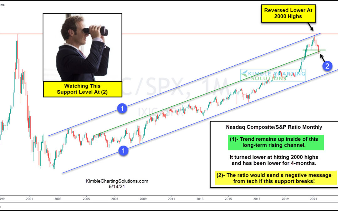
by Chris Kimble | May 14, 2021 | Kimble Charting
Tech stocks have been on shaking ground over the past several weeks / few months. And this shows up clearly in today’s ratio chart, pitting the Nasdaq Composite versus the S&P 500 Index on a “monthly” basis. This long-term chart really gets at the heart of the...

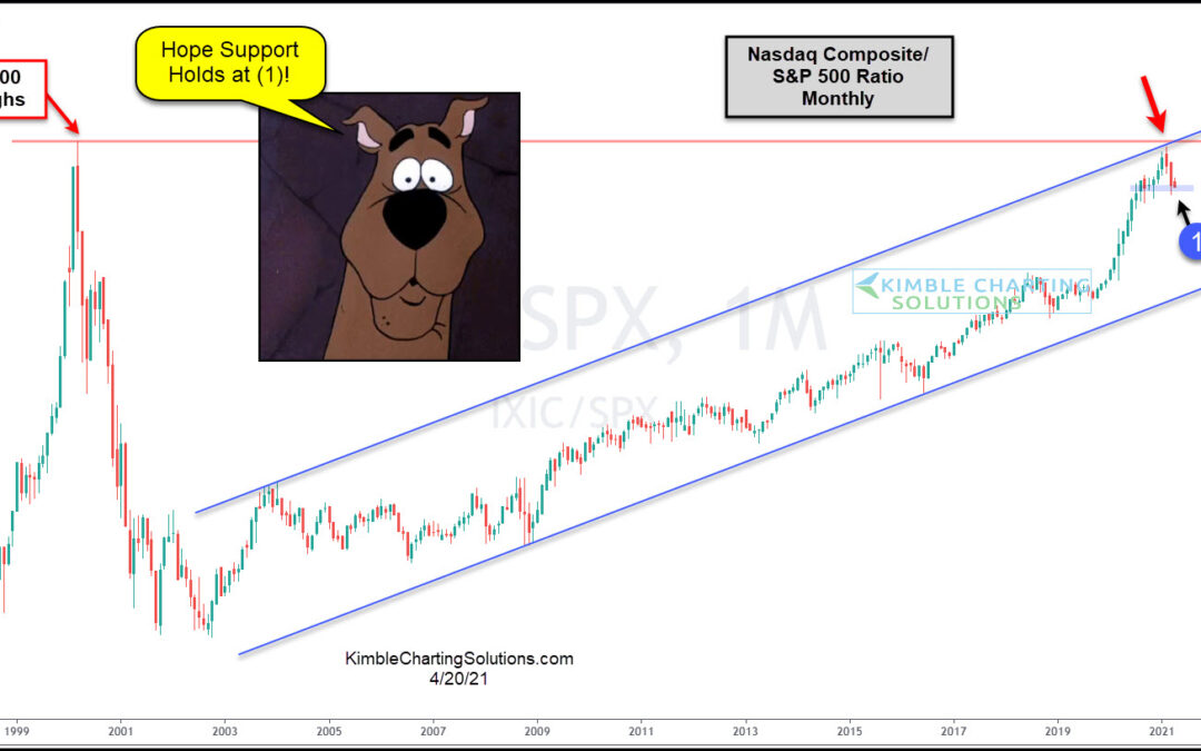
by Chris Kimble | Apr 20, 2021 | Kimble Charting
For the past 19-years, the Nasdaq Composite Index has been stronger than the S&P 500. Is this trend about to change? This chart looks at the Nasdaq Composite Index/S&P 500 ratio since 1997. It peaked in 2000 and fell like a rock, as tech stocks fell...
