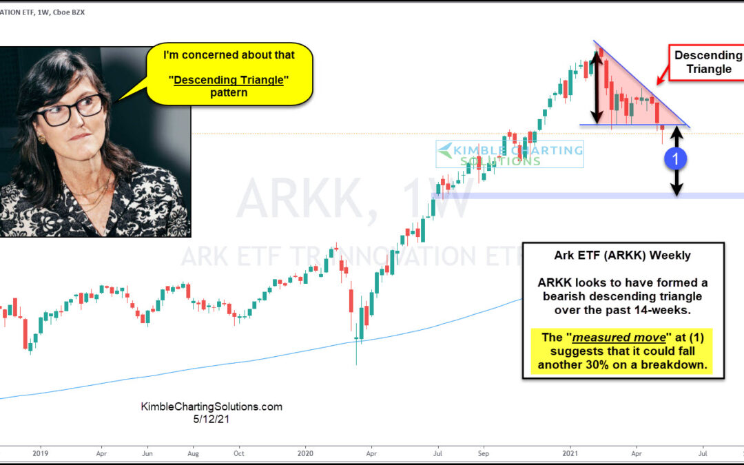
by Chris Kimble | May 12, 2021 | Kimble Charting
Red hot Ark ETF (ARKK) has cooled off of late, losing over 30% of its value. Is it about to fall another 30%? If this pattern is correct, it is possible it does! ARKK looks to have formed a bearish descending triangle over the past 14-weeks. Currently, it is testing...
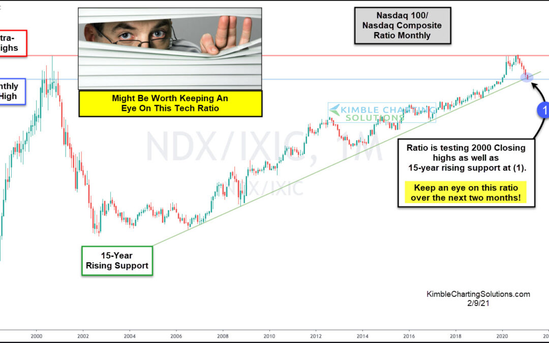
by Chris Kimble | Feb 10, 2021 | Kimble Charting
Tech stocks continue to lead the market higher, with the Nasdaq Composite and Nasdaq 100 recording intra-day all-time highs. BUT something isn’t right beneath the surface. And it could be a rally killer. I emphasize “could”. The 12-year bull market has been lead by...
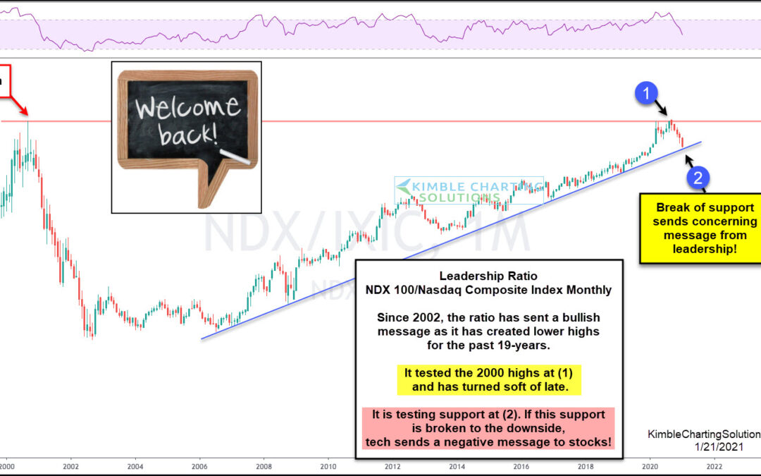
by Chris Kimble | Jan 21, 2021 | Kimble Charting
Since the 2000 tech bubble and crash, tech stocks have regained their leadership form. Especially large-cap tech stocks. Headlines have varied in focus from the “4 horseman” to “FANG” and “FANGE”, but one thing remains: Large-cap tech stocks have been the bull market...
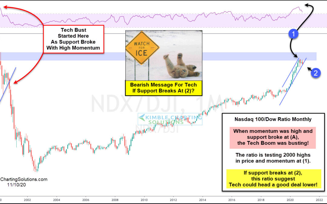
by Chris Kimble | Nov 10, 2020 | Kimble Charting
Twenty years ago the NDX 100/Dow Jones Ratio created a topping pattern, as monthly momentum was sky-high, as the Dot.com peak was taking place. Following this setup, the NDX 100 fell nearly 90% in less than three years. The NDX/Dow ratio over the past 90-days is...
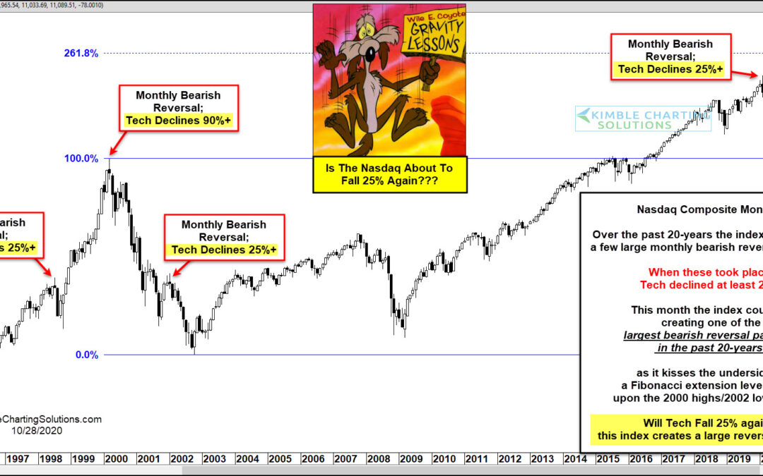
by Chris Kimble | Oct 29, 2020 | Kimble Charting
Technology is the lifeblood of our current economy and dictates future innovation. The sector has also taken a primary leadership role in the 11-year bull market. But, as most of you are aware, that doesn’t mean that tech stocks are always smooth sailing. In fact, the...
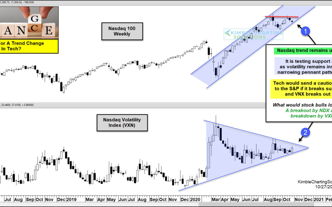
by Chris Kimble | Oct 27, 2020 | Kimble Charting
Is the bull trend in tech about to end? What Tech and its volatility index does in the next few weeks will go a long way to answer this question! This chart looks at the NDX 100 and its Volatility Index (VXN) on a weekly basis over the past couple of years. The trend...
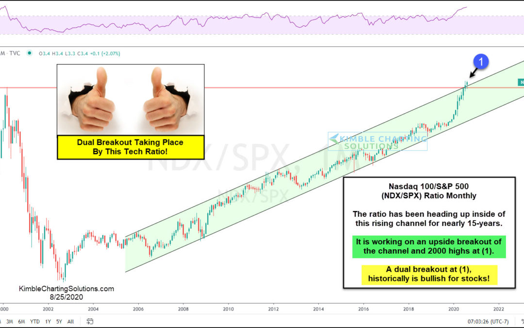
by Chris Kimble | Aug 26, 2020 | Kimble Charting
This year has definitely accelerated the trend in utilizing technology in the way we work (remotely) and live. And it’s showing up in the stock market. Today’s chart looks at the ratio of the Nasdaq 100 Index (large-cap tech stocks) to the S&P 500 Index...
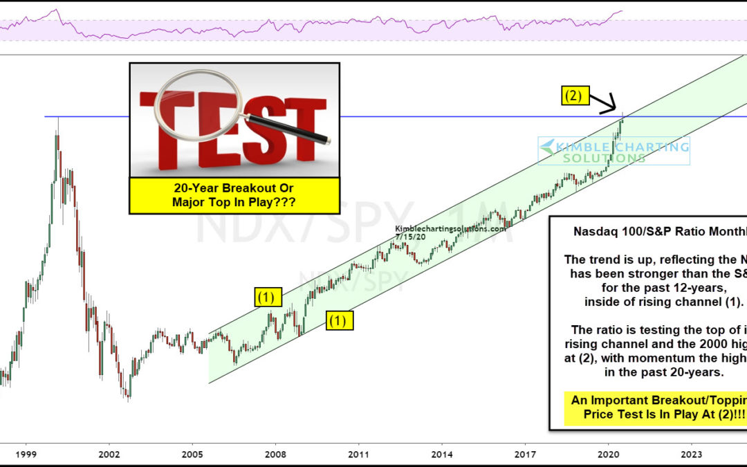
by Chris Kimble | Jul 16, 2020 | Kimble Charting
Is the latest ramp higher and Large-cap tech stocks have been the clear market leader, out-performing the broad market for months. In today’s chart, we look at the Nasdaq 100 to S&P 500 performance ratio in an effort to answer the question: Is the ramp higher in...
