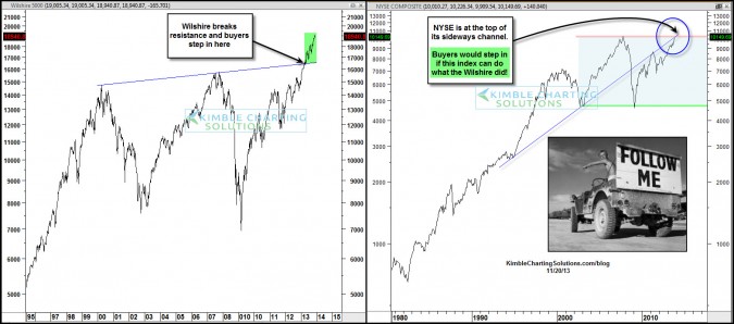
by Chris Kimble | Nov 20, 2013 | Kimble Charting
CLICK ON CHART TO ENLARGE Buyers jumped on board the Wilshire 5000 index once it broke resistance in the left chart above, which was a positive for this very broad index, pushing it almost vertical on this chart. Now another broad index is attempting a breakout. The...

by Chris Kimble | Nov 11, 2013 | Kimble Charting
CLICK ON CHART TO ENLARGE I would first like to take a moment and express my appreciation to all Veterans! Thank you for your service and sacrifice. The photo above caught my eye when one thinks of Courage and heading into uncharted waters. For sure the markets...

by Chris Kimble | Nov 8, 2013 | Kimble Charting
CLICK ON CHART TO ENLARGE One of the broadest stock index’s, the NYSE, is now making a run at its 2007 highs, while at the top of a rising wedge pattern and facing a key support/resistance line dating back to the mid 1990’s! Joe Friday…. A break...
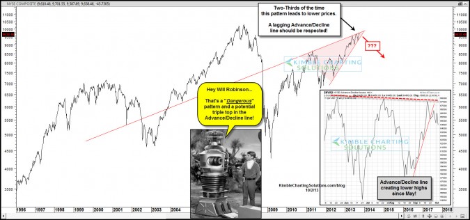
by Chris Kimble | Oct 2, 2013 | Kimble Charting
CLICK ON CHART TO ENLARGE Bearish rising wedge patterns two-thirds of the time lead to falling prices. The NYSE composite has created a bearish rising wedge that is about to come to an end. At the same time this pattern is coming to completion, the Advance/Decline...

by Chris Kimble | Aug 23, 2013 | Kimble Charting
CLICK ON CHART TO ENLARGE Whether you own them or not, I believe it is important to keep one eye on the two broadest index’s, the NYSE Composite and Wilshire 5000. Let me make this clear…the trend on both remains up at this time! Both are facing multi-year...

by Chris Kimble | Aug 14, 2013 | Kimble Charting
CLICK ON CHART TO ENLARGE Twice in the past 13-years the NYSE created a double top at one resistance line at (1) above and then the “sky fell”…. as it declined 50%…. twice. Now the NYSE could have created another double top at a parallel...

by Chris Kimble | Aug 6, 2013 | Kimble Charting
CLICK ON CHART TO ENLARGE Advance/Decline breadth has often been a key leading indicator to important tops & bottoms in the broad market. The NYSE Advance/Decline line hit an all-time high in May and now has rallied back to reach the May high a towards the end of...
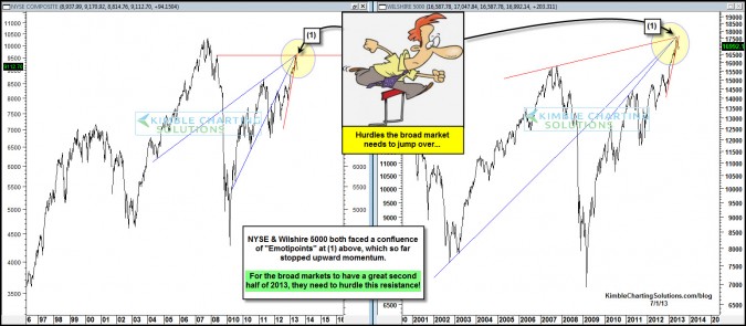
by Chris Kimble | Jul 1, 2013 | Kimble Charting
CLICK ON CHART TO ENLARGE Well the first half of 2013 is behind us and the S&P 500 had a great first half, gaining over 12%. Two of the broadest index’s that had a good first half as well, ran into an confluence of Emotipoints dating back several...
