by Chris Kimble | Mar 4, 2022 | Kimble Charting
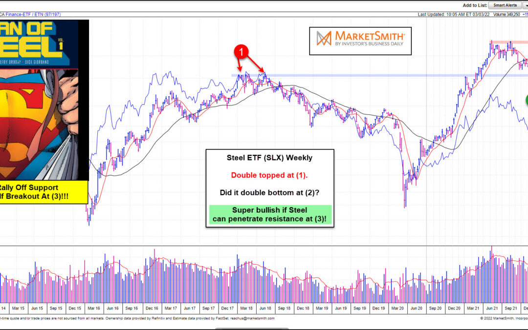
Geopolitical tensions surrounding the Russia/Ukraine war have sent steel prices higher. And if the rally continues, it may mean considerably higher steel prices and added inflationary pressure. Today’s chart from Marketsmith takes a “weekly” look at the Steel ETF...
by Chris Kimble | Jul 28, 2021 | Kimble Charting
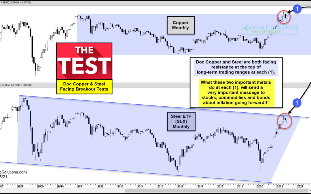
Just as the economic recovery is picking up steam, there are mixed messages coming from inflation data as well as the equities (breadth) and bonds markets (yields). Enter the commodities market… here we can find several key economic inputs that are elevated, and some...
by Chris Kimble | Feb 26, 2018 | Kimble Charting
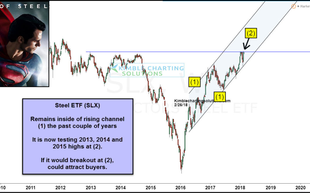
CLICK ON CHART TO ENLARGE The chart above looks at Steel ETF (SLX) over the past 8-years. SLX has done very well the past couple of years inside of rising channel (1). The rally now has it testing 2012, 2013 & 2014 highs, that so far has been strong as steel! If...

by Chris Kimble | Jan 31, 2018 | Kimble Charting
The 6-pack below updates chart patterns from the Gold and Steel sector that we share often on this blog. It is shared weekly with our Metals and Premium Members. The 6-pack below looks at Gold, Gold Miners (GDX & GDXJ), GDXJ/GDX ratio, Gold/US$ ratio and Steel ETF...

by Chris Kimble | Nov 2, 2017 | Kimble Charting
The 6-pack below looks at several charts in the metals sector (Gold, Gold Miners, and Steel). Each looks to be facing something similar at the same time. CLICK ON CHART TO ENLARGE Each asset or ratio above has something similar in play in the short and long-term. In...
by Chris Kimble | Oct 18, 2017 | Kimble Charting
In the past few week’s we’ve highlighted some assets and indicators that point to a stable/improving economy: Copper prices, firmer interest rates, etc. Time to add one more to the list: rising steel prices. Today we’ll look at a chart of the VanEck Vectors Steel...
