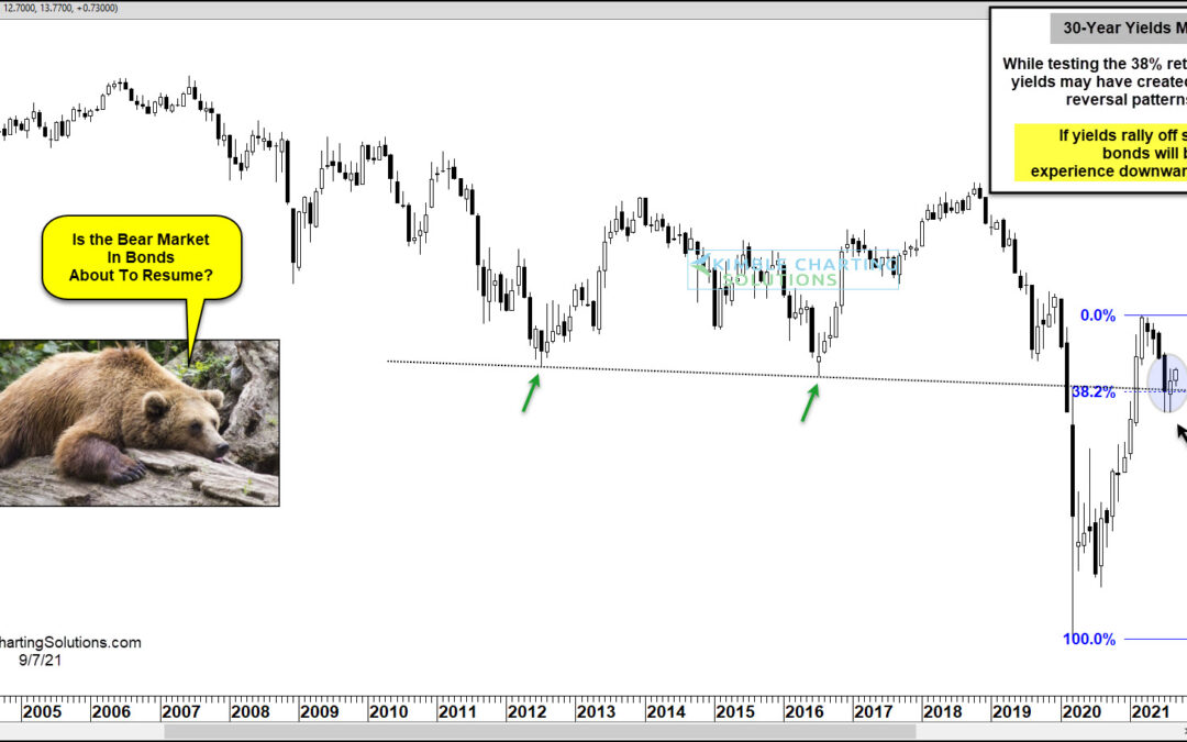
by Chris Kimble | Sep 8, 2021 | Kimble Charting
US Treasury bonds experienced a bear market and added selling pressure following the coronavirus flash crash as bond yields bottomed in early 2020 and took flight. The move higher in yields peaked early this year, taking some pressure off bonds. But if yields should...
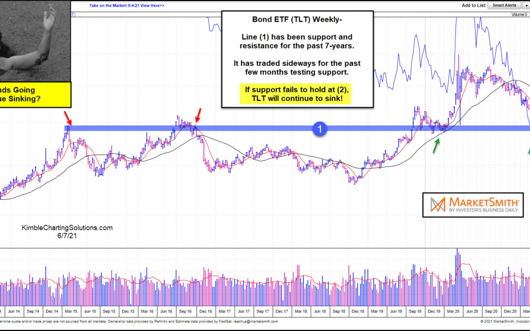
by Chris Kimble | Jun 8, 2021 | Kimble Charting
US government bonds have come under pressure over the past year. And that decline has come to an important inflection point. Time to bounce higher? Or will government bonds continue to sink lower? That is the theme of today’s “weekly” chart from Marketsmith.com, of...
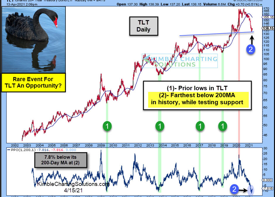
by Chris Kimble | Apr 15, 2021 | Kimble Charting
Long-dated treasury bonds have been crushed over the past year, sending ETFs like TLT (20+ Year US Treasury Bond ETF) spiraling over 20%. Improving economy? Inflation concerns? Perhaps a combination of both… interest rates have risen sharply and thus bond prices have...
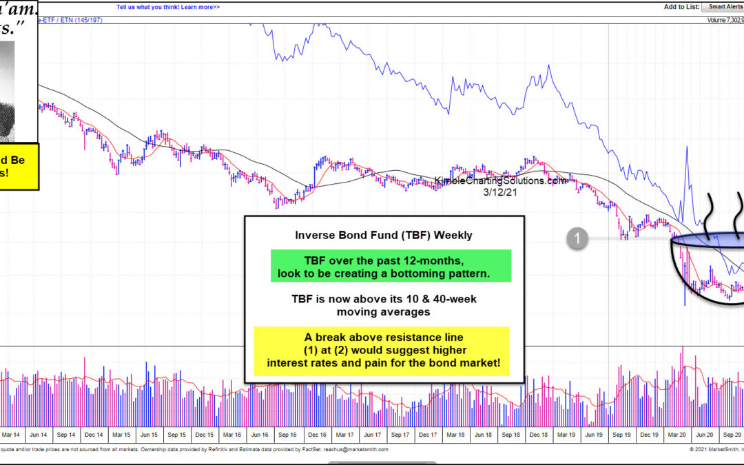
by Chris Kimble | Mar 12, 2021 | Kimble Charting
The bond market has had a bad 12-months, as interest rates bottomed in March of 2020. Popular Government Bond ETF (TLT) has lost more than 15% in the past year! Are bonds about to receive more bad news? Sure could!!! This chart from Marketsmith looks at the Inverse...
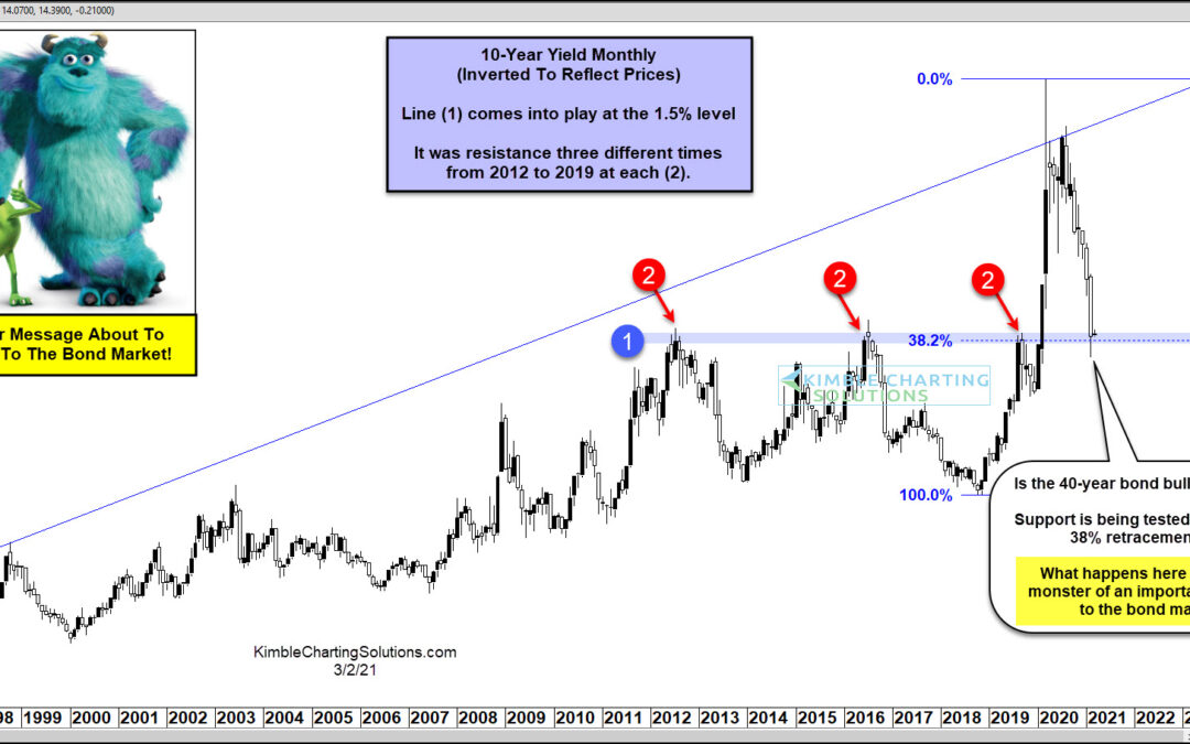
by Chris Kimble | Mar 3, 2021 | Kimble Charting
The bull market in bond prices has steady, durable, and trustworthy. Over the past 40 years, if investors could count on anything, it was rising bonds and falling bond yields (interest rates). But this trend / dynamic may be changing… The post pandemic spike lower in...
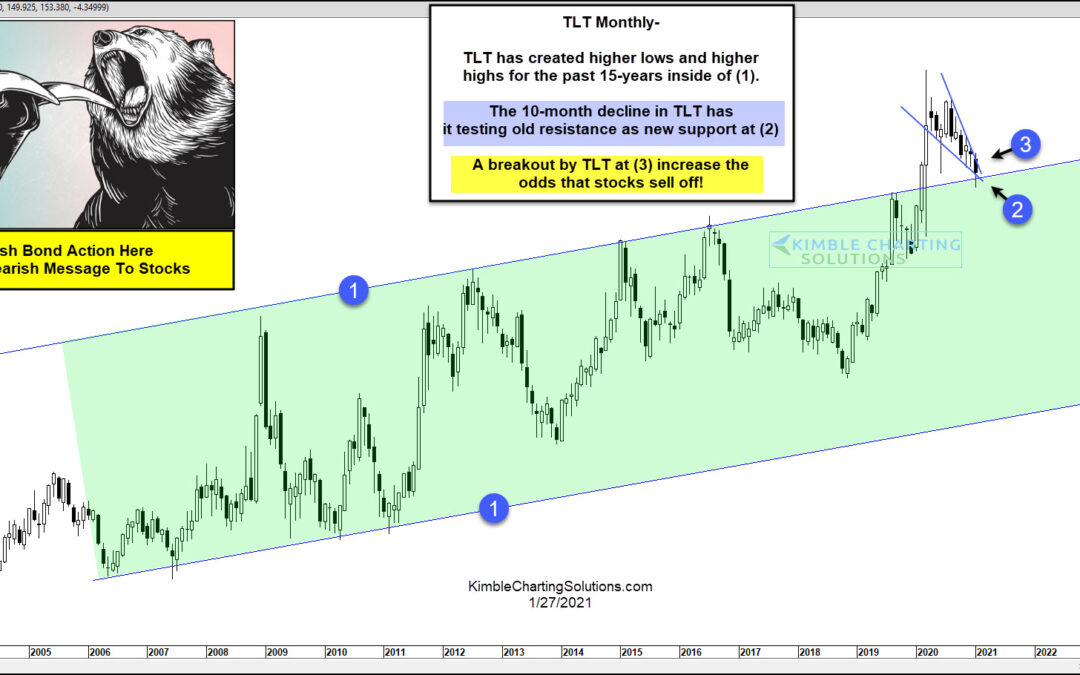
by Chris Kimble | Jan 27, 2021 | Kimble Charting
Bonds have experienced a large percentage decline since the highs of last March. Have bonds fallen enough? If they rally, could they be sending a bearish message to stocks? This chart looks at Govt Bond ETF (TLT) over the past 20-years. TLT has created a series of...
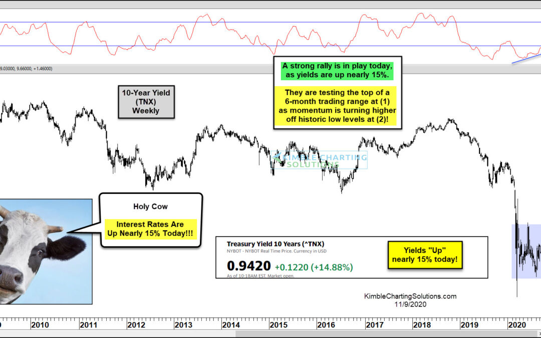
by Chris Kimble | Nov 9, 2020 | Kimble Charting
Holy Cow a big move in interest rates is taking place this morning! Does this mean an important breakout/higher interest rates are about to happen? Could be! This chart looks at the 10-year yield on a weekly basis over the past 12-years. For sure the long-term trend...

by Chris Kimble | Nov 3, 2020 | Kimble Charting
The S&P 500 and the Nasdaq don’t have much to brag about the past 90-days, as their performance has been near flat. It also hasn’t paid a great deal to be long bonds, as popular bond ETF (TLT) has declined over 6%. What asset has it paid to own over...
