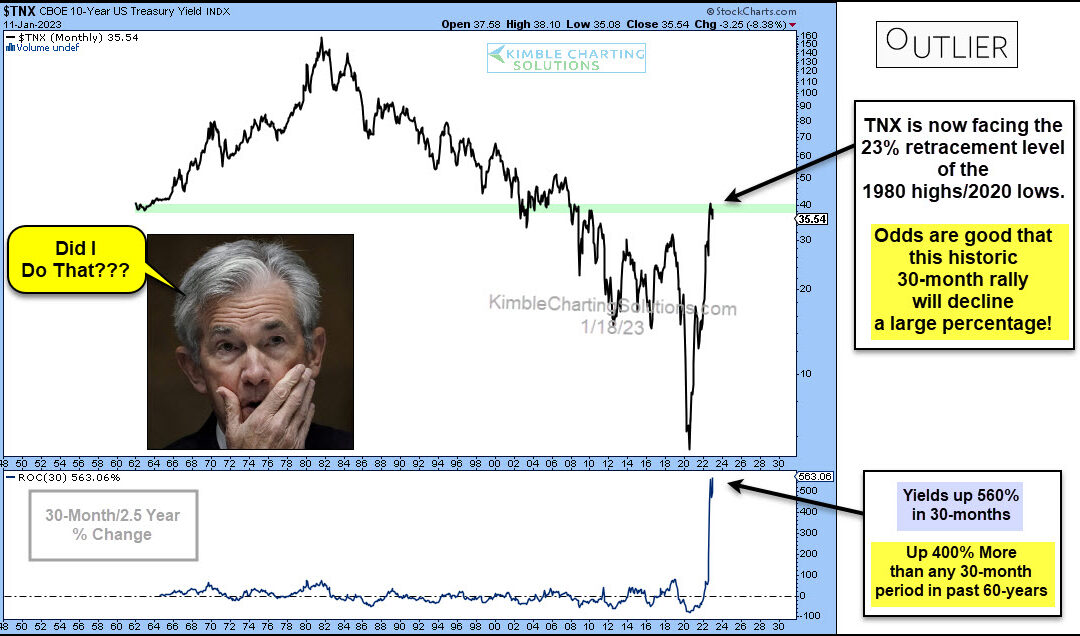
by Chris Kimble | Jan 19, 2023 | Kimble Charting
Interest rates have risen rather quickly as the Federal Reserve attempts to fight inflation. Will the move be a case of too far, too fast? Today’s long-term “monthly” chart of the 10-year US treasury bond yield seems to think so. In my humble opinion, the chart below...
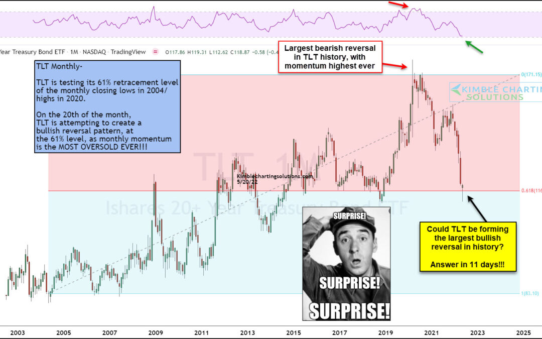
by Chris Kimble | May 24, 2022 | Kimble Charting
It’s been an ugly couple of year for US Treasury Bonds. T-bond prices have dropped sharply as yields have risen. This has been an added pressure on retirement portfolios as treasury bonds are no longer trading like a conservative asset. Time for a bounce in T-bonds?...
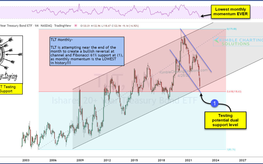
by Chris Kimble | Apr 26, 2022 | Kimble Charting
The past two years have seen the treasury bond market turn upside down. In short (pun intended), treasury bonds have been hit hard by selling. Note that we highlighted an important test of resistance for treasury bond yields last week. Today, we look at a long-term...
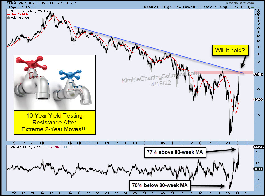
by Chris Kimble | Apr 20, 2022 | Kimble Charting
It’s been a crazy past couple of years for the 10-year US treasury bond yields and interest rates. The crazy extremes have seen rates fall to near zero and his back up near 3 percent. We can see this in today’s long-term chart of the 10-Year US treasury bond yield. As...
by Chris Kimble | Apr 13, 2022 | Kimble Charting
Over the past two years, we have seen inflation soar. And with that has coming rising interest rates. This week’s CPI and PPI data have only confirmed consumers fears. But how much of the latest inflation data is baked into current interest rates? Today we take a look...
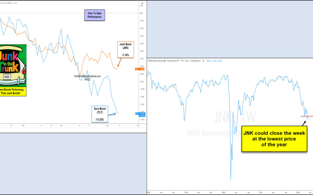
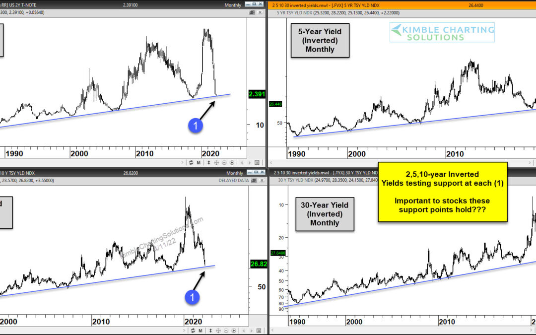
by Chris Kimble | Apr 11, 2022 | Kimble Charting
It’s been a crazy last couple of years. And that is probably an understatement. And 2022 is off to a similar start with supply disruptions, surging inflation, and war overseas. Needless to say, stocks are trading lower this year. And, no surprise, junk bonds are...
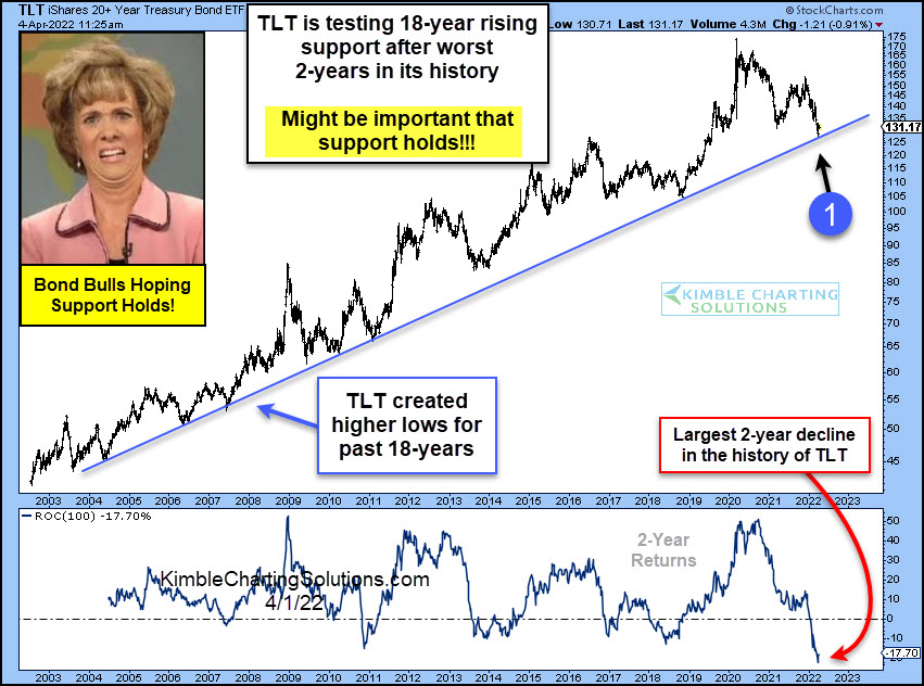
by Chris Kimble | Apr 5, 2022 | Kimble Charting
Treasury bonds have left a bad taste in investors’ mouths for the past couple of years. And this collective “UGH!” comes after years of solid returns. Will the bull market continue? Or is this the beginning of the end? Today’s chart takes a look at the 20+ Year...
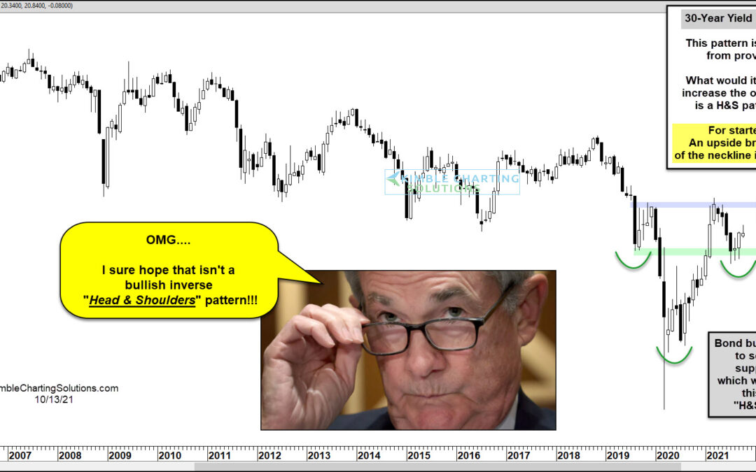
by Chris Kimble | Oct 13, 2021 | Kimble Charting
As you might imagine, US Treasury Bond Yields (and interest rates) crashed following the news of the coronavirus in 2020. But it didn’t take long for them to make a sharp U-turn and head higher. This seems to fit with the major concern of the day: inflation. Which...
