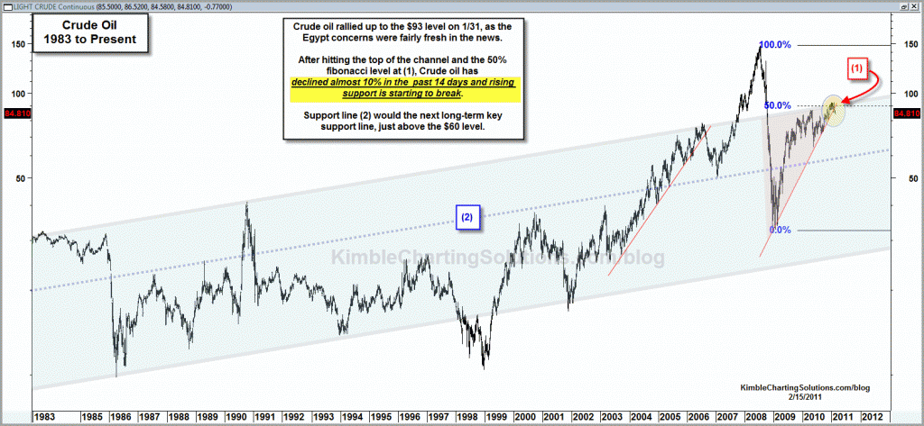
by Chris Kimble | Feb 15, 2011 | Kimble Charting
CLICK ON CHART TO ENLARGE Rising channel resistance dating back to the early 1980’s and fibonacci resistance both came into play at (1), about the time the news from Egypt took center stage. Crude oil has decline almost 10% in the past 14...

by Chris Kimble | Feb 8, 2011 | Kimble Charting
CLICK ON CHART TO ENLARGE Crude bounced off support prior to the news regarding Egypt. After hitting resistance Crude has declined $6 from the highs, in excess of 5%, despite the news from the Mid-east. Game Plan…Am picking up Crude on support...

by Chris Kimble | Feb 6, 2011 | Kimble Charting
One of my many pleasures doing the blog is the relationships I have established around the globe. I am honored and humbled when a viewer says “if your ever in my town, lets get together.” A group of investors in Naples, Florida has ask me to come down and...

by Chris Kimble | Jan 26, 2011 | Kimble Charting
Golds small decline of late has prompted many to request a longer-term chart on Gold….Per popular request, here you go. CLICK ON CHART TO ENLARGE I started sharing on 1/4 (when Gold stood at $1,422, now at $1,332 per ounce) that the entire...

by Chris Kimble | Jan 24, 2011 | Kimble Charting
On 12/29 (in the chart below) the Power of the Pattern suggested that a “right shoulder” could be forming in Gas prices and that $2.50 was a key level for gas to not break above. If gas were to break above $2.50 prices could get rather...
by Chris Kimble | Jan 7, 2011 | Kimble Charting
CLICK TO ENLARGE Monday afternoon I shared in the chart above, that Silver has reached a percentage gain that often saw it run out of gas (see post here) The following day gold lost over $40 per ounce and Silver gave back almost 5% in a...

by Chris Kimble | Jan 5, 2011 | Kimble Charting
Last week I shared that a long-term “Head & Shoulders” pattern could be forming in Gasoline charts below (see post here) CLICK ON CHART TO ENLARGE Below is an update of Gasoline on a shorter term basis. CLICK ON CHART TO ENLARGE Hope is not a...

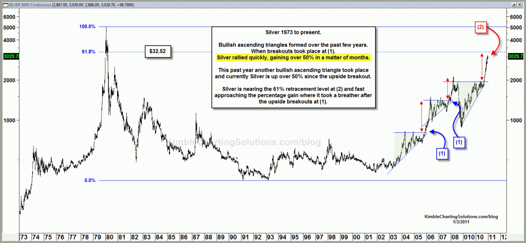
by Chris Kimble | Jan 3, 2011 | Kimble Charting
Back in August, I shared that a rather large “ascending triangle” had formed in Silver and that 65% of the time, this pattern suggested much higher prices were in store. See chart below per the pattern (see 8/18 post here) Silver was trading at...
