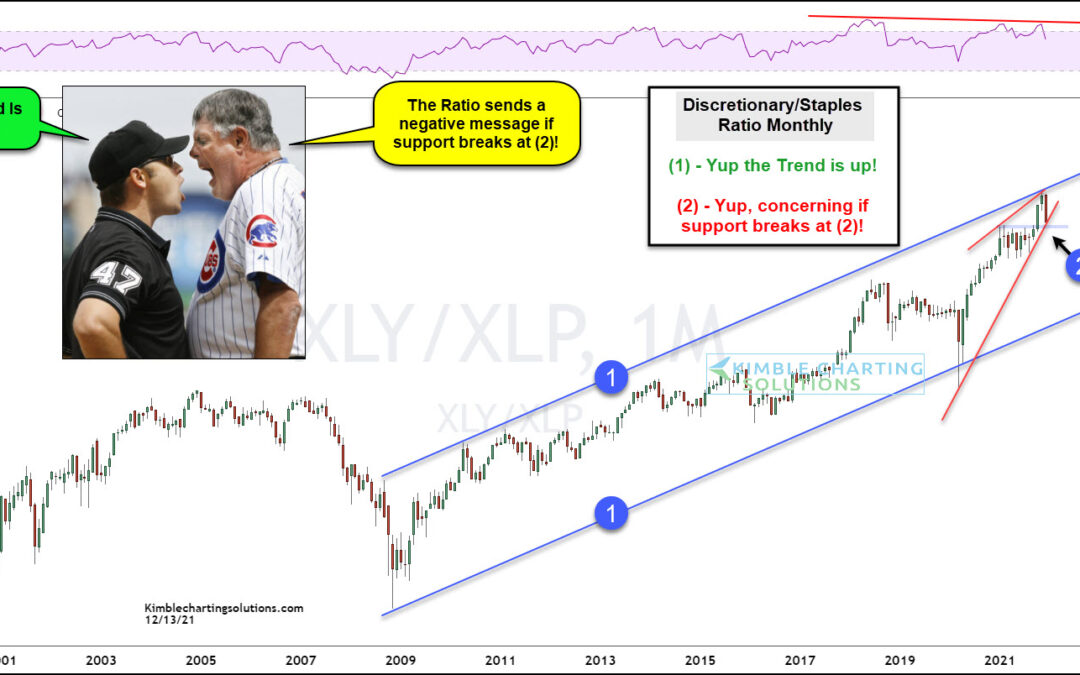
by Chris Kimble | Dec 14, 2021 | Kimble Charting
Consumer behavior can tell you a lot about the stock market. Sounds a bit funny, but it’s very true. And especially so when comparing buying of discretionary items versus buying of everyday staples items. In today’s chart, we look at the long-term performance ratio of...
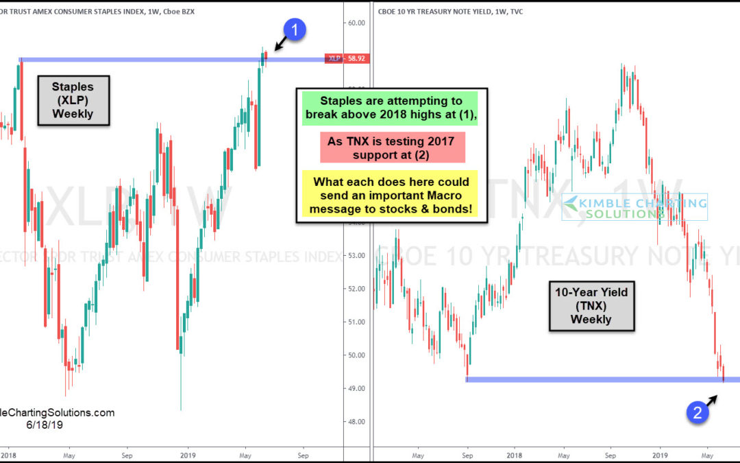
by Chris Kimble | Jun 18, 2019 | Kimble Charting
Could the Staples sector and the yield on the 10-year note be on the verge of sending an important message to the stock and bond markets? It sure looks that way. Staples ETF (XLP) is currently attempting to break above the January 2018 highs at (1). If it does, it...
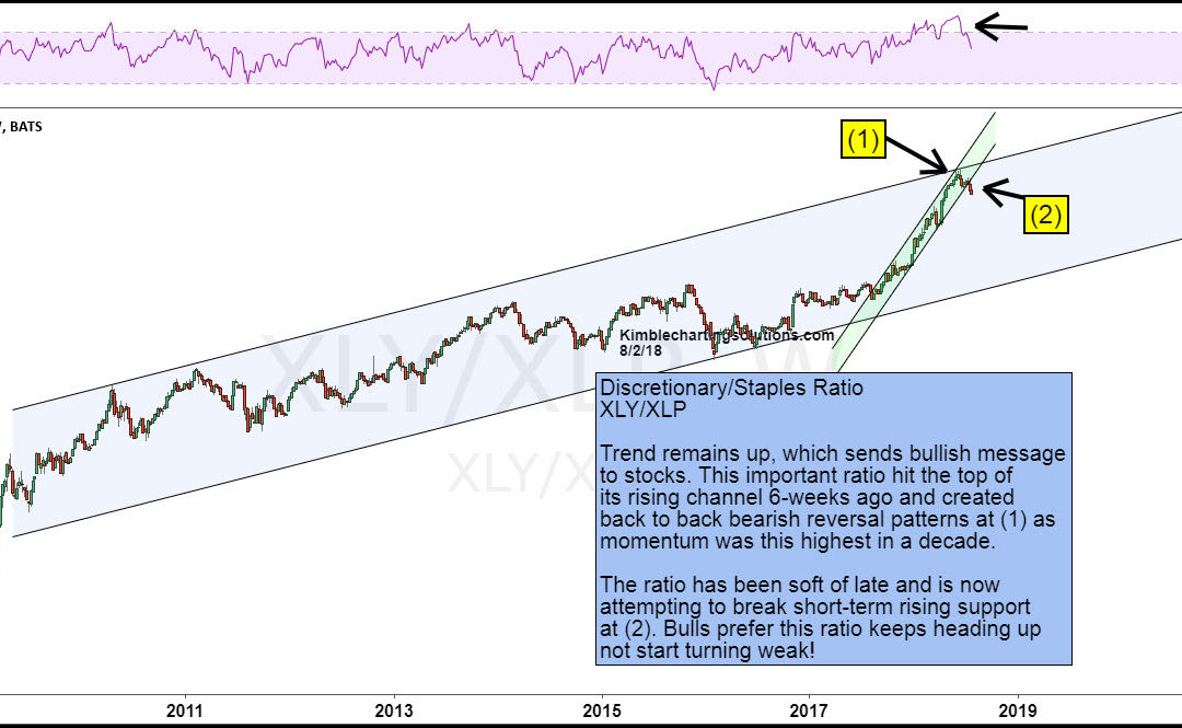
by Chris Kimble | Aug 6, 2018 | Kimble Charting
The consumer has always been a good gauge of the U.S. economy. Similarly, investors can gauge the health of the stock market by looking at consumer stocks. One way to gauge this is to look at the ratio of the Consumer Discretionary Sector ETF(NYSEARCA: XLY) to...
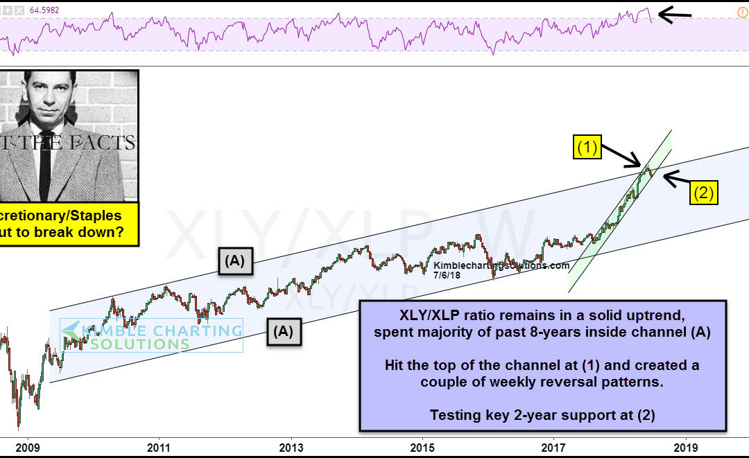
by Chris Kimble | Jul 6, 2018 | Kimble Charting
CLICK ON CHART TO ENLARGE The Discretionary/Staples ratio has been in a solid uptrend over the past 8-years, inside of rising channel (A), which sends a bullish message to the stock market. It has been especially strong in the past 2-years. These rallies now have the...
