by Chris Kimble | Apr 27, 2018 | Kimble Charting
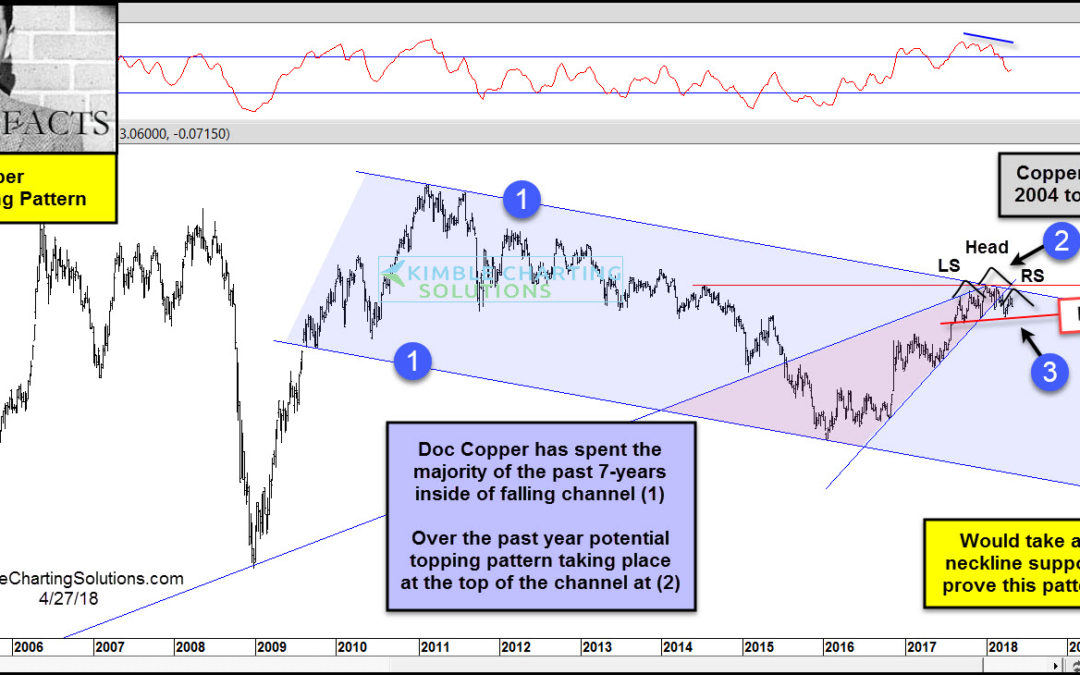
CLICK ON CHART TO ENLARGE The long-term trend of Doc Copper remains down, as it has created a series of lower highs and lower lows inside of falling channel (1) over the past 7-years. It hit the bottom of the channel in late 2015, where it found support and a rally...
by Chris Kimble | Feb 26, 2018 | Kimble Charting
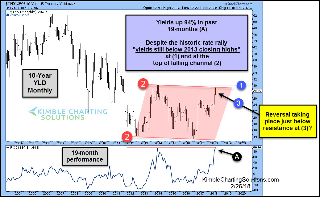
CLICK ON CHART TO ENLARGE The top part of the chart above looks at the 10-year yield on a monthly basis going back 14-years. The bottom section looks at the 19-month performance since 2004. Yields are up 94% in the past 19-months, which is the largest 19-month rally...

by Chris Kimble | Feb 17, 2018 | Kimble Charting
Is the bond bull market of the past 30-years over? Are we seeing just the start of a trend higher in interest rates or are they about to blast off? This isn’t the million dollar question, its the “Trillion Dollar” question as U.S. Government debt...

by Chris Kimble | May 3, 2017 | Kimble Charting
A good deal of talk going around the street since the election last year, has revolved around the “reflation theme!” Below looks at a couple of charts that could be suggesting that the reflation theme could be peaking. First we take a look at the price...
