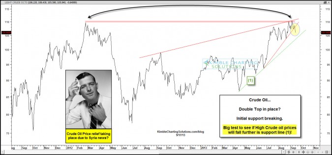
by Chris Kimble | Sep 17, 2013 | Kimble Charting
CLICK ON CHART TO ENLARGE Crude Oil might have created a double top in the chart above. At this time it is too soon to tell. A small rising support line is breaking of late. The odds of a double top would increase if Crude Oil happens to take out rising support line...

by Chris Kimble | Jul 17, 2013 | Kimble Charting
CLICK ON CHART TO ENLARGE The chart above reflects how a variety of assets performed over a 70- day period of time, ending July 10th. As you can see the top performing asset was the inverse bond ETF TBF, as interest rates rose sharply during this time frame. ...

by Chris Kimble | Jul 10, 2013 | Kimble Charting
CLICK ON CHART TO ENLARGE Whether you rent or own Real Estate, the direction of Real Estate values is very important to the health of the overall economy! Unless you liver under a rock, I’m not telling you anything new when I share that the weakness in Home...
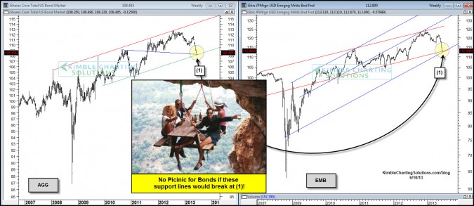
by Chris Kimble | Jun 10, 2013 | Kimble Charting
CLICK ON CHART TO ENLARGE Aggregate Bond ETF (AGG) and Emerging Markets Bond ETF (EMB) have declined rather sharply of late. The declines has taken each of them down to multi-year support lines at (1) in the charts above. This 2-pack reflects that interest rates...

by Chris Kimble | May 13, 2013 | Kimble Charting
CLICK ON CHART TO ENLARGE The all important 10-year yield has stayed within a well defined falling channel for the past year years. Since 2011 a possible bullish head & shoulders pattern in yields could be taking shape. The rally in yields since the summer...

by Chris Kimble | May 6, 2013 | Kimble Charting
CLICK ON CHART TO ENLARGE The TIP ETF was created to help bond owners with potential negative impacts of rising inflation/interest rates. The above chart reflects that TIP is working on a break of support, of a pennant pattern. Are TIP’s smelling economic...
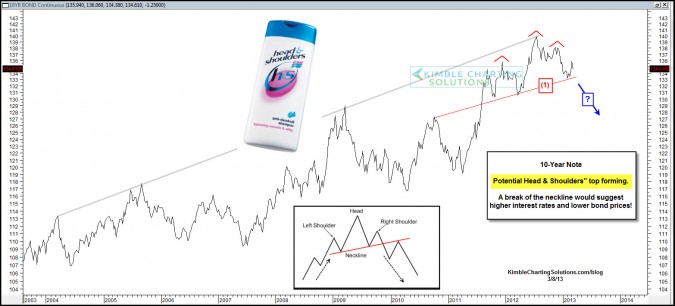
by Chris Kimble | Mar 9, 2013 | Kimble Charting
CLICK ON CHART TO ENLARGE The death of the bond bull has been discussed many times for the past few YEARS! The 10-year note is up against a 10-year resistance line and my be forming a topping pattern over the 15 months. Key to this pattern is how much selling...

by Chris Kimble | Jan 7, 2013 | Kimble Charting
CLICK ON CHART TO ENLARGE Many discuss the potential for much higher inflation, due to the action of the Central Bankers (excess printing of money). The MS Commodity Index (CRX) and the Yield on the 30-Year bond (TYX) are two indicators that are sensitive to inflation...
