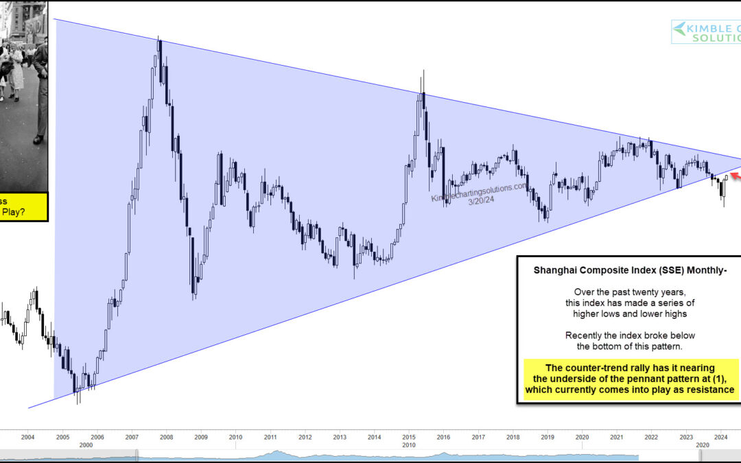
by Chris Kimble | Mar 22, 2024 | Kimble Charting
When the Chinese economy or stock markets are signaling an important turn or good/bad signal, the rest of the world needs to listen. Today, we look at a long-term chart of the important Chinese stock market index, the Shanghai Stock Exchange Composite (SSEC). Could...
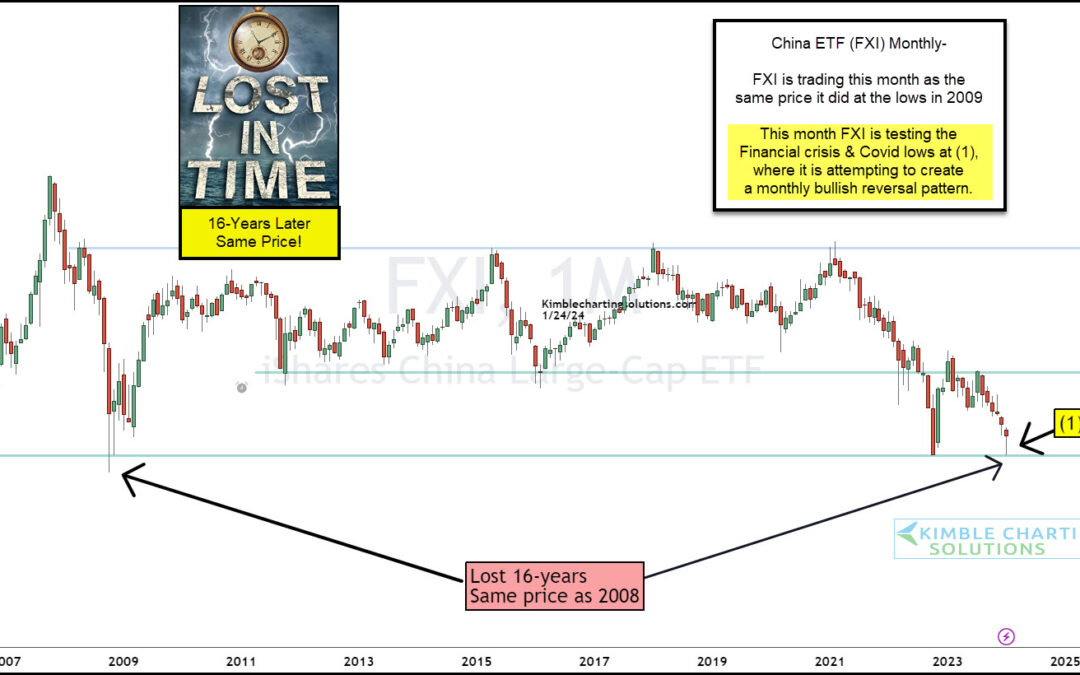
by Chris Kimble | Jan 25, 2024 | Kimble Charting
It’s been over 15 years since China’s equity market was in a long-term bullish position. Now, don’t get me wrong- there have been plenty of medium-term trends to trade and make money, but the long-term chart for the major China ETF (FXI) has traded sideways since the...
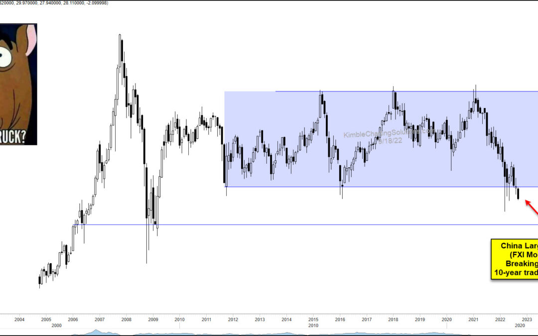
by Chris Kimble | Sep 20, 2022 | Kimble Charting
The global equities market has been in a tailspin this year. But could it get worse yet? Today we look at a very important piece of the global equities complex: China. Today’s “monthly” chart of the China large-cap ETF $FXI highlights the risk that China may be...
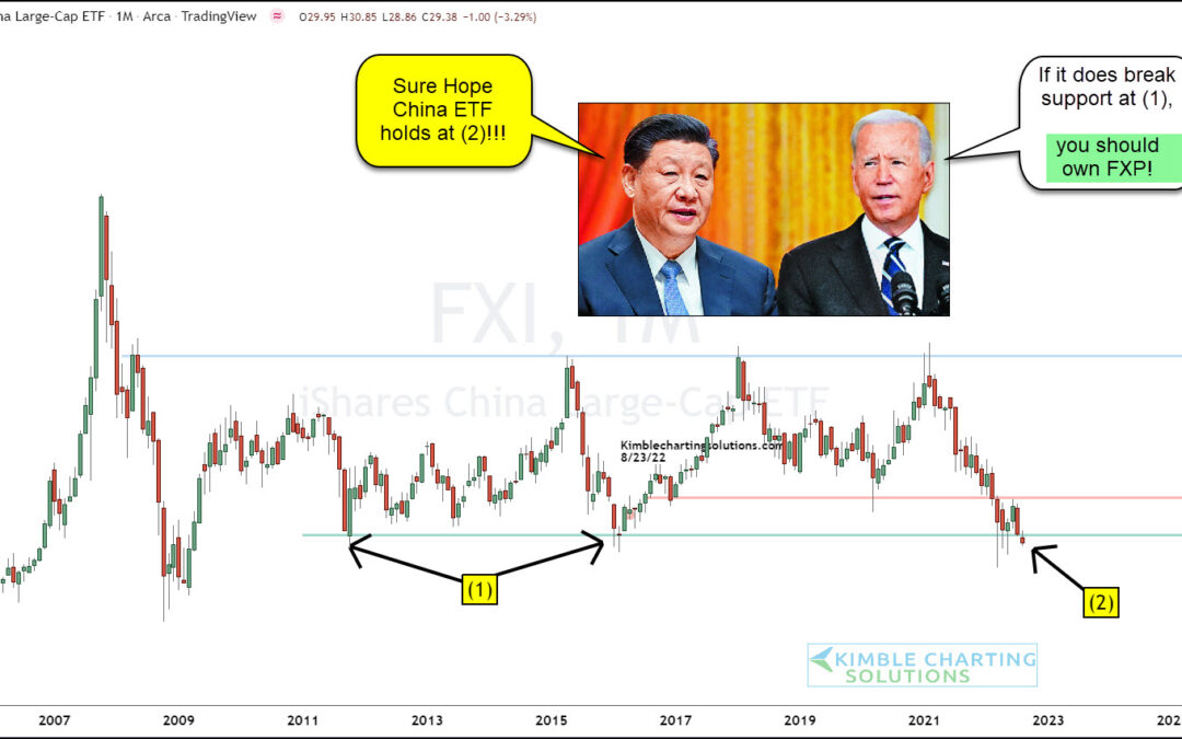
by Chris Kimble | Aug 25, 2022 | Kimble Charting
Next to the United States, one could argue that China is the world’s most important economy. It’s population and sheer size (and exports) make it a big deal to the investing community and global economy (and trade). So today we look at an important development on the...
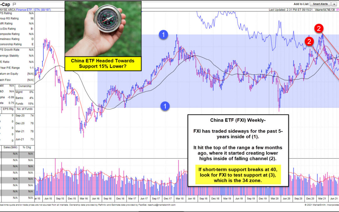
by Chris Kimble | Sep 17, 2021 | Kimble Charting
Chinese stocks have been in a funk this year, testing the patience of many investors in that equities space. The selloff took shape at the beginning of the year and has continued through this fall. Is there an end in site? Perhaps not quite yet… Today we look at a...
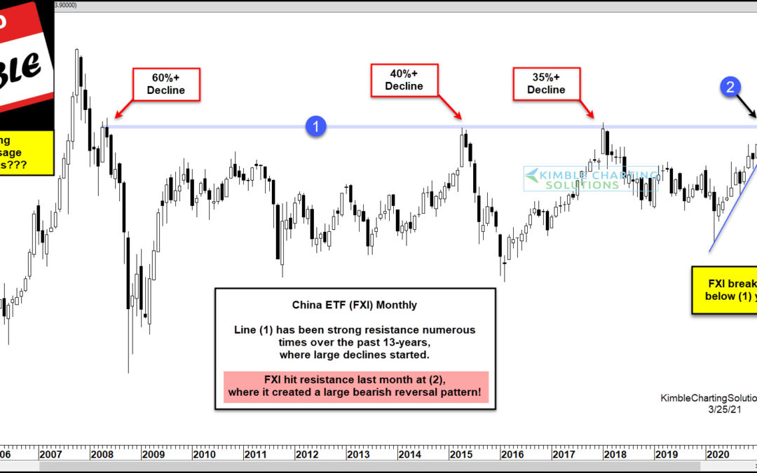
by Chris Kimble | Mar 25, 2021 | Kimble Charting
Is Big Trouble about to hit China? If history is a guide, the answer is yes. This chart looks at China ETF (FXI) on a monthly basis over the past 15-years. FXI has found line (1) to be resistance three different times in the past 13-years. At this resistance line, it...
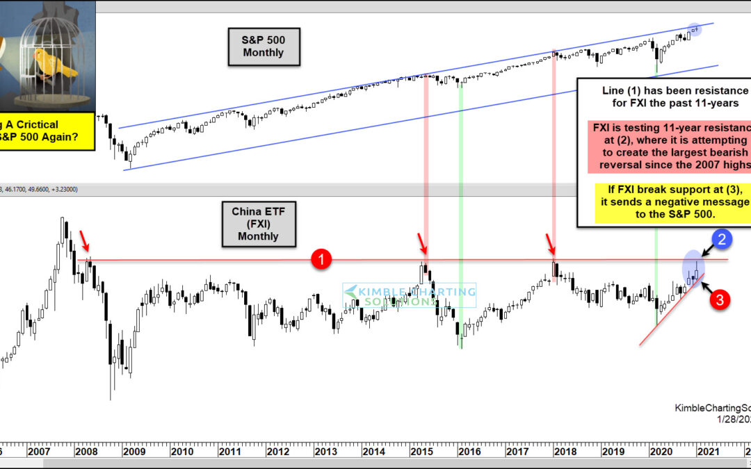
by Chris Kimble | Jan 29, 2021 | Kimble Charting
China has become critical factor in the global equity markets in the 21st century. Today we look at the ETF $FXI for China’s stock market and show how U.S. investors have received several timely bullish and bearish signals over the past decade-plus (when comparing FXI...
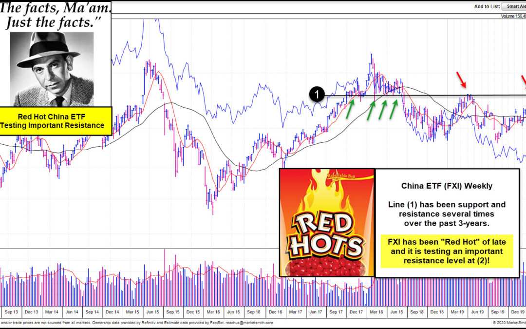
by Chris Kimble | Jul 10, 2020 | Kimble Charting
China ETF (FXI) has been “Red Hot” of late? Is it about to run out of steam or will it remain on fire going forward? This chart of FXI comes from Investors Business Daily and Marketsmith.com. It reflects that FXI is above key long-term moving averages and...
