by Chris Kimble | Jun 10, 2016 | Uncategorized
CLICK ON CHART TO ENLARGE Tech stocks peaked in 2000 and fell hard into 2002, losing around 90% of the index’s value. Since the 2002 lows, the NDX 100 has created a series of higher lows and higher highs. The rally since the 2002 lows, has the NDX back at...

by Chris Kimble | Jun 2, 2016 | Uncategorized
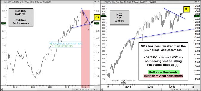
CLICK ON CHART TO ENLARGE From a Power of the Pattern perspective, Tech humbly appears to be facing the most important resistance test its faced in 2016. The left chart looks at the NDX/S&P ratio, which reflects that tech was much stronger from early to 2013 until...

by Chris Kimble | May 12, 2016 | Kimble Charting
Bio-Tech and Tech have been stock market leaders for years and years. Below looks what these leading sectors are doing of late. CLICK ON CHART TO ENLARGE Bio-Tech/SPX ratio (left chart above) broke below 5-year rising channel last year at (1). NDX/SPX ratio (right...

by Chris Kimble | Apr 30, 2016 | Kimble Charting
CLICK ON CHART TO ENLARGE This chart looks at the Nasdaq 100 index over the past 10-years. A potential “Head & Shoulders” (H&S) topping pattern could be in play, highlighted in red. Even if this is NOT an H&S topping pattern, the following...

by Chris Kimble | Feb 9, 2016 | Kimble Charting
CLICK ON CHART TO ENLARGE When assets reach prior highs, its time to pay attention from a Risk On & Risk Off basis. The chart on the left is Silver, going back to the mid 1970’s. As you can see it reached $50 in the early 1980’s and then quickly...

by Chris Kimble | Feb 8, 2016 | Kimble Charting
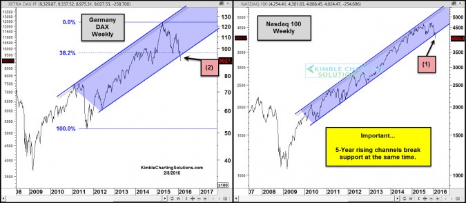
CLICK ON CHART TO ENLARGE Two leading indices, Nasdaq 100 and Germany (DAX), look to be doing something neither has done for the past 5-years. The Nasdaq 100 last week looks to have “closed below 5-year rising channel support” at (1) above. At the...

by Chris Kimble | Feb 5, 2016 | Kimble Charting
CLICK ON CHART TO ENLARGE S&P 500 tops in 2000 and 2007 took place 91 one months apart. Did another top take place 91 months after the 2007 top. So far it looks very possible. If you double that time frame, you get 182 months. What is the odds that the NDX 100...

by Chris Kimble | Feb 4, 2016 | Kimble Charting
CLICK ON CHART TO ENLARGE Tesla has had a great run higher over the past 5-years, as it has stayed within the rising channel above. Once it broke out of its sideways channel in 2013 near the $30 level, it blasted off, moving almost 10x higher! Over the past 2-years,...


