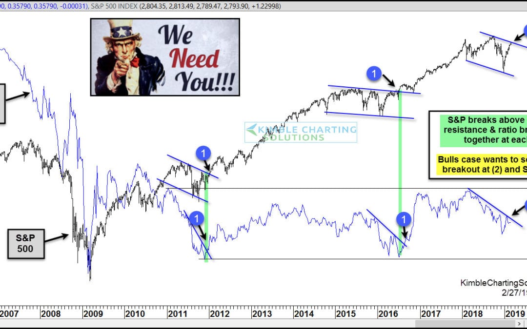
by Chris Kimble | Feb 27, 2019 | Kimble Charting
The ole saying “So Goes The Banks, So Goes Stocks” could be very accurate right now! This dual chart looks at the S&P 500 and the S&P/Bank Ratio on a weekly basis over the past 13-years. In 2011 and 2016 the S&P 500 and the ratio both faced...
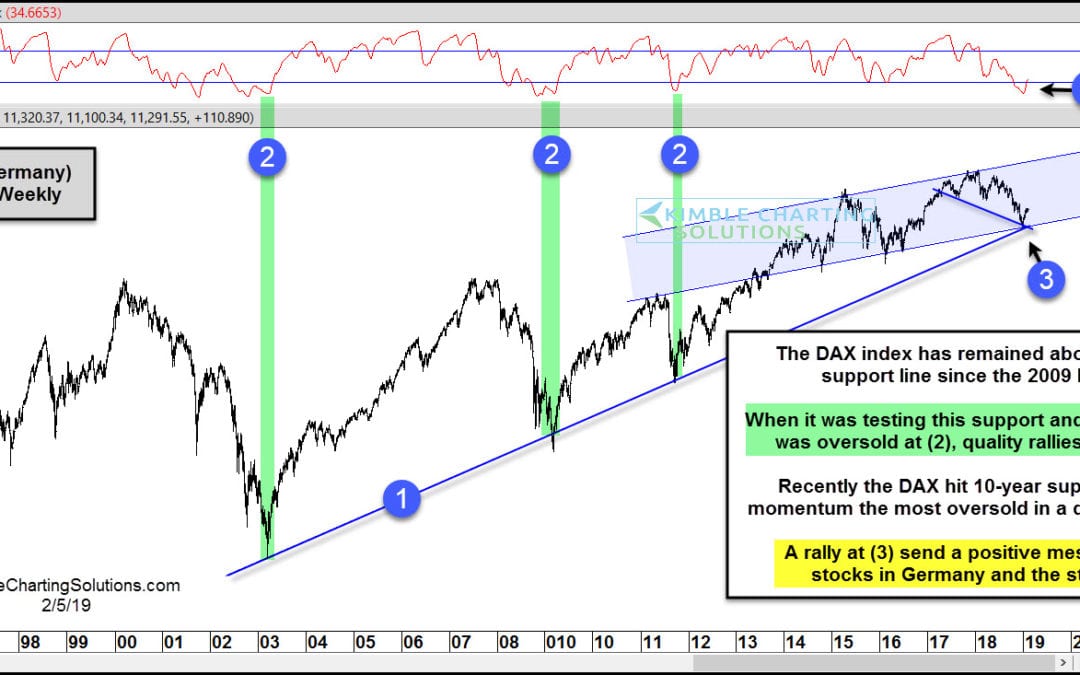
by Chris Kimble | Feb 5, 2019 | Kimble Charting
Is it as easy as “So Goes Germany, So Goes Stocks In The States?” Well, I wouldn’t go that far. Often times over the past 15-years, how the DAX index performs seems to send an important message to stock in the states. This chart looks at the DAX...
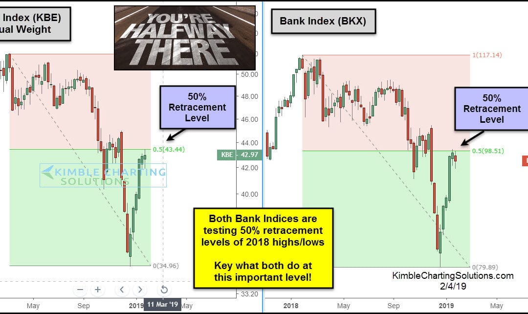
by Chris Kimble | Feb 4, 2019 | Kimble Charting
The Banking sector often sends a very important message to the broad market. Banks are at a price point where they could send a very important message to the overall market. This 2-pack looks at the Banking Index (BKX) and the Equal Weight Bank Index (KBE) over the...
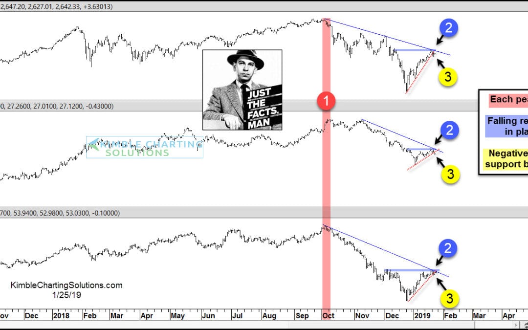
by Chris Kimble | Jan 25, 2019 | Kimble Charting
Stocks, Yields and Crude Oil have experienced a high degree of correlation since the October highs and each looks to be experiencing a key price test at the same time! The S&P 500, 10-year yields and Crude Oil hit highs at nearly the same time in early October at...
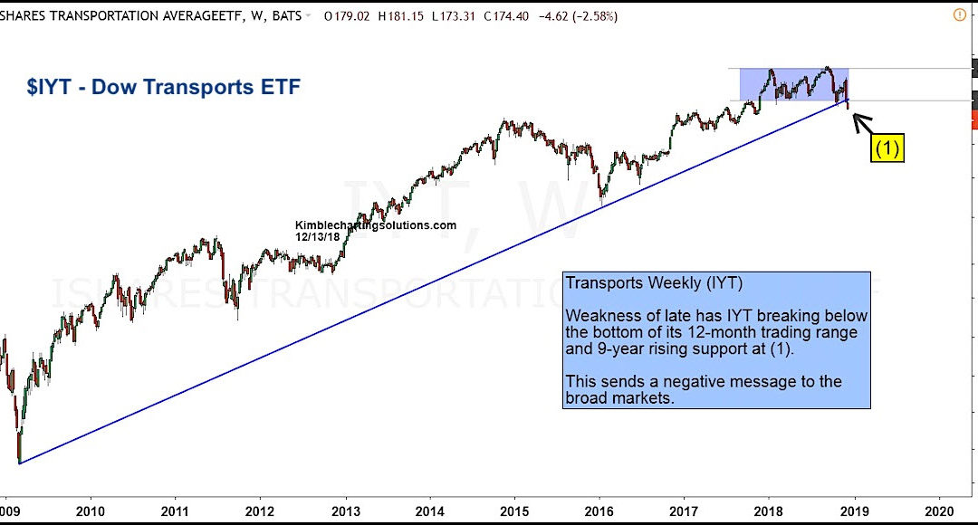
by Chris Kimble | Dec 15, 2018 | Kimble Charting
The bull market is experiencing its first real test since the 2014/2015 stock market correction. Volatility is high and key sectors are heading lower. One such sector is the Transportation Sector(NYSEARCA: IYT) and select stocks. The age-old Dow Theory call for the...
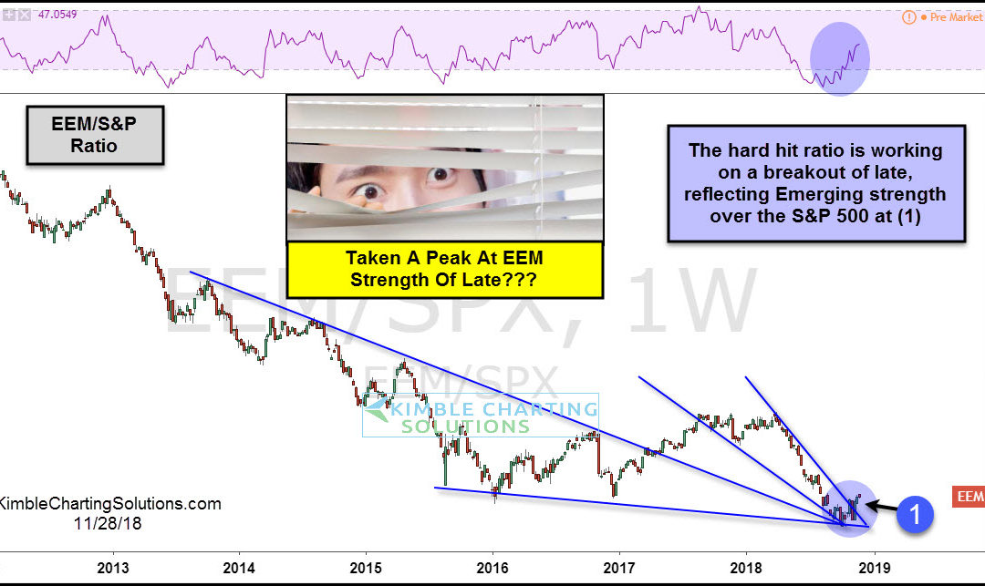
by Chris Kimble | Nov 28, 2018 | Kimble Charting
This chart looks at the Emerging Markets ETF (EEM)/S&P 500 ratio over the past 6-years. The decline in the ratio reflects EEM has been much weaker than the S&P 500 since 2012. A couple of months ago the ratio tested triple support as momentum was hitting the...
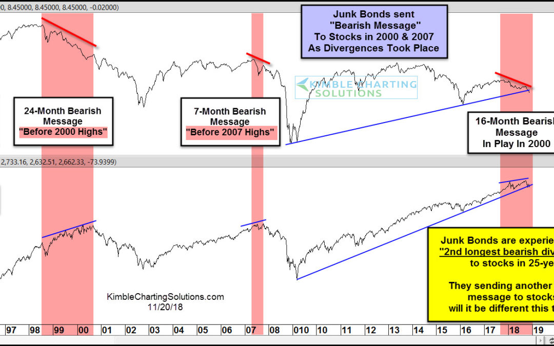
by Chris Kimble | Nov 20, 2018 | Kimble Charting
This chart looks at Junk Bond Fund (PHDAX) and the S&P 500 over the past 25-years. Junk bonds sent bearish messages “before stocks peaked in 2000 & 2007.” Bearish divergences took place for 24-months in 2000 and 7-months in 2007, prior to stocks...
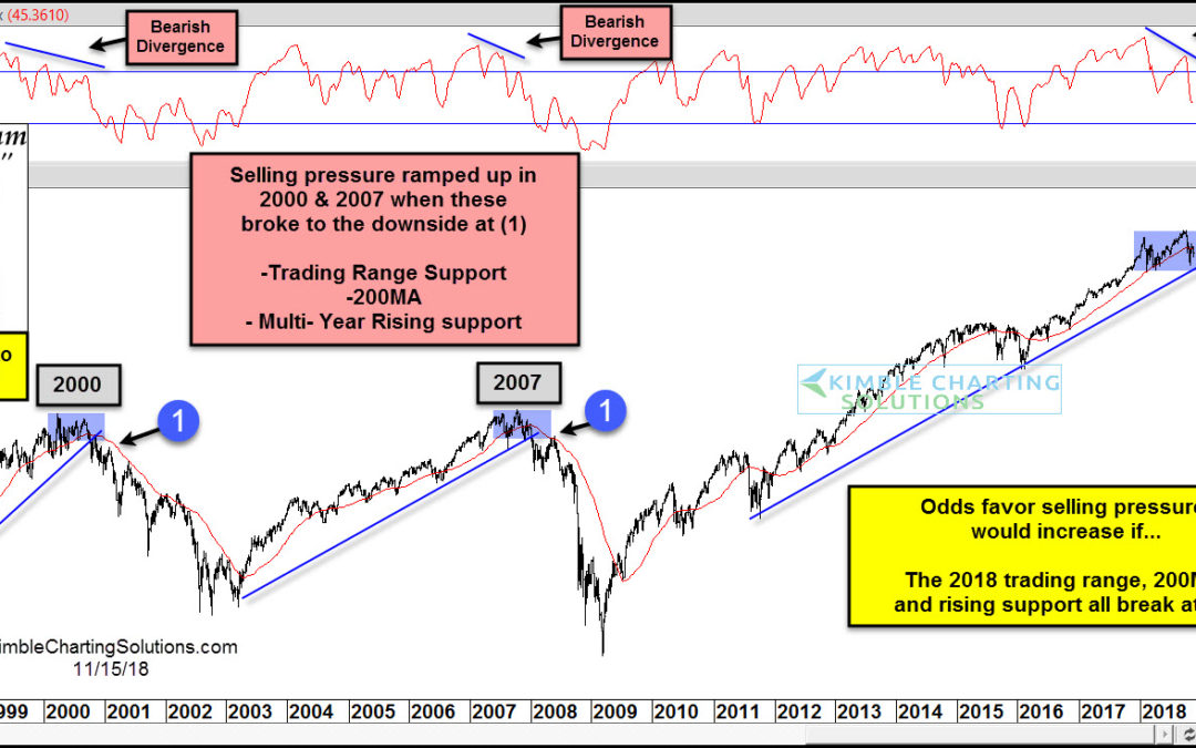
by Chris Kimble | Nov 16, 2018 | Kimble Charting
CLICK ON CHART TO ENLARGE Trouble started for the S&P 500 in 2000 when momentum diverged for months, it broke below multi-month trading range support, 200-day moving average, and multi-year rising support at (1). Trouble started for the S&P 500 in 2007 when...
