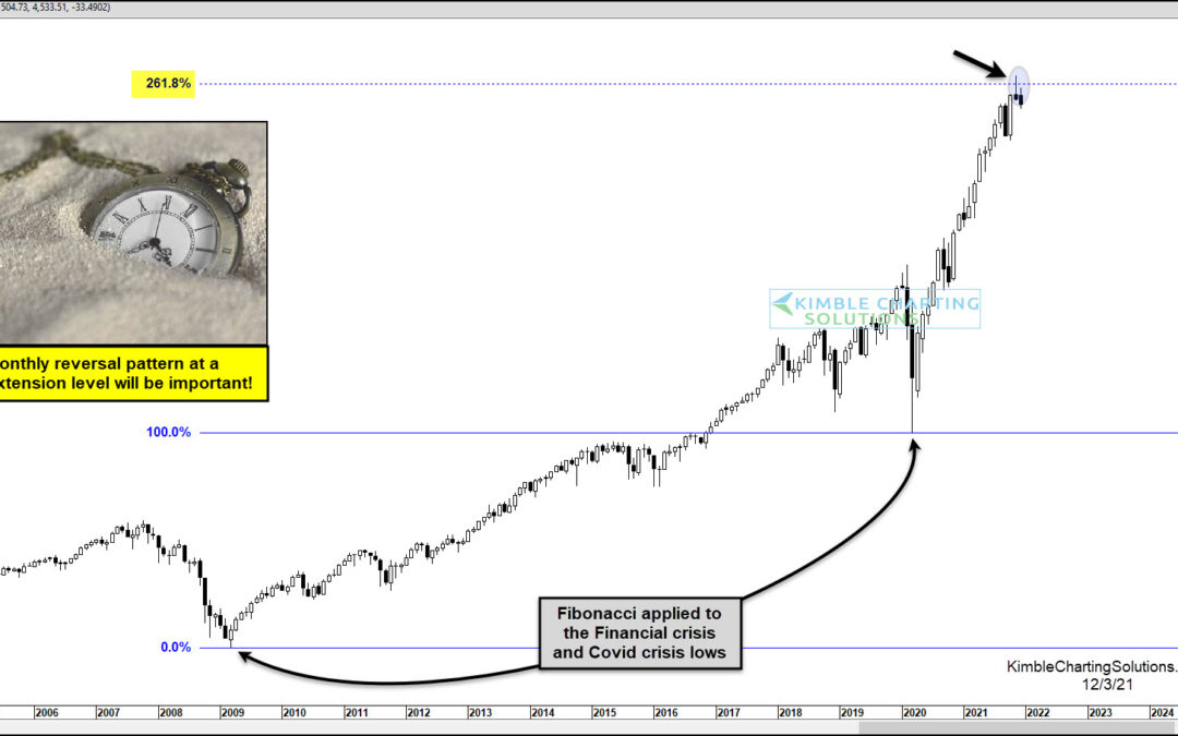
by Chris Kimble | Dec 4, 2021 | Kimble Charting
The month of November was an ugly one for stocks. Not because they closed lower but because of how they closed the month. Today’s chart looks at the S&P 500 Index on a “monthly” basis and, as you can see, stocks made new all-time highs last month. So in that...
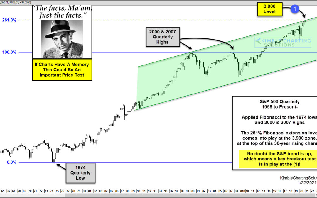
by Chris Kimble | Jan 22, 2021 | Kimble Charting
Do charts have memories? Can prices as far back as 45-years ago impact prices today? I understand if you answered both questions with a resounding no. In my humble opinion, an important test of these questions comes into play at current prices in the S&P 500 at...
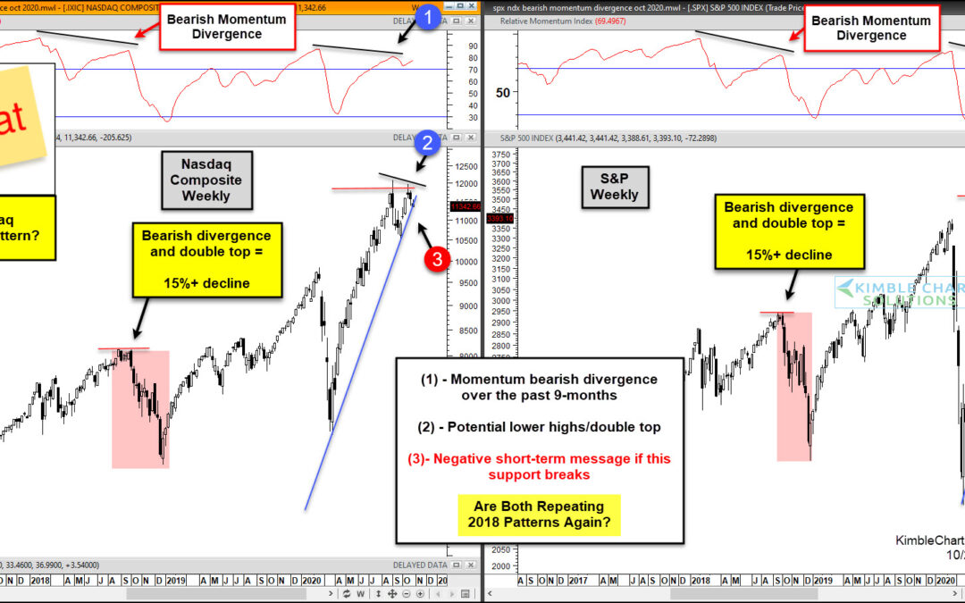
by Chris Kimble | Oct 28, 2020 | Kimble Charting
Stock market volatility has turned higher as the month of October has wore on. And now that we are just one week away from the elections, it appears that investors are showing their uncertainty through the price action on the major U.S. stock market indices. In...
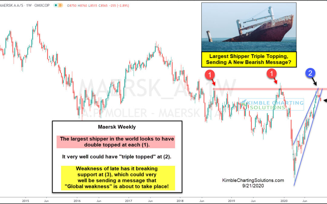
by Chris Kimble | Sep 21, 2020 | Kimble Charting
Is the largest shipping company on the planet sending a bearish message about the economy, which will impact stock prices? Sure could be! This chart looks at Maersk on a weekly basis. It looks to have double topped at each (1). When it peaked for the second time in...
by Chris Kimble | Jul 2, 2020 | Kimble Charting
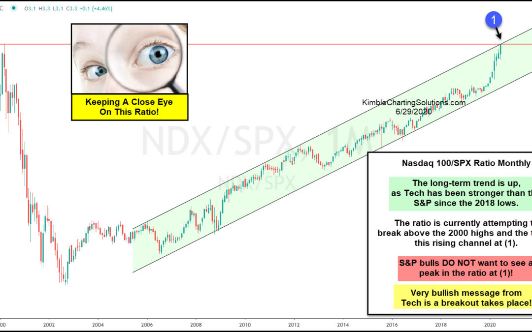
The tech bubble didn’t end well. BUT it did tell us that the world was shifting into the technology age… Since the Nasdaq 100 bottomed in 2002, the broader markets have turned over leadership to the technology sector. This can be seen in today’s chart, highlighting...
by Chris Kimble | Jun 10, 2020 | Kimble Charting
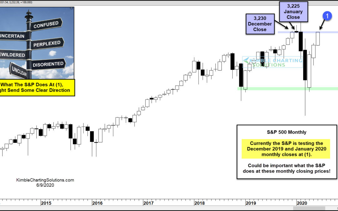
The stock market rally has taken the S&P 500 Index all the way back to an important price point on the “monthly” chart. And how the index closes during the summer months may provide further direction to investors, starting with June. As you can see in today’s...
by Chris Kimble | Jun 10, 2020 | Kimble Charting
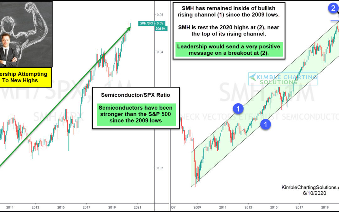
Strong leadership is attempting to break out to new all-time highs. If it is successful, it sends a positive message to the broad markets! The chart on the left compares Semiconductors (SMH) to the S&P 500 over the past 12-years. Since the 2009 lows, the ratio has...
by Chris Kimble | Jun 8, 2020 | Kimble Charting
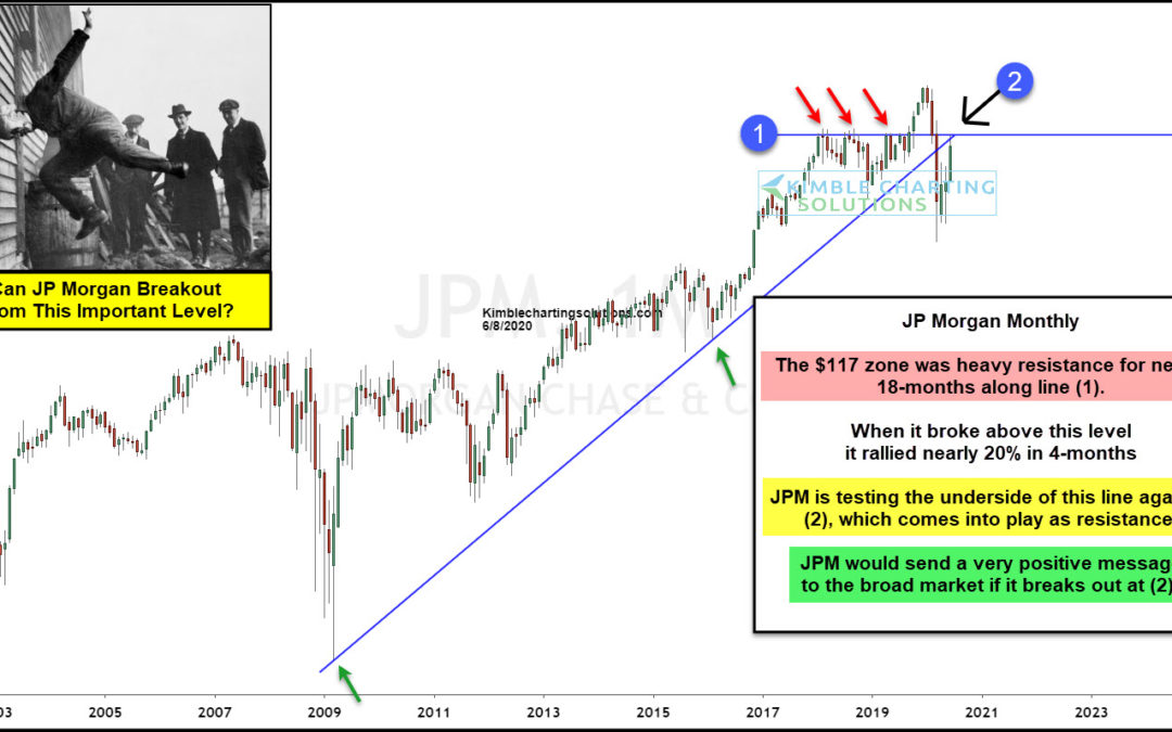
Is a major bank in the states about to send the broad market a bullish message? If it breaks out at (2), it will! JP Morgan struggled to break above resistance for nearly 18-months, as it keep kissing the underside of line (1). Once it succeeded in breaking out, it...
