
by Chris Kimble | Jun 15, 2017 | Kimble Charting
When it come to performance so far this year, would one be better off owning the S&P 500 or Long-Term Zero coupon bonds? Below compares the S&P 500 to Pimco’s Zero Coupon Bond ETF (ZROZ). So far this year, both have done well and pretty much have the...
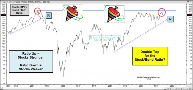
by Chris Kimble | Jul 8, 2015 | Kimble Charting
CLICK ON CHART TO ENLARGE This chart looks at the Stock/Bond ratio over the past 10-years. As you can see the ratio hit all-time highs back in 2007 and once it turned lower and broke support line (1), the trade was to overweight bonds and underweight stocks. In 2009...

by Chris Kimble | Feb 14, 2013 | Global Dashboard, Kimble Charting
CLICK ON CHART TO ENLARGE I shared this Stock/Bond ratio chart with Premium, Global Dashboard and Sector Extreme Members last week. This chart shouldn’t be used as a market timing tool, yet it is pretty good at helping investors know when to over or...
