
by Chris Kimble | Jan 30, 2012 | Kimble Charting
The chart below reflects the past 60 day returns of the broad market and some very hot sectors. CLICK ON CHART TO ENLARGE Some of these sector ETF’s have doubled to tripled the 500’s performance over the past 60 days. Below is a...

by Chris Kimble | Jan 26, 2012 | Kimble Charting
CLICK ON CHART TO ENLARGE The health/condition of the broad market can not be overlooked or overstated. In “Focusing” on the broadest measures of the stock market (NYSE/Wilshire 5000), the chart above reflects that they both remain inside of large...

by Chris Kimble | Dec 19, 2011 | Kimble Charting
On 7/27 the Wilshire looked to be completing a Right shoulder of a bearish head & shoulders pattern and the “Power of the Pattern” was suggesting an ugly pattern was at hand and investors should reduce risk right away! (see post here) In...
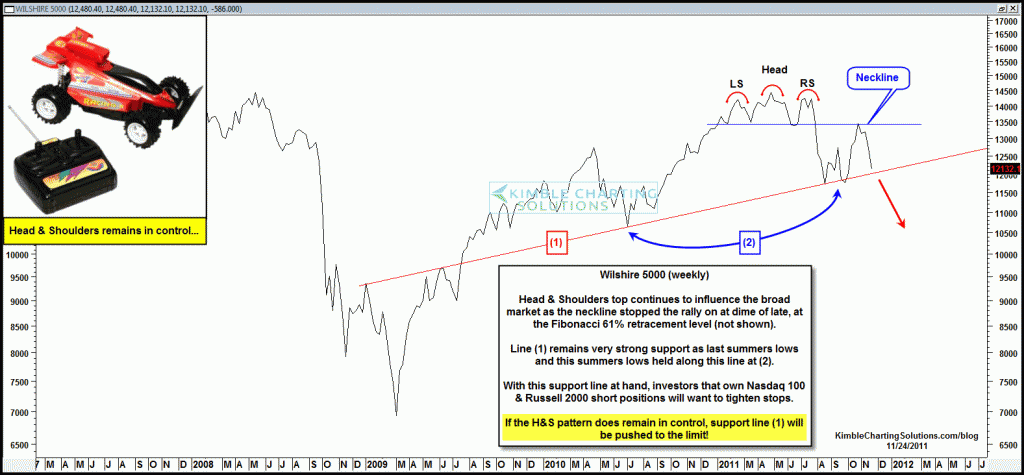
by Chris Kimble | Nov 24, 2011 | Kimble Charting
Prior to a historic decline in August, the Wilshire 5000 had created a very ugly “Head & Shoulders” topping pattern. The “Power of the Pattern” was suggesting at the time extreme caution for longs was here and for those willing to...
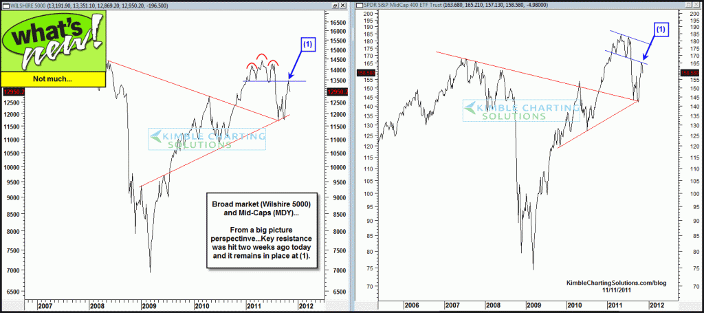
by Chris Kimble | Nov 11, 2011 | Kimble Charting
Shared pre-market Monday morning that the markets action would revolve around the news from Europe (see post here) See update to that post at the end of the week… CLICK ON CHART TO ENLARGE So whats new today compared to Monday morning? Not...

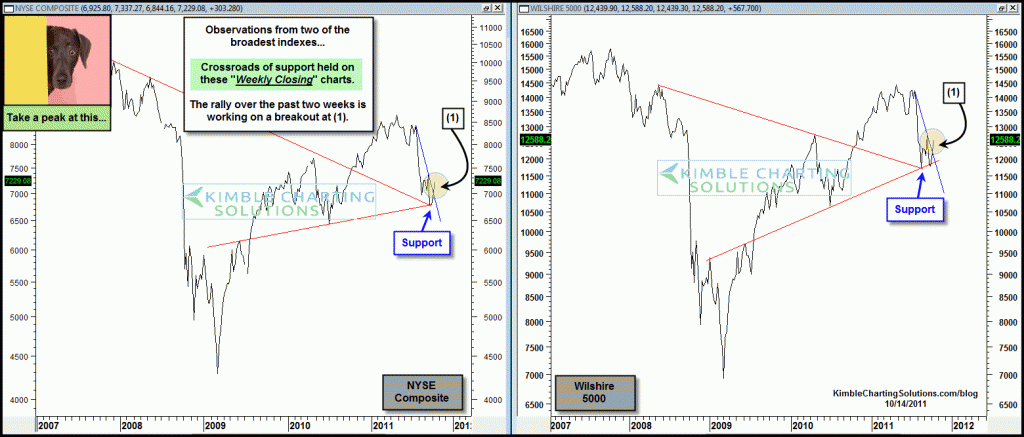
by Chris Kimble | Nov 7, 2011 | Kimble Charting
Last week, key broad markets declined a little over 2%. Many feel the price action is being driven from the news coming out of Europe and for sure its hard to argue with that belief. Since this is a Monday morning, I thought it might benefit us to take a...
by Chris Kimble | Nov 4, 2011 | Kimble Charting
On 10/14 I shared the chart below, reflecting that the broad market was breaking key short-term falling resistance lines, which was bullish. (see post here) CLICK ON CHART TO ENLARGE The charts below reflect that bull market upside leaders, Russell 2000 and...
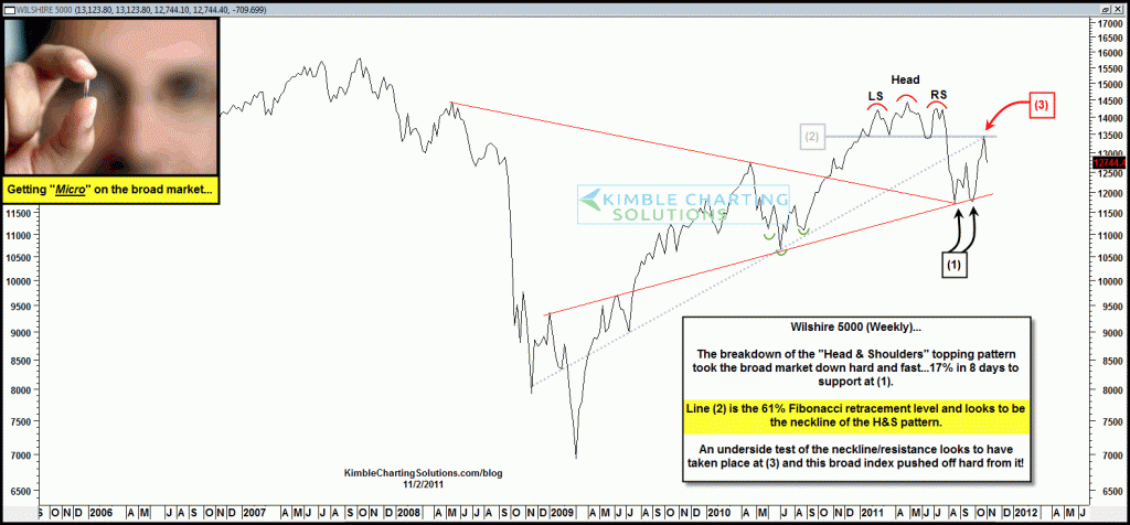
by Chris Kimble | Nov 2, 2011 | Kimble Charting
The Wilshire 5000 looked to have created a very bearish right shoulder at the end of July. (see post here) What followed? A 17% decline in 8 days! Then what? The Wilshire 5000 looked to have found support after this large decline and was...
