
by Chris Kimble | Dec 22, 2014 | Global Dashboard, Kimble Charting
CLICK ON CHART TO ENLARGE As the year is coming to an end and the Dow is near all-time high levels, I wanted to take a peak at two different long-term perspectives. One of them Fibonacci Extension levels and the other a long-term Mega phone pattern. If one...

by Chris Kimble | Mar 25, 2014 | Global Dashboard, Kimble Charting
CLICK ON CHART TO ENLARGE High Yield funds are considered by many to be good leading indicators for the future direction of the stock market. Above are four high yield funds (Not ETF’s) which reflect they are moving higher this year, all are above rising...

by Chris Kimble | Jan 8, 2014 | Global Dashboard, Kimble Charting
The Power of the Pattern suggested interest rates were about to blast off in May of last year (See post here) Since that post the yield on the 10-year note is up 80%! Below is the performance of interest sensitive assets & the S&P 500 since that...

by Chris Kimble | Oct 9, 2013 | Global Dashboard, Kimble Charting, Sector / Commodity
These triplets may not have been planned…. but our “Triple Play Advantage” was! What is the “Triple Play Advantage?” If you become a member of one of our weekly research reports, you can get two more weekly research reports at 50%...

by Chris Kimble | Jun 27, 2013 | Global Dashboard, Kimble Charting
We have created the “Triple Play Advantage” program for our viewers. What is the Triple Play Advantage? You can get the Power of the Pattern analysis applied to a variety of assets, sent to you once a week, with special reports sent based upon breaking...
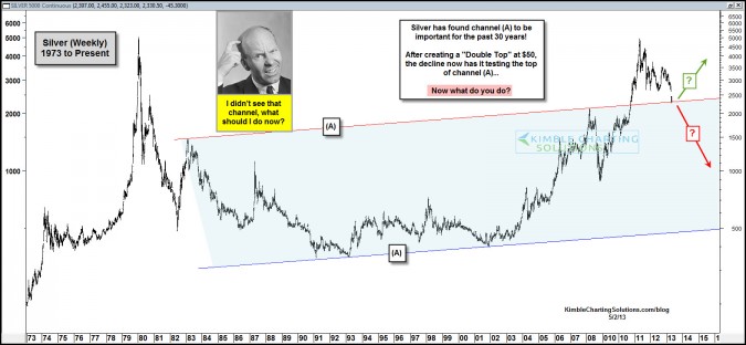
by Chris Kimble | May 2, 2013 | Global Dashboard, Kimble Charting
CLICK ON CHART TO ENLARGE For the majority of the past 30 years, Silver has traded inside of channel (A) in the above chart. Once Silver broke above channel (A) in 2010, it rallied over 100% in 6 months. After creating a double top at $50, Silver has lost 50% of its...

by Chris Kimble | Apr 29, 2013 | Global Dashboard, Kimble Charting
CLICK ON CHART TO ENLARGE The above chart was shared with Premium Members last week. The chart reflects a key line is at hand for Gold with bullish sentiment at one of the lowest readings in years. I am starting a “New Metals Research” report (see...

by Chris Kimble | Apr 24, 2013 | Global Dashboard, Kimble Charting
CLICK HERE TO ENLARGE The Power of the Pattern (POP) has been valuable to investors over the past few years, especially when it comes to the metals complex. See below for just a few examples of how the POP helped investors in Gold alone! Gold should rally...
