
by Chris Kimble | Feb 1, 2013 | Kimble Charting
Gomer pointed out that the long-term bond yield looked to be be making a “Bullish inverse Head & Shoulders” at a double bottom, 100 days ago, in the chart below. (see post here) The Power of the Pattern was reflecting these bullish situations...
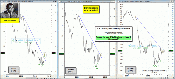
by Chris Kimble | Oct 26, 2012 | Kimble Charting
CLICK ON CHART TO ENLARGE Short to longer-term Yields look to have created “Bullish Inverse Head & Shoulders” patterns over the past few months. (this is bullish for yields and bearish for govt.bond prices) In the past couple of days the 5 &...
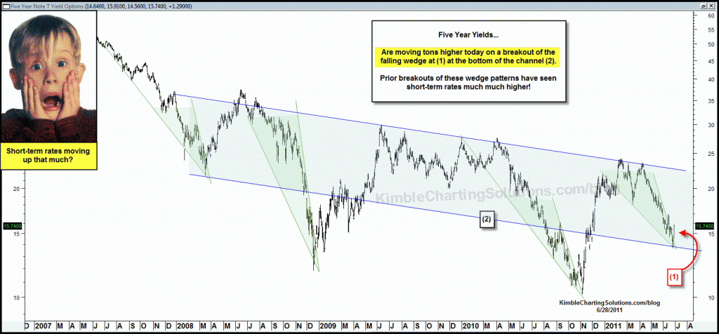
by Chris Kimble | Jun 29, 2011 | Kimble Charting
Shared the chart below yesterday, reflecting how the yield on the 5-year note had created several bullish falling wedges over the past 3 years. (see post here) CLICK ON CHART TO ENLARGE The chart below reflects that the yield on the 5-year note had...

by Chris Kimble | Jun 28, 2011 | Kimble Charting
Yesterday I shared that TLT remained stuck inside of a 2% range, yet the “Power of the Pattern” continued to suggested TLT would move lower.(see post here) Anyone notice how the 5-year yield is skyrocketing today? If you don’t believe they...
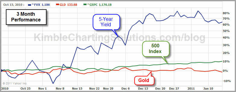
by Chris Kimble | Jan 15, 2011 | Kimble Charting
If stocks were up over 60% in the last 90 days, would you consider that they might be due a rest? Below is a 90-day comparision of the 500 index, gold and the yield on the 5-year note. CLICK ON CHART TO ENLARGE See below for a multi-year chart on the...
