
by Chris Kimble | Mar 21, 2015 | Kimble Charting
CLICK ON CHART TO ENLARGE Value/Growth ratio… spent about a year and of late has broken out. Discretionary/Staples ratio…pushing above a pennant patter, with support in place that started back in 2010 Russell/S&P ratio… hit support in October of...
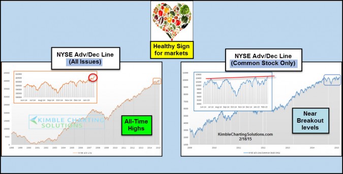
by Chris Kimble | Feb 18, 2015 | Global Dashboard, Kimble Charting
CLICK ON CHART TO ENLARGE The above charts are two different ways to look at the Advance/Decline line on the NYSE. The chart on the left is the typical version, which is “all issues” on the NYSE. This has been the most common way to look at the A/D line...

by Chris Kimble | Oct 27, 2014 | Kimble Charting
CLICK ON CHART TO ENLARGE When it comes to Advance/Decline line patterns and listening to its messages, I am a big fan of watching support lines and watching to see if the A/D line is diverging against the broad markets. As you can see in the right chart, the...

by Chris Kimble | Oct 29, 2013 | Kimble Charting
CLICK ON CHART TO ENLARGE Junk bond mutual funds and ETF’s started reflecting weakness back in May, about the time the S&P 500 was starting to struggle a little bit. The decline in the junk market saw each of these 6 funds/ETF’s highlighted above, to...

by Chris Kimble | Aug 23, 2013 | Kimble Charting
CLICK ON CHART TO ENLARGE Whether you own them or not, I believe it is important to keep one eye on the two broadest index’s, the NYSE Composite and Wilshire 5000. Let me make this clear…the trend on both remains up at this time! Both are facing multi-year...

by Chris Kimble | Jun 19, 2012 | Kimble Charting
CLICK ON CHART TO ENLARGE I shared a chart on the blog yesterday, that I had shared with Premium members 11 days ago, reflecting that bullish sentiment was rather low as the broad markets were on support. This combo was suggesting it was a bright idea to go long...
