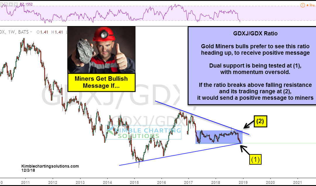
by Chris Kimble | Dec 3, 2018 | Kimble Charting
2018 has been rough on Gold Miners, as they’ve declined a large percentage. The decline has this key ratio testing dual support to start off the week. This chart looks at the GDXJ/GDX ratio (Junior Miners/Senior Miners) over the past 8-years. If you are bullish...

by Chris Kimble | Nov 15, 2018 | Kimble Charting
Gold, Silver, and the precious metals industry have a pretty simple relationship with the U.S. Dollar: They perform better when the Dollar is weakening… and they tend to struggle when the Dollar is strengthening. One of our favorite ratios to monitor for Gold Bugs is...
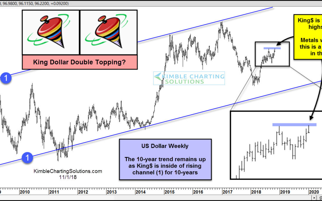
by Chris Kimble | Nov 1, 2018 | Kimble Charting
CLICK ON CHART TO ENLARGE This chart looks at the King Dollar over the past 10-years. It remains in a long-term uptrend, creating a series of higher lows and higher highs inside of rising channel (1). King$ has spent the majority of the past 3-year trading sideways...
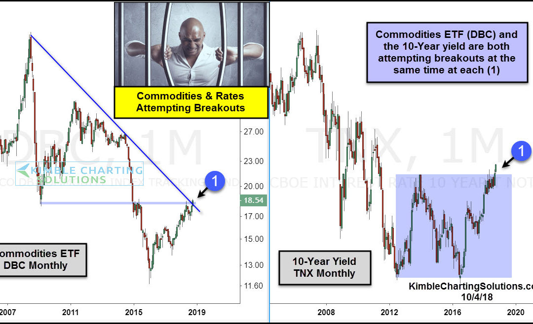
by Chris Kimble | Oct 4, 2018 | Kimble Charting
CLICK ON CHART TO ENLARGE When it comes to assets being in long-term bull markets, Commodities and interest rates do not come to mind, as each has endured long-term bear markets. Could these long-term trends be coming to an end? Possible The 2-pack above looks at...
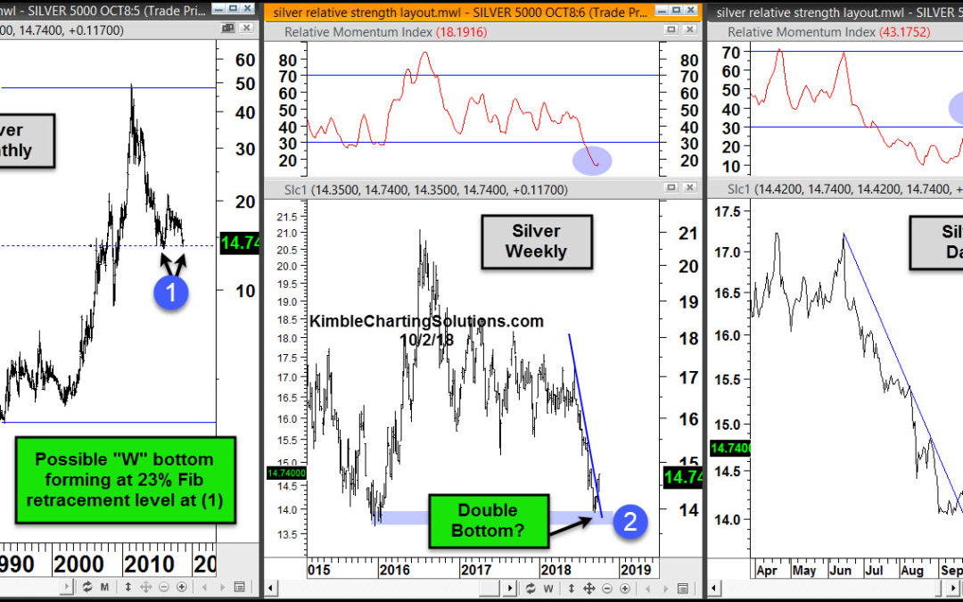
by Chris Kimble | Oct 3, 2018 | Kimble Charting
CLICK ON CHART TO ENLARGE Is Silver creating a double bottom and breaking above key resistance levels? Could be! This 3-pack looks at Silver at three different time frames. The left chart looks at Silver on a “Monthly” basis since late 1970’s. The...
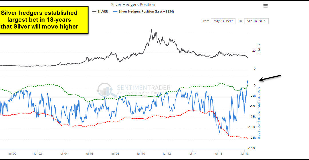
by Chris Kimble | Sep 28, 2018 | Kimble Charting
CLICK ON CHART TO ENLARGE This chart from Sentimentrader.com looks at the positions by Silver hedgers. At this time a very crowded trade is in play, an 18-year extreme. If history is a guide, Silver is currently closer to a short-term low than a high. Silver, Gold and...
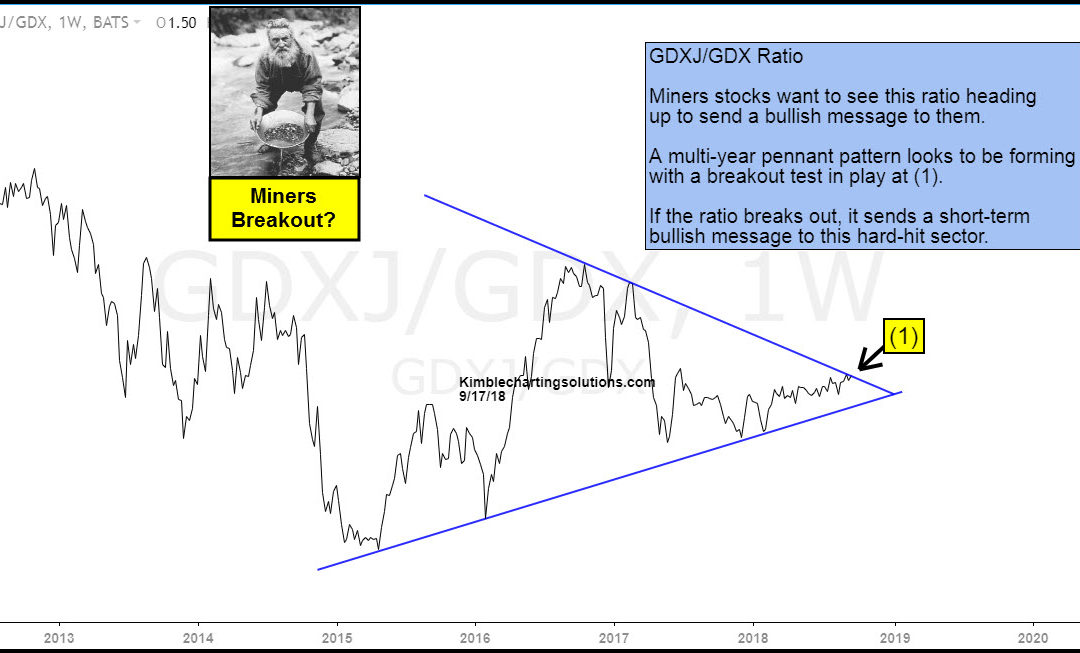
by Chris Kimble | Sep 17, 2018 | Kimble Charting
CLICK ON CHART TO ENLARGE The Junior Miners/Senior Miners Ratio (GDXJ/GDX) can often signal when key turning points are about to take place for Gold & Silver Miners. Above looks at this ratio, which highlights that a multi-year narrowing pennant pattern has been...
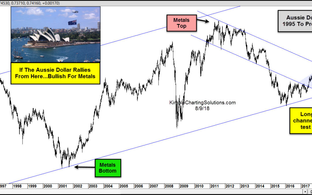
by Chris Kimble | Aug 9, 2018 | Kimble Charting
CLICK ON CHART TO ENLARGE The chart looks at the price patterns of the Aussie Dollar over the past 20-years. The trend on the AU$ is up over the past couple of decades and it is down since peaking back in 2011. The decline of late has the AU$ testing 17-year rising...
