
by Chris Kimble | Feb 17, 2015 | Kimble Charting, Metals
CLICK ON CHART TO ENLARGE One month ago Gold Miners ETF (GDX) had just experienced the best 3-week rally in the history of the ETF (Up 24% in three weeks)! (see post here) Aggressive Metals members were on board for this historic rally, due to buying on support. The...
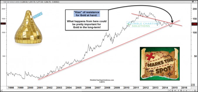
by Chris Kimble | Jan 28, 2015 | Kimble Charting, Metals
CLICK ON CHART TO ENLARGE Gold is now testing the underside of an old 10-year support line, now as resistance. This line is also being joined by another resistance line, at current price levels. The “X” marks the spot that looks to be VERY important...

by Chris Kimble | Jan 20, 2015 | Kimble Charting, Metals
CLICK ON CHART TO ENLARGE When one looks back over the past few years, King Dollar has been much stronger than Gold & Silver by a big percentage. The above ratio of the Dollar compared to Gold, reflects a strong trend downward (Dollar stronger than...

by Chris Kimble | Jan 16, 2015 | Kimble Charting, Metals
CLICK ON CHART TO ENLARGE Its been a decent 3 weeks for Gold miners ETF (GDX). Actually one of the best three weeks since the ETF was created back in 2006! All of this is taking place at the same time the Gold is attempting to break above a multi-year falling...
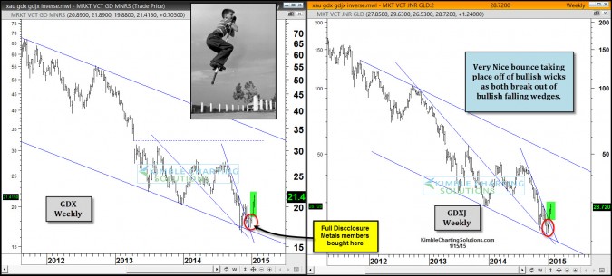
by Chris Kimble | Jan 15, 2015 | Kimble Charting
CLICK ON CHART TO ENLARGE Metals Mining ETF’s GDX and GDXJ both forming bullish falling wedges at falling channel support. Both created bullish wicks at the lows. Both are blasting out of these bullish patterns. Full Disclosure…Metals members went...

by Chris Kimble | Jan 9, 2015 | Kimble Charting, Metals
CLICK ON CHART TO ENLARGE GDX & GDXJ created bullish falling wedges at falling channel support, which was a nice pattern to see. Two-thirds of a time this pattern leads to rising prices. When the falling wedge takes place at channel support, odds are even...

by Chris Kimble | Jan 7, 2015 | Kimble Charting
CLICK ON CHART TO ENLARGE Even though the U.S. Dollar and Euro seemed to have had decent moves the past 6 months, when you take a 30,000 foot view of both, they are at the same price point as they were 11-years ago. Both have done nothing more than trade...

by Chris Kimble | Dec 26, 2014 | Kimble Charting, Metals
CLICK ON CHART TO ENLARGE When we look back on 2014, one thing is clear, it wasn’t a good year to “Buy & Hold” the Gold Bugs Index (HUI). The chart below reflects that that HUI has under performed the S&P 500 by 32% YTD. CLICK ON CHART...
