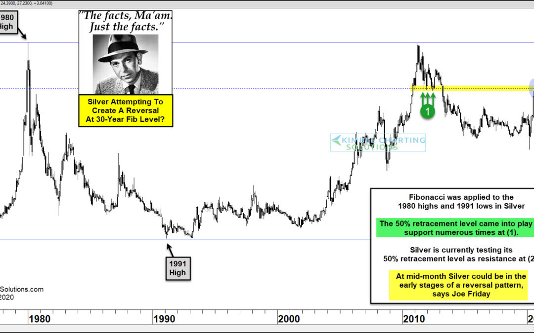
by Chris Kimble | Aug 14, 2020 | Kimble Charting
Could Silver prices from 30-years ago be influencing price action this month? Joe Friday suggests it is possible. This chart looks at Silver Futures on a monthly basis over the past 40-years. Fibonacci levels were applied to the 1980 highs ($50) and 1991 lows ($.350)...
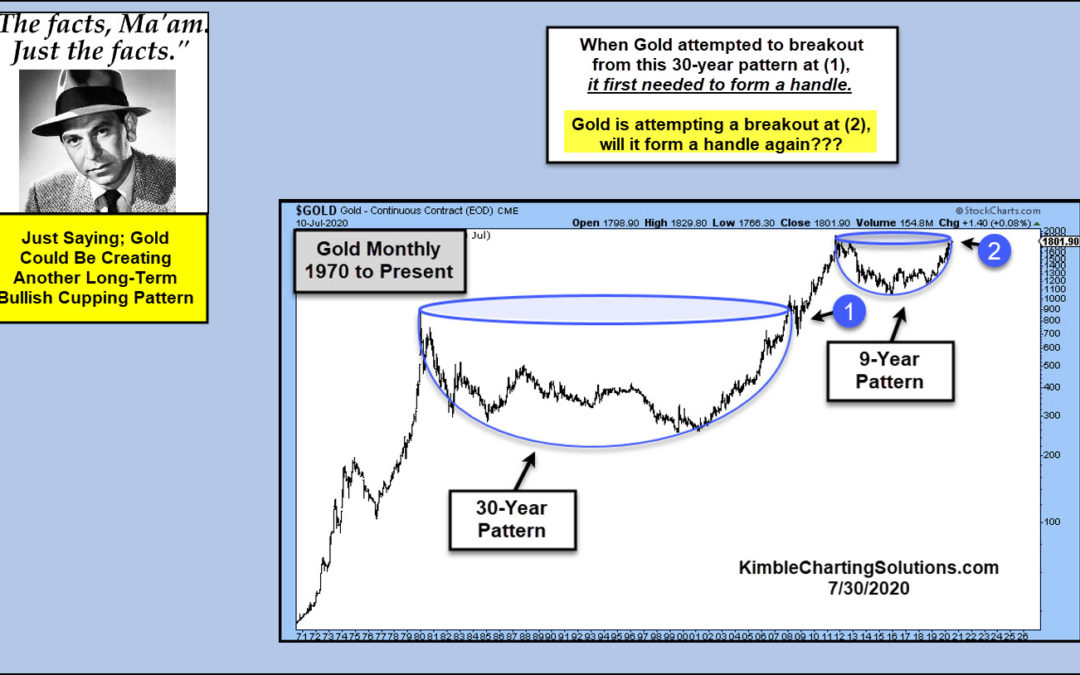
by Chris Kimble | Jul 31, 2020 | Kimble Charting
Is Gold forming another long-term bullish cupping pattern? Sure could be! Is the long-term pattern complete? If history is a guide, it would suggest not yet. When gold attempted to break above its 1980 highs, it first needed to form a “handle.” It did so...
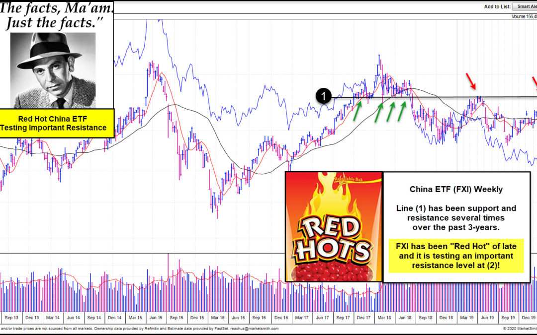
by Chris Kimble | Jul 10, 2020 | Kimble Charting
China ETF (FXI) has been “Red Hot” of late? Is it about to run out of steam or will it remain on fire going forward? This chart of FXI comes from Investors Business Daily and Marketsmith.com. It reflects that FXI is above key long-term moving averages and...
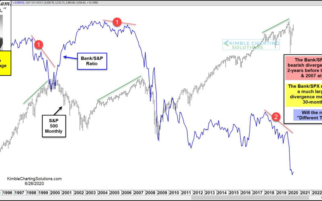
by Chris Kimble | Jun 26, 2020 | Kimble Charting
When the economy is humming along, the stock market tends to out-perform. And one sign of a strong economy is a healthy banking sector. On the flip side, when the economy is struggling, the banking sector lags. And this is a drag on the broader stock market. Today’s...
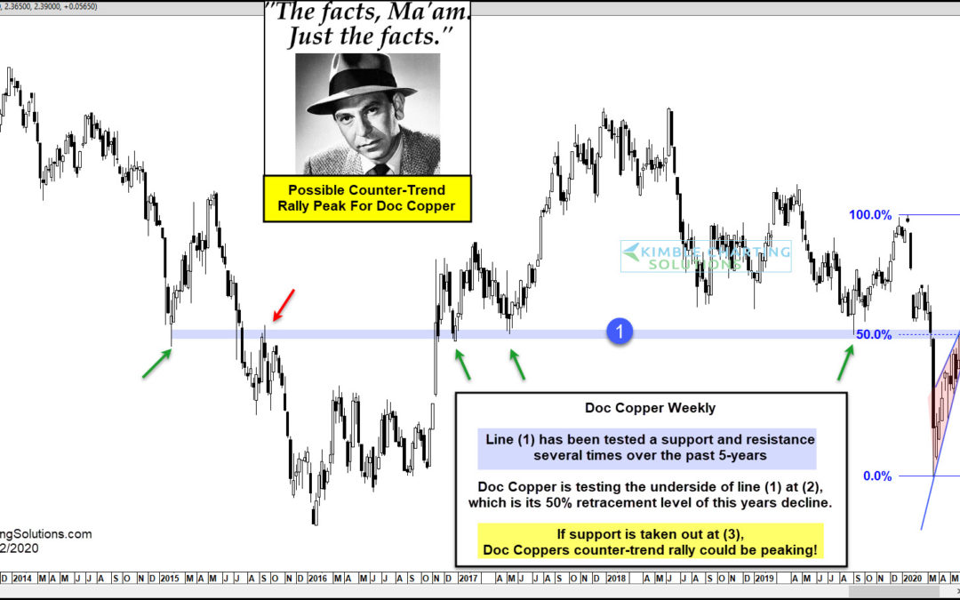
by Chris Kimble | May 22, 2020 | Kimble Charting
Could ole Doc Copper be sending an important message about the overall health of the global economy and the stock market in the next couple of weeks? It appears it could! This chart looks at Copper futures on a weekly basis over the past 7-years. Doc Copper looks to...

by Chris Kimble | May 8, 2020 | Kimble Charting
Silver has been much weaker than Gold for the past 9-years. Is that trend about to change? A short-term change is possible, says Joe Friday! This chart compares the price of Silver to Gold over the past decade. At the 2011 highs, the ratio created a bearish reversal...
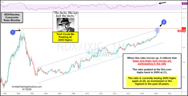
by Chris Kimble | May 1, 2020 | Kimble Charting
When fewer and fewer stocks are holding up a market, could that end up sending a bearish message to stock market bulls? Yes. This ratio looks at the NDX 100 index compared to the Nasdaq Composite Index. The ratio compares the strength of the 100 largest tech stocks...
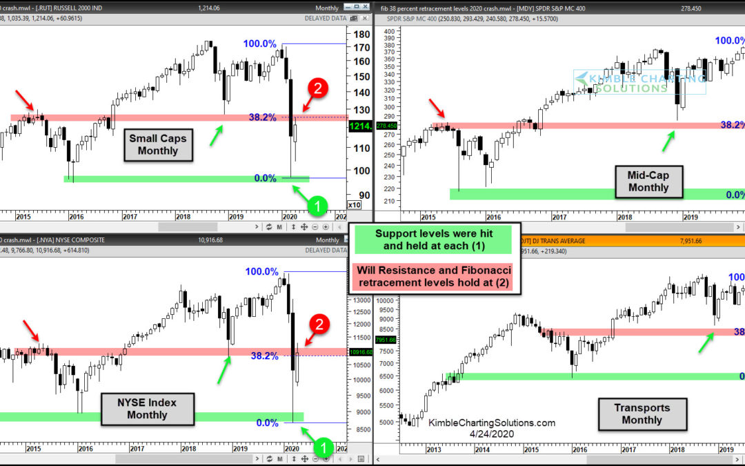
by Chris Kimble | Apr 24, 2020 | Kimble Charting
The bullish case for stocks is being put to an important price test here and now! This 4-pack reflects that “new resistance” and Fibonacci retracement levels are in play for each of these look-alike patterns. Each of these important indices hit long-term...
