by Chris Kimble | May 4, 2018 | Kimble Charting
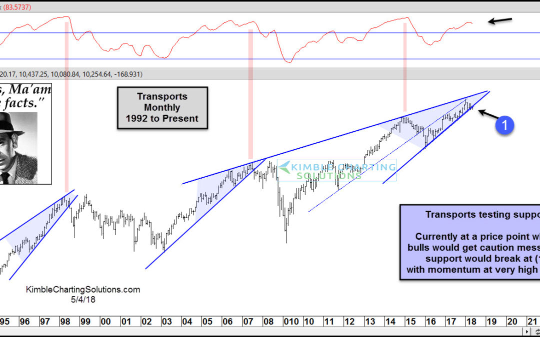
CLICK ON CHART TO ENLARGE This chart looks at the Dow Jones Transportation Index over the past 25-years on a monthly basis. The trend for Transports is up and nothing of late has changed the long-term trend. Transports are testing 3-year rising support at (1) with...
by Chris Kimble | Apr 11, 2018 | Kimble Charting
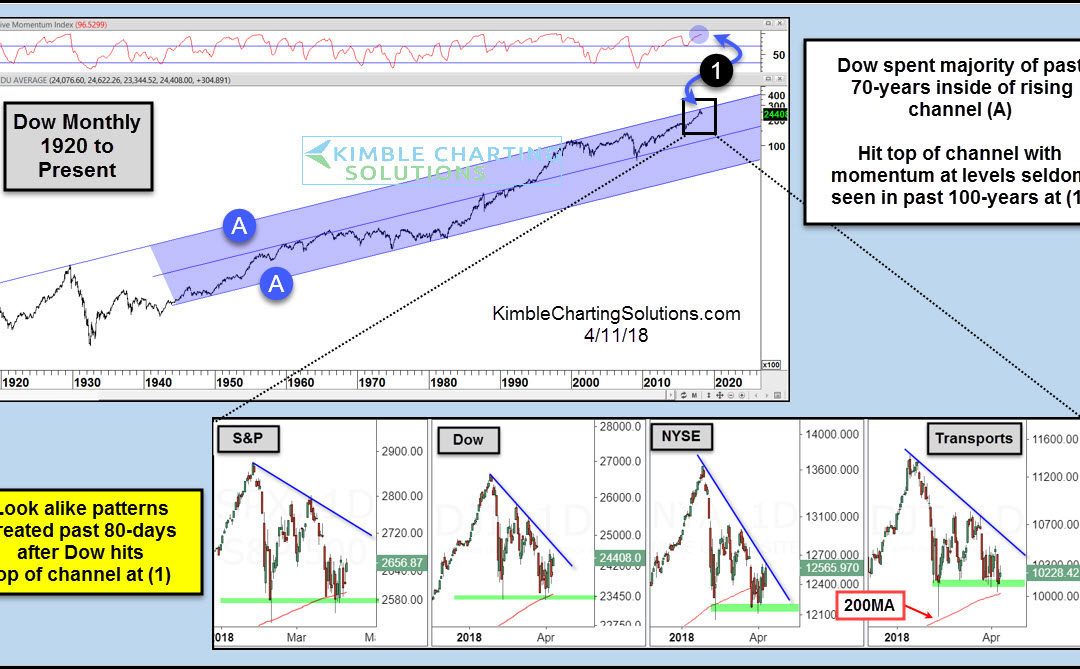
CLICK ON CHART TO ENLARGE The Dow has spent the majority of the past 70-years inside of bullish rising channel (A). It hit the top of this channel in January at (1), as monthly momentum was hitting levels last seen in 2007, 2000, 1987, 1957 and 1929. The 4-pack...

by Chris Kimble | Nov 20, 2017 | Kimble Charting
1-year ago this month, the Transports/S&P 500 ratio peaked and has been heading lower, reflecting that Transports have been diverging against the broad market. Below looks at the performance of the S&P to Transportation ETF (IYT)- CLICK ON CHART TO ENLARGE The...

by Chris Kimble | Aug 23, 2017 | Kimble Charting
Below looks at the Dow Jones Transports ETF (IYT) that remains in a long-term bull market. CLICK ON CHART TO ENLARGE IYT broke to new all-time highs seven weeks ago at (1). It stayed at new highs for one week, before selling pressure started taking place. The weakness...

by Chris Kimble | Aug 17, 2017 | Kimble Charting
Historically stocks tend to “Start” to get soft this time of year. Below looks at the average performance of the S&P 500 during the month of August over the past 10 & 20-years. CLICK ON CHART TO ENLARGE The typical decline in August is...

by Chris Kimble | Aug 10, 2017 | Kimble Charting
Below looks at the Dow Jones Transportation Index since 1994. Is it possible that the Transports index is repeating the patterns that were created back in 1999 & 2007? Below is an update on a potential pattern that we have been sharing with members for months....

by Chris Kimble | Apr 19, 2017 | Kimble Charting
“Buy these 50 stocks and that’s all you need” to get rich. That was the early 1970’s as the stock market bounced back from a deep correction to make new highs (point 1 on the chart below). Those 50 stocks were dubbed the “Nifty 50“ and investing in them felt like a...

by Chris Kimble | Apr 6, 2017 | Kimble Charting
Although the major stock market indices are just a few percent from all-time highs, the market is clearly at an interesting and important juncture here. Since setting new all-time highs in March, the major stock market indices have churned sideways, with only the...
