by Chris Kimble | Sep 11, 2018 | Kimble Charting
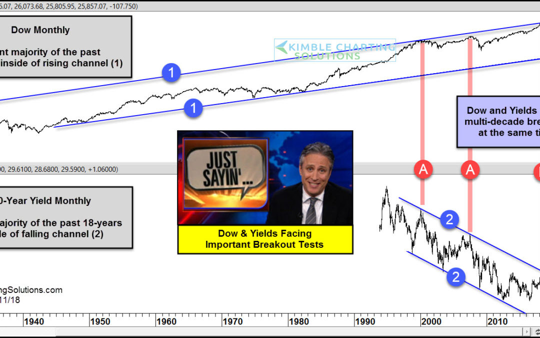
CLICK ON CHART TO ENLARGE This chart looks at the Dow Jones Industrials Average and the Yield on the 10-year note on a monthly basis for several decades. The top chart looks at the Dow since 1927 and the bottom chart looks at yields since 1994. The Dow has spent the...
by Chris Kimble | Apr 7, 2018 | Kimble Charting
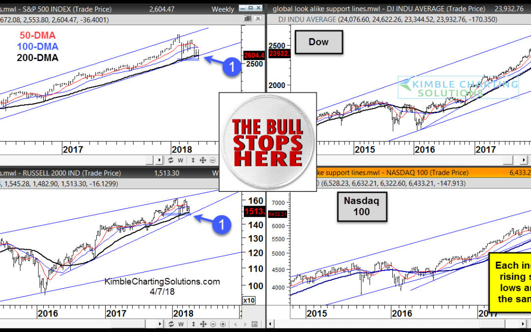
CLICK ON CHART TO ENLARGE The definition of a bull market or bull trends widely vary. One of the more common criteria for bull markets is determined by the asset being above or below its 200 day moving average. In my humble opinion, each index above remains in a bull...
by Chris Kimble | Apr 4, 2018 | Kimble Charting
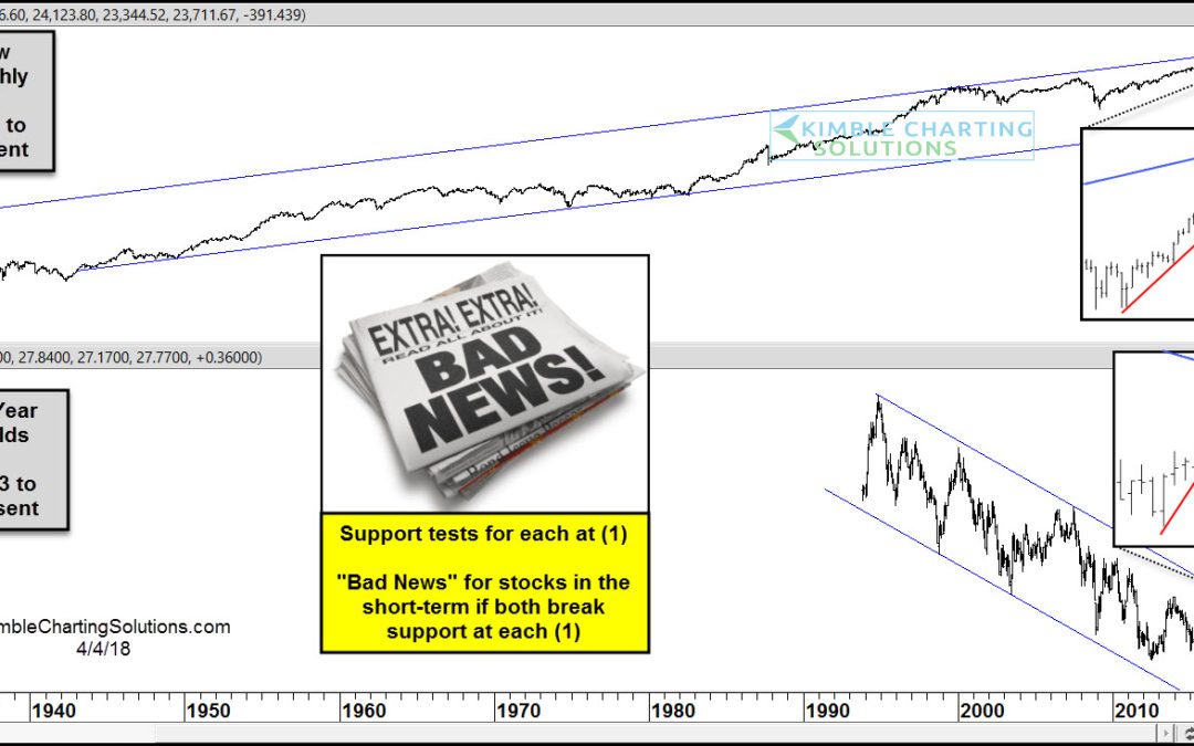
CLICK ON CHART TO ENLARGE The top chart above highlights that the Dow has spent the majority of the past 70-years inside of a rising channel. The bottom chart highlights that the 10-year yield has spent the majority of the past 25-years inside of a falling channel....
by Chris Kimble | Apr 3, 2018 | Kimble Charting
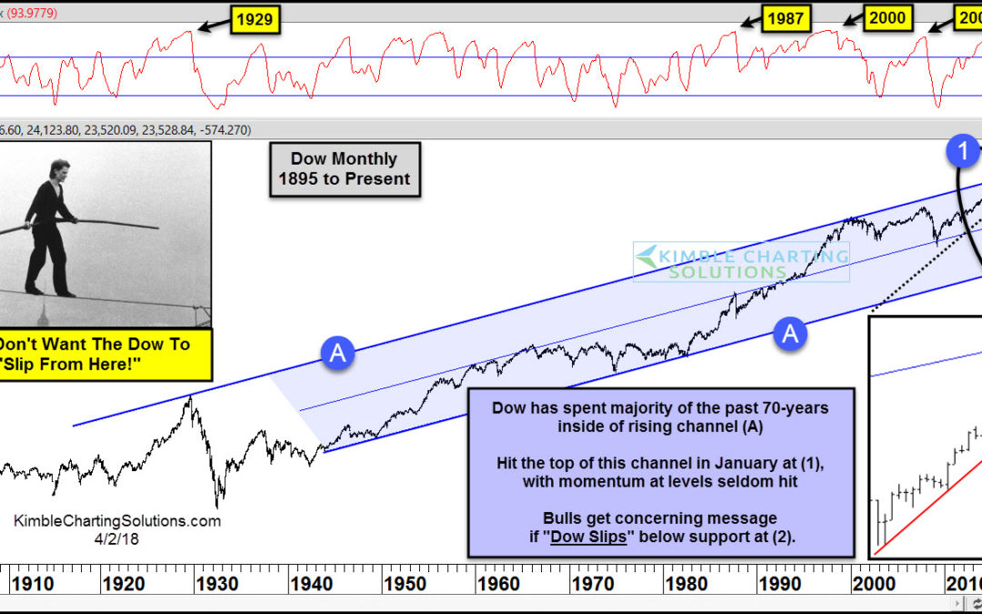
The Dow Jones Industrial Average peaked at 26,616 on January 26th. Those highs set the stage for the stock market correction that investors are facing right now. How and Why? We’ve been warning since early this year that stocks were getting ahead of themselves. The...
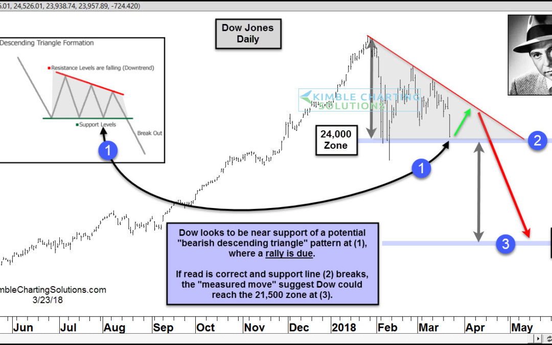
by Chris Kimble | Mar 23, 2018 | Kimble Charting
Over the past couple of months, the Dow Jones Index could be forming a descending triangle pattern, which two-thirds of the time leads to lower prices. The declines of late have the Dow testing support of this pattern, where a “short-term rally is due!” ...
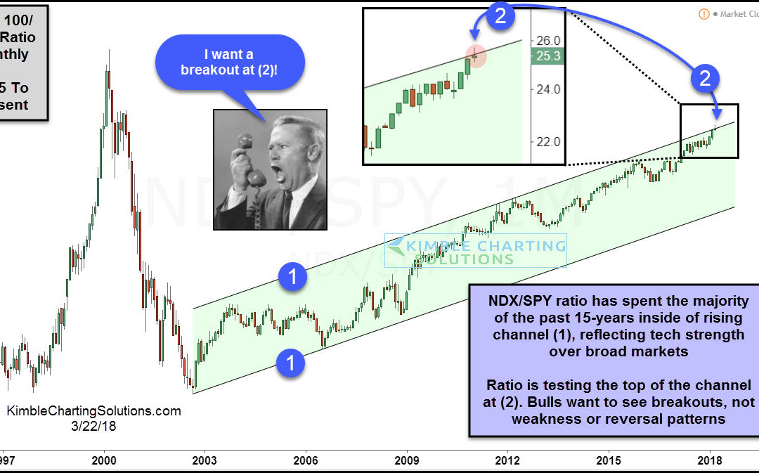
by Chris Kimble | Mar 22, 2018 | Kimble Charting
CLICK ON CHART TO ENLARGE Tech stocks have been on a roll for the past 15-years (long-term bull trend) and nothing of late has changed that! Above looks at the Nasdaq 100/SPY ratio on a monthly basis over the past couple of decades. Over the past 15-years, the ratio...
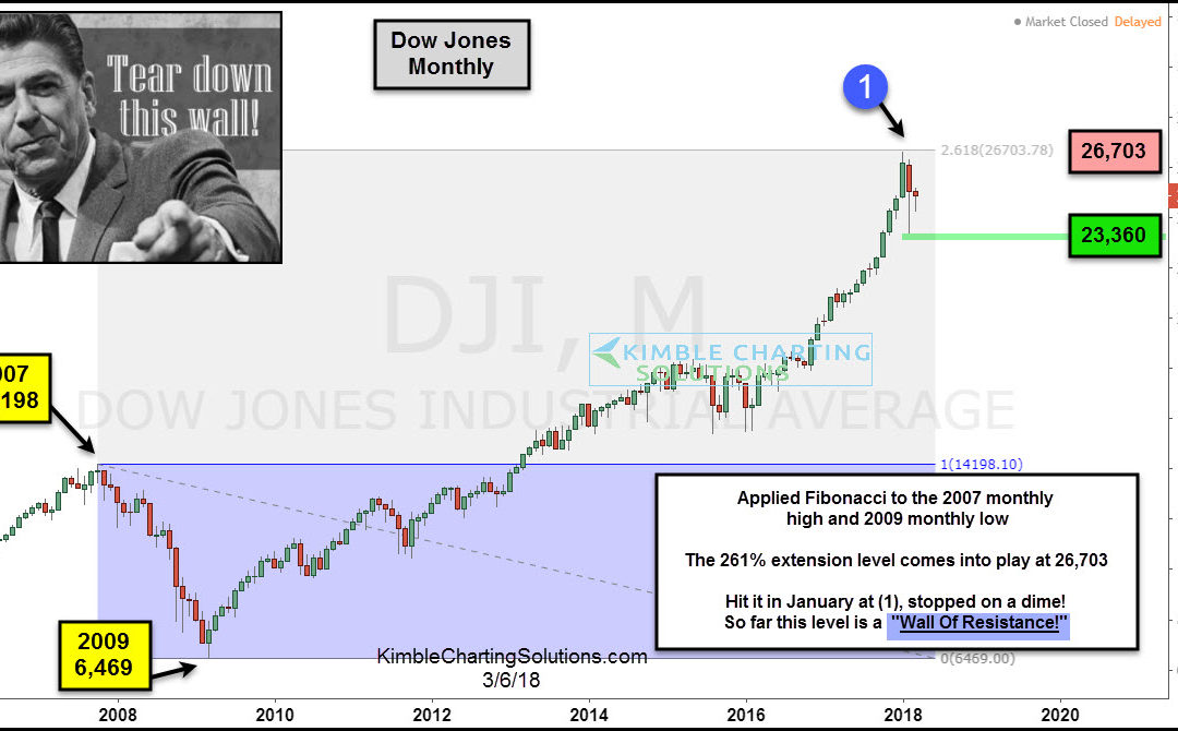
by Chris Kimble | Mar 7, 2018 | Kimble Charting
Don’t believe in the power of Fibonacci price levels? Perhaps this two-pack of stock market charts will change your mind. Back in late December, I warned that we were approaching the 261.8 Fibonacci resistance level on the Dow Jones Industrials: “We are now at the...
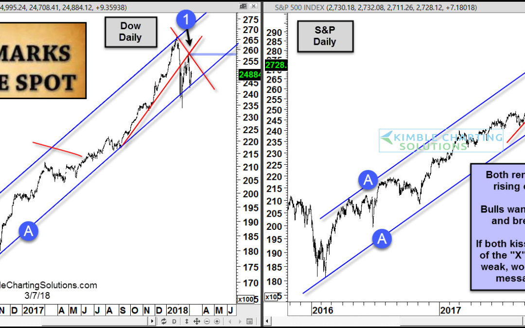
by Chris Kimble | Mar 7, 2018 | Kimble Charting
CLICK ON CHART TO ENLARGE This 2-pack highlights that the Dow and S&P remain inside of quality rising channels (A). Both hit rising support on 2/9 and rallied. “X” marks the spot that bulls want to see taken out to the upside. If this is accomplished,...
