
by Chris Kimble | Feb 22, 2018 | Kimble Charting
Back in November, I shared a long-term historical chart of the Dow Jones Industrial Average and pointed out a megaphone pattern breakout that looked bullish for stocks. After that post, the Dow Industrials rose over 3000 points heading into January before embarking on...
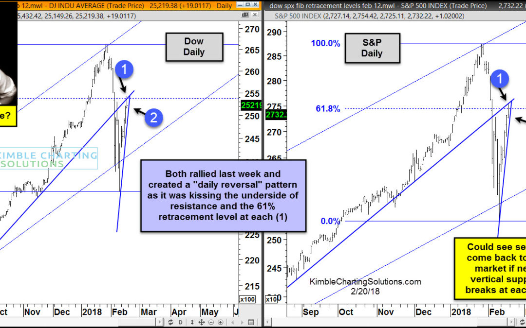
by Chris Kimble | Feb 20, 2018 | Kimble Charting
CLICK ON CHART TO ENLARGE The 2-pack above highlights that the Dow and S&P 500 remain inside of rising channels as the recent declines hit the bottom of the channels and bullish reversals took place. Short-term positive action by these key indices sent a positive...

by Chris Kimble | Feb 14, 2018 | Kimble Charting
Happy Valentines Day to each of you! Speaking of Valentines Day, stock market bulls around the world would “love to see rising support hold in several key markets in Europe.” Global stock market correlation seems to be fairly high these days. With this in...

by Chris Kimble | Feb 12, 2018 | Kimble Charting
Back in December, before any market weakness started, we were featured in a CBS MarketWatch article entitled “A Dow Crash? Another 25% Jump? No, Here’s The Case For A Market Freeze In 2018.“ At that time, our research showed that the Dow Jones Industrial...
by Chris Kimble | Feb 9, 2018 | Kimble Charting
In June of 2016 the Power of the Pattern shared the chart below, reflecting that the Dow was using old mega phone resistance as new support. The purpose of the blog post was to show this pattern and relay it was sending a long-term bullish message to stocks. The chart...

by Chris Kimble | Feb 9, 2018 | Kimble Charting
Below looks at the Dow Jones Industrial average over the past 100-years. The long-term of the Dow remains up. The action of the past couple of weeks has NOT changed that fact. We do find this interesting-The Dow Industrials finally moved into correction territory...

by Chris Kimble | Feb 6, 2018 | Kimble Charting
Last Friday Joe Friday shared this “Just The Facts Ma’am”- The Dow was hitting “momentum last seen in 1929, 1987 & 2000” in the chart below. (See Post Here) CLICK ON CHART TO ENLARGE While momentum was reaching momentum levels seldom...
by Chris Kimble | Feb 2, 2018 | Kimble Charting
Below looks at a chart on the Dow since the early 1900’s on a monthly basis, with momentum applied in the upper part of the chart. CLICK ON CHART TO ENLARGE The Dow at this time is attempting a breakout of this 70-year channel at (3) as the trend is strongly...
