by Chris Kimble | Jul 20, 2018 | Kimble Charting
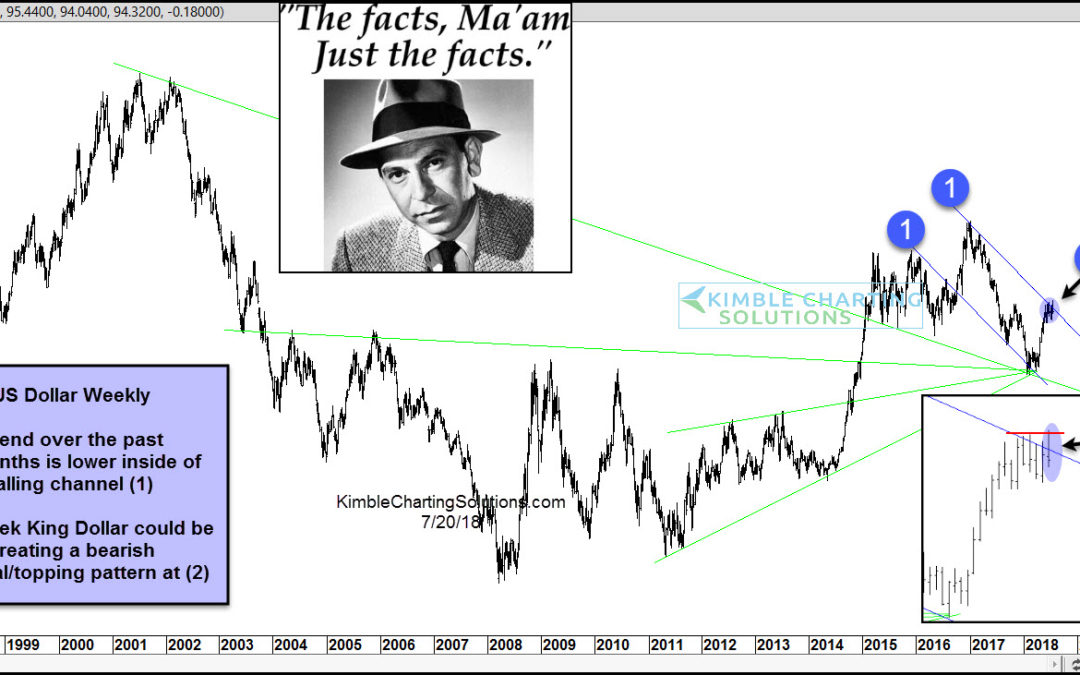
CLICK ON CHART TO ENLARGE The US Dollar hit peaked in January of 2017 and started creating a series of lower highs and lower lows, which has formed falling channel (1). King Dollar hit a cluster of support and the bottom of the falling channel (1) 6-months ago and a...
by Chris Kimble | Feb 20, 2018 | Kimble Charting
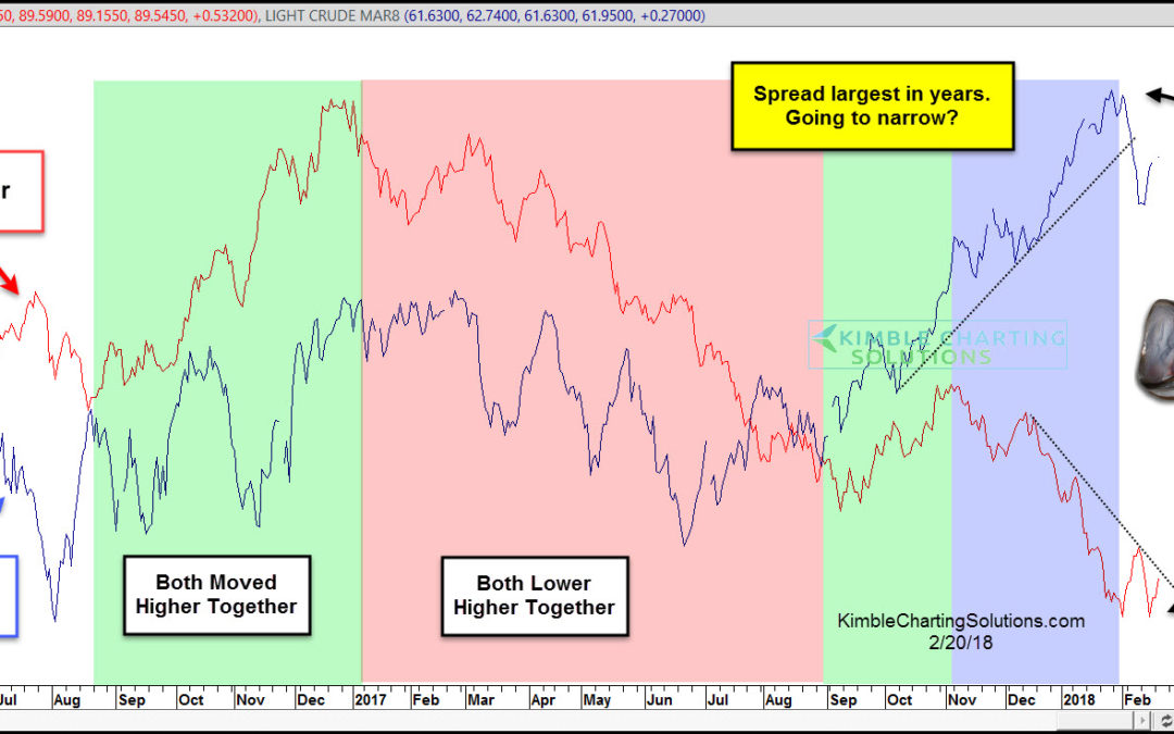
CLICK ON CHART TO ENLARGE King Dollar & Crude Oil sometimes dance to the same tune (correlate) and sometimes they head in opposite directions (non-correlate). Above looks at the correlation between the two over the past couple of years. From September of 2016...

by Chris Kimble | Feb 20, 2018 | Kimble Charting
Certain price zones for all assets come into play where bulls would not want to see selling get started. Below highlights one of those points for Gold Bulls. The left chart looks at Gold over the past 20-years and the right chart zooms in to look at just the past...

by Chris Kimble | May 22, 2017 | Kimble Charting
The US Dollar (CURRENCY:USD) has shown strength versus the Euro (CURRENCY:EUR) since 2008, with the “meat” of that strength coming in the last 3 to 4 years. This strength worked as a headwind for precious metals, emerging markets, and at times, the domestic economy....

by Chris Kimble | May 16, 2017 | Kimble Charting
The US Dollar looks to have kissed the underside of key resistance and is starting to fall. Is this a “Kiss Good-Bye” for King Dollar? Below looks at the US Dollar over the past two years. CLICK ON CHART TO ENLARGE King$ remains in a short-term falling...

by Chris Kimble | Apr 25, 2017 | Kimble Charting
Below looks at a long-term chart of the US Dollar, that was shared on 12/30/16. This chart highlighted that King Dollar was facing two long term resistance lines, at the 104 zone. (See Post Here). Joe Friday was pointing out this was a rare test of resistance and...

by Chris Kimble | Mar 21, 2017 | Kimble Charting
The US Dollar has been a stellar performer the past few years, as it has been stronger than most currencies around the world. The chart below looks at US$ over the past couple of years and highlights that it could be creating some patterns, that are often associated...
