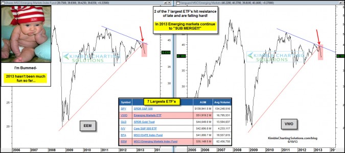
by Chris Kimble | Jun 19, 2013 | Kimble Charting
CLICK ON CHART TO ENLARGE The inset table above reflects the 7 largest ETF’s in the U.S. So far this year, 5 of the 7 are either under performing the S&P 500 by 10% or more, three of them by more than 25%! These funds total $171 Billion in assets! 3 of the...

by Chris Kimble | Mar 7, 2013 | Kimble Charting
CLICK ON CHART TO ENLARGE EFA is a diversified international ETF (see lower left box above). How these countries perform has many impacts on global growth and on the performance of the U.S. markets. Even though the S&P 500 has gained 13% since July of...

by Chris Kimble | Jan 10, 2013 | Kimble Charting
Several months ago the Power of the Pattern suggested to Premium Members they should be looking to go long European Stocks or Create a market neutral Spread trade by longing EFA and Shorting the 500 index. Why go long Europe when they were having such...

by Chris Kimble | Dec 17, 2012 | Kimble Charting
Is Santa Claus bringing good cheer to the Emerging markets complex this year? The chart below reflects that BRIC ETF’s/Emerging markets are reflecting relative strength compared to the S&P 500 over the past 60 days. CLICK TO ENLARGE The 4-pack below reflects...
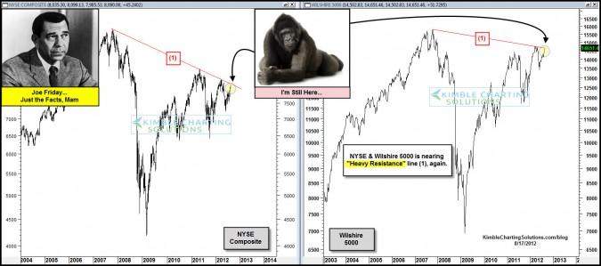
by Chris Kimble | Aug 17, 2012 | Kimble Charting
CLICK ON CHART TO ENLARGE Two of the broadest market index’s in the United States are back at resistance that has stopped their rallies over the past few years. Can these key markets push aside the 800 pound gorilla? Is the U.S. broad markets the only...

by Chris Kimble | Aug 14, 2012 | Kimble Charting
CLICK ON CHART TO ENLARGE Emerging Markets ETF (EEM) and European ETF (EFA) are up against key falling resistance lines. Is EEM creating a pattern just like it did back in 2007 at (1), as it kisses the underside of resistance at (2)? The chart below reflects that both...

by Chris Kimble | Jul 23, 2012 | Global Dashboard, Kimble Charting
Who broke down first? Shanghai Index or Europe? CLICK ON CHART TO ENLARGE Last May the Shanghai index first broke below key support, of a multi-year flag pattern at (1) in the chart above. The Power of the Pattern suggested at that time, its “global...

by Chris Kimble | Jun 28, 2012 | Kimble Charting
CLICK ON CHART TO ENLARGE Traders appear to have created bearish Head & Shoulders patterns in the Copper complex and Europe. Each asset in the 4-pack above reflects a similar pattern, as each looks to be testing their neckline! Even though each...
