
by Chris Kimble | Jul 28, 2014 | Kimble Charting
CLICK ON CHART TO ENLARGE Is the Sky going to fall because junk bonds fall 1.4%? Junk Bond ETF (JNK) has been in the news of late, due to recent softness. Should we be concerned? Some seem to think so! The lower inset chart does reflect that JNK has...
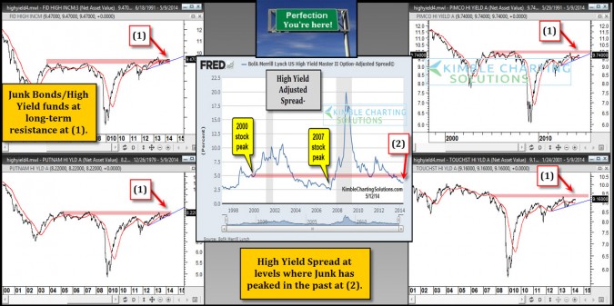
by Chris Kimble | May 13, 2014 | Kimble Charting
CLICK ON CHART TO ENLARGE Junk bond mutual funds are now nearing resistance levels at (1), that has kept them from moving higher for the past 10-years. In the past when these resistance lines were hit, it represented a peak for the junk market and stocks peaked...

by Chris Kimble | Mar 25, 2014 | Global Dashboard, Kimble Charting
CLICK ON CHART TO ENLARGE High Yield funds are considered by many to be good leading indicators for the future direction of the stock market. Above are four high yield funds (Not ETF’s) which reflect they are moving higher this year, all are above rising...

by Chris Kimble | Jan 28, 2014 | Kimble Charting
CLICK ON CHART TO ENLARGE Its been a tough past 12-months for Junk Bond ETF’s JNK & HYG! Performance is nothing to write home about and has lagged the S&P 500 by almost 20%. Over the past few months bullish “ascending triangles”...

by Chris Kimble | Oct 29, 2013 | Kimble Charting
CLICK ON CHART TO ENLARGE Junk bond mutual funds and ETF’s started reflecting weakness back in May, about the time the S&P 500 was starting to struggle a little bit. The decline in the junk market saw each of these 6 funds/ETF’s highlighted above, to...

by Chris Kimble | Oct 22, 2013 | Kimble Charting, Sector / Commodity
CLICK ON CHART TO ENLARGE The above 6-pack reflects a wide variety of bonds and yields. The upper left two charts highlights heavy falling channel resistance in the 10 & 30-year yield, which are now breaking support. The other 4 charts high light breakouts in...

by Chris Kimble | Sep 27, 2013 | Kimble Charting
CLICK ON CHART TO ENLARGE From the summer lows (June 2012) to May of 2013, Junk Bond ETF (JNK) and the S&P 500 moved higher together (green shaded area above), which if history is a good guide, was a healthy sign. Since May of this year, junk bonds have been...

by Chris Kimble | Aug 21, 2013 | Kimble Charting
CLICK ON CHART TO ENLARGE “I Love Junk Bonds” for several reasons! They are awesome total return tools when the trend is up and they provide quality “leading signals” for the macro economy. Speaking of total return, the chart above reflects...
