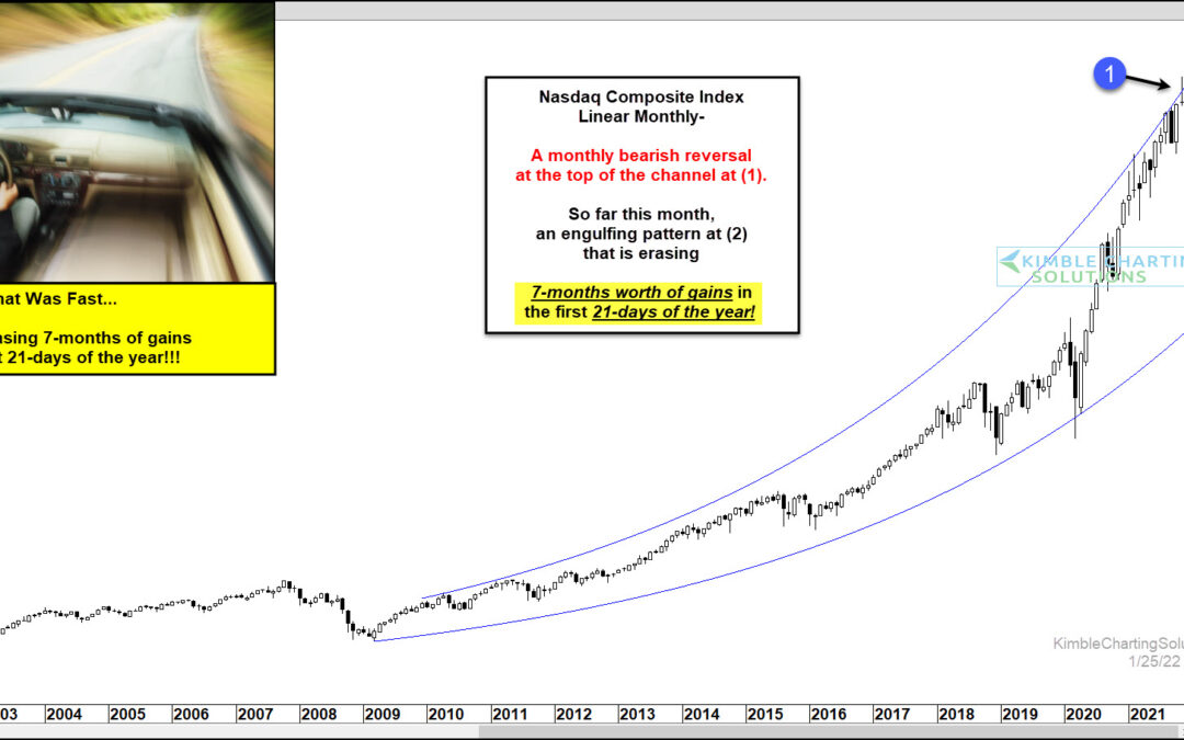
by Chris Kimble | Jan 25, 2022 | Kimble Charting
The tech wreck has been fast and furious. And considering that the stock market correction is still relatively new, we really don’t know if it will end soon or carry on for weeks/months. Today’s chart is “linear” and takes a long-term “monthly” view. As you can see,...
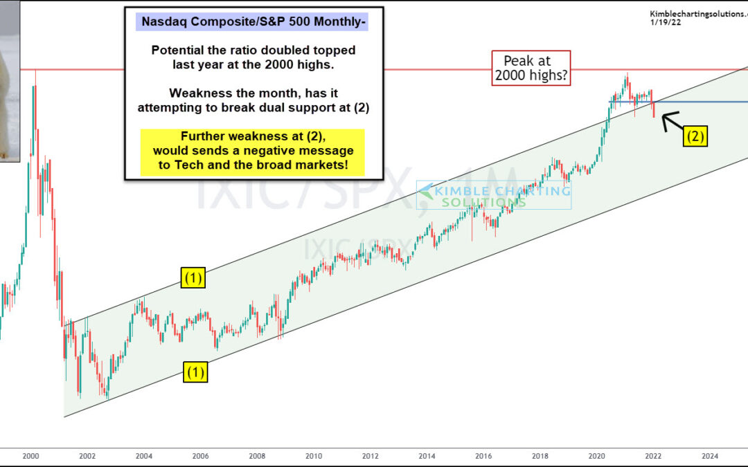
by Chris Kimble | Jan 19, 2022 | Kimble Charting
One theme over the past several months has been tech stock’s under-performance. And 2022 seems to be amplifying this theme as we kick off the new year. Today’s chart focus is on the ratio of the Nasdaq Composite to the S&P 500 Index. We have shared this...
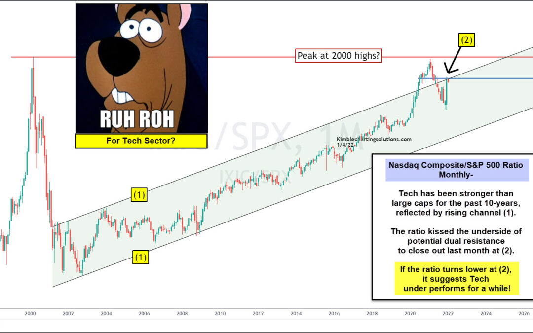
by Chris Kimble | Jan 5, 2022 | Kimble Charting
Tech stocks began under-performing the broader market several months ago when the ratio of the Nasdaq Composite to S&P 500 Index peaked out at the 2000 high. This is worth noting because this tech ratio has been in a rising up-trend for the past two decades,...
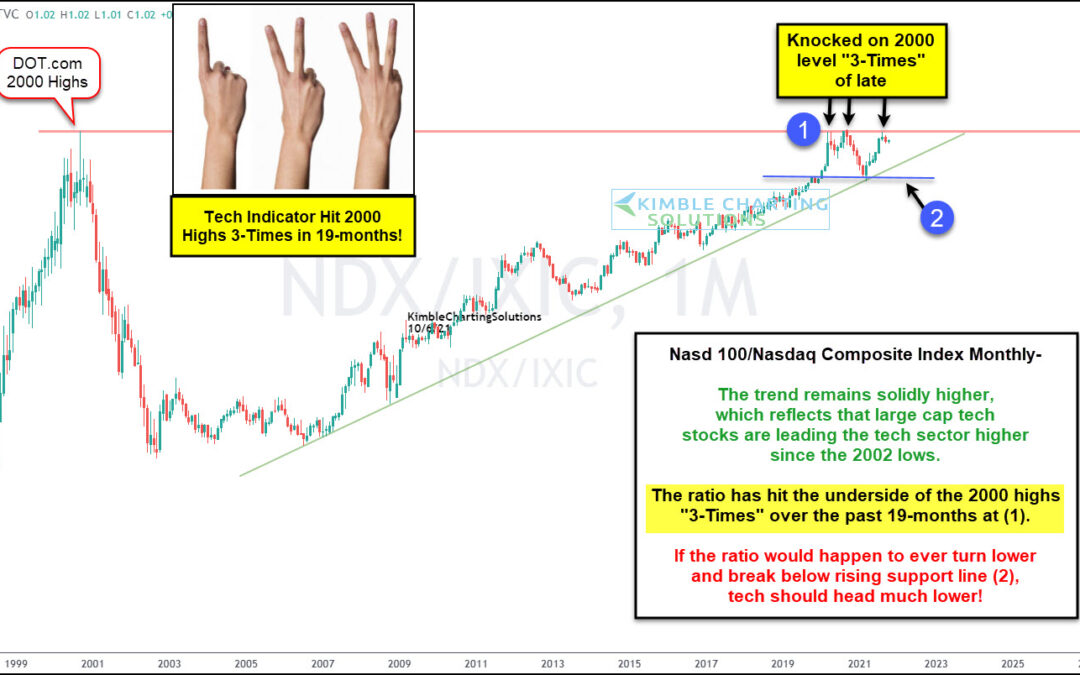
by Chris Kimble | Oct 7, 2021 | Kimble Charting
Tech stocks have played a major leadership role in the 12 year advance off the 2008-2009 stock market low. But within that leadership silo, it has been large-cap tech stocks that have been the real leaders. Today’s chart highlights this by showing the ratio of the...
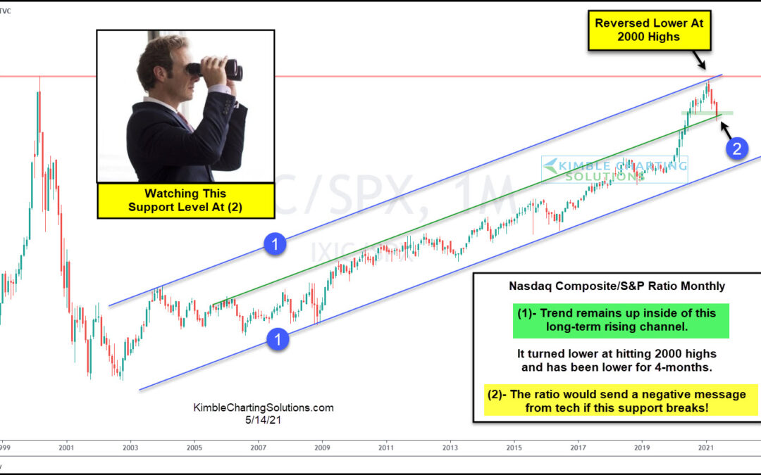
by Chris Kimble | May 14, 2021 | Kimble Charting
Tech stocks have been on shaking ground over the past several weeks / few months. And this shows up clearly in today’s ratio chart, pitting the Nasdaq Composite versus the S&P 500 Index on a “monthly” basis. This long-term chart really gets at the heart of the...
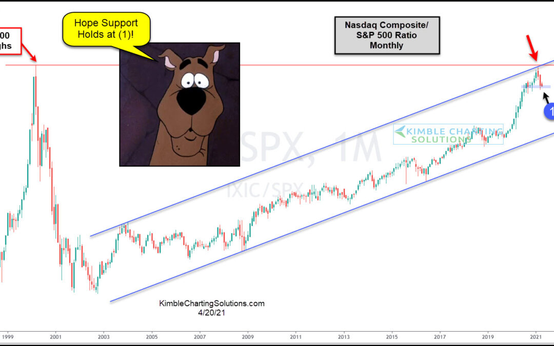
by Chris Kimble | Apr 20, 2021 | Kimble Charting
For the past 19-years, the Nasdaq Composite Index has been stronger than the S&P 500. Is this trend about to change? This chart looks at the Nasdaq Composite Index/S&P 500 ratio since 1997. It peaked in 2000 and fell like a rock, as tech stocks fell...
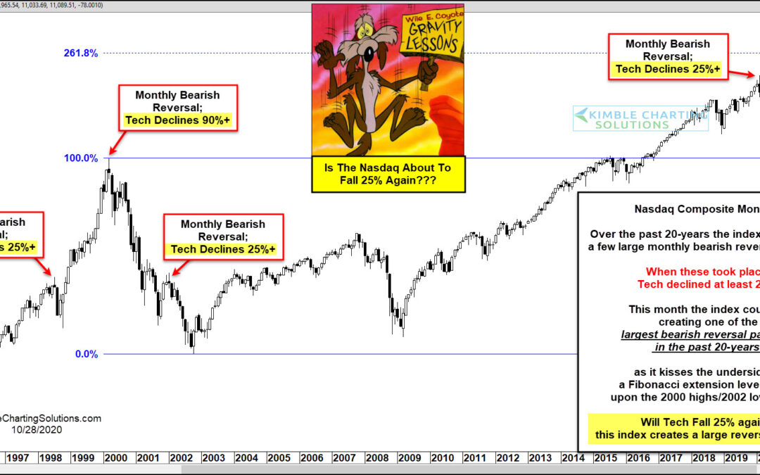
by Chris Kimble | Oct 29, 2020 | Kimble Charting
Technology is the lifeblood of our current economy and dictates future innovation. The sector has also taken a primary leadership role in the 11-year bull market. But, as most of you are aware, that doesn’t mean that tech stocks are always smooth sailing. In fact, the...
by Chris Kimble | Oct 28, 2020 | Kimble Charting
Stock market volatility has turned higher as the month of October has wore on. And now that we are just one week away from the elections, it appears that investors are showing their uncertainty through the price action on the major U.S. stock market indices. In...
