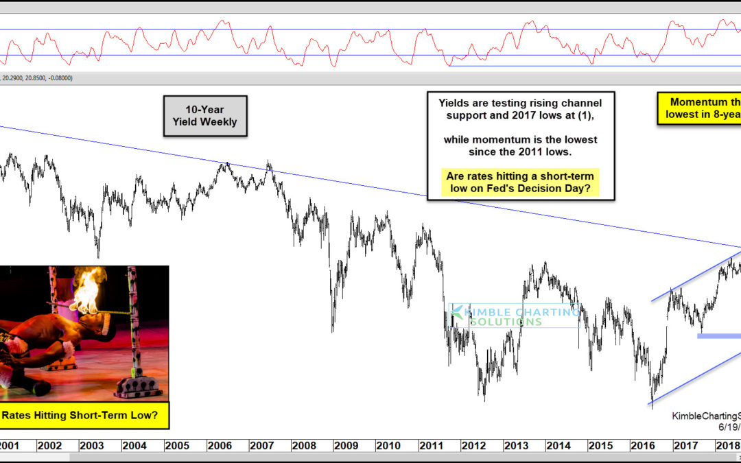
by Chris Kimble | Jun 19, 2019 | Kimble Charting
This afternoon the Fed will announce if they are going to lower interest rates. Does the bond market already have a rate decrease priced into the market? Possible! This chart looks at the yield on the 10-year note over the past 20-years. Without a doubt, the long-term...
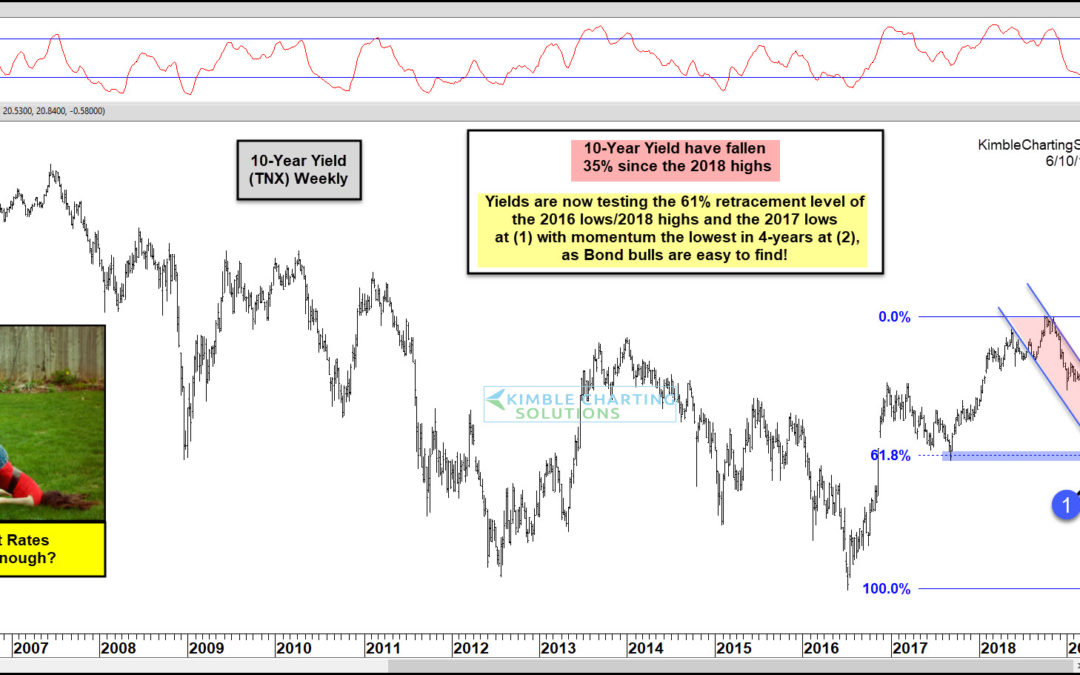
by Chris Kimble | Jun 10, 2019 | Kimble Charting
This chart looks at the Yield on the 10-year note on a weekly basis. Interest rates look to have peaked last October. Since hitting those highs, yields have declined 35%! This large decline has them testing the 2017 lows and its 61% retracement level of the 2016...
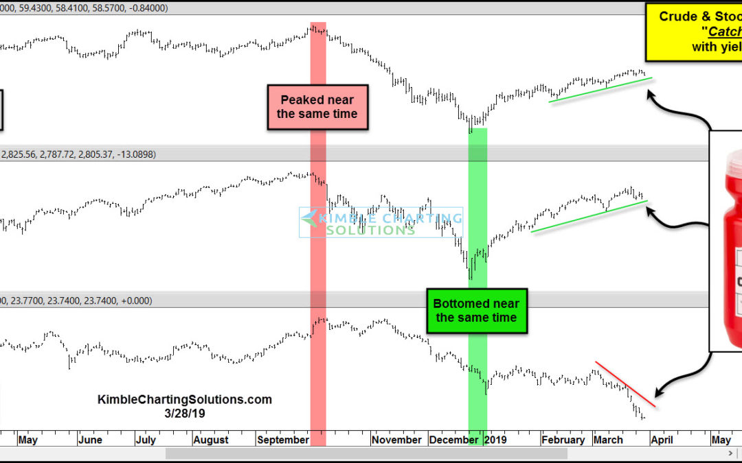
by Chris Kimble | Mar 28, 2019 | Kimble Charting
Crude Oil, Stocks, and Yields have experienced a high degree of correlation over the past few months. All three peaked together near the end of September and all three bottomed together near Christmas. This month a big divergence is taking place! The chart above...
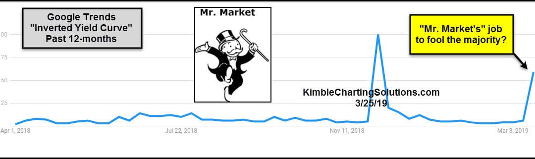
by Chris Kimble | Mar 26, 2019 | Kimble Charting
Is Mr.Markets job to fool the majority? If so, some surprises in the bond market could be near! This table from Google Trends looks at the popularity of articles mentioning the “Yield Curve.” Last week it seemed like everywhere you turned people were...
by Chris Kimble | Feb 28, 2019 | Kimble Charting
When the financial media talks about US Treasuries, it is usually focused on the yield curve. Or sometimes they will highlight the 10-year treasury yield and its relation to mortgage rates. But more recently, the news has been focused on the prospects of a yield curve...
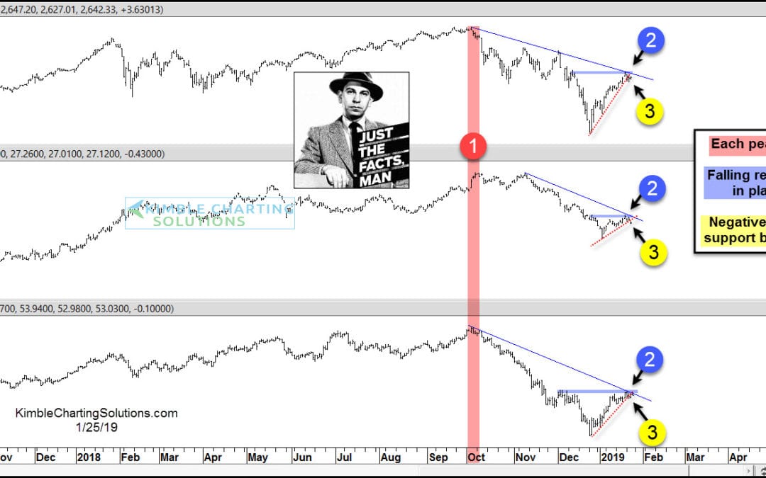
by Chris Kimble | Jan 25, 2019 | Kimble Charting
Stocks, Yields and Crude Oil have experienced a high degree of correlation since the October highs and each looks to be experiencing a key price test at the same time! The S&P 500, 10-year yields and Crude Oil hit highs at nearly the same time in early October at...

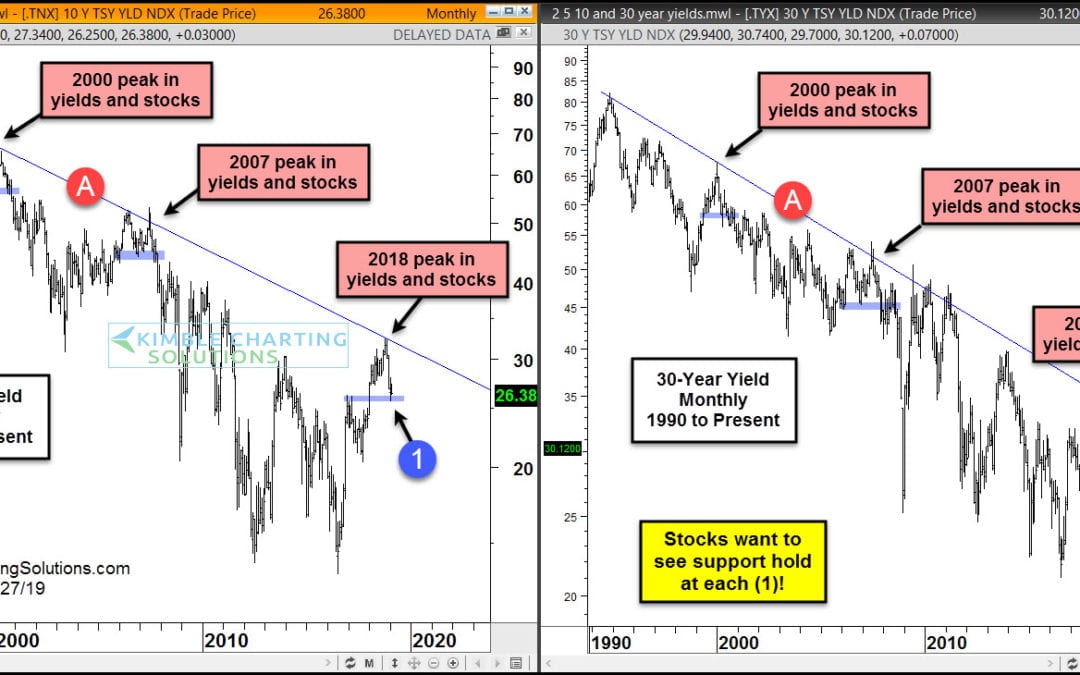
by Chris Kimble | Jan 3, 2019 | Kimble Charting
This chart overlays the S&P 500 and the Yield on the 5-year note over the past 25-years. When Yields hit falling resistance in 2000 & 2007, they fell hard and stocks did too (50% S&P 500 declines)! Yields hit 20-year falling resistance a couple of months...
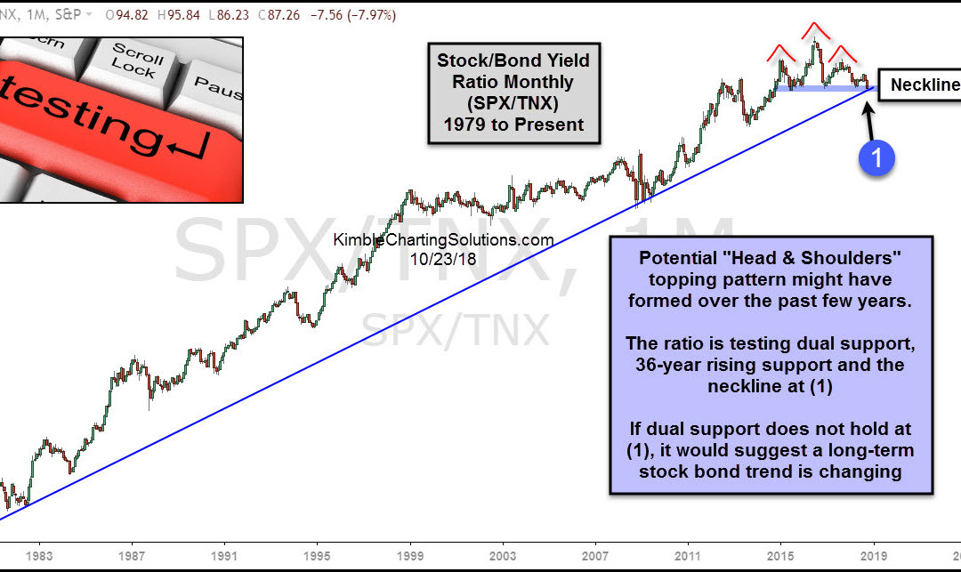
by Chris Kimble | Oct 24, 2018 | Kimble Charting
CLICK ON CHART TO ENLARGE This chart looks at the S&P 500/10-Year Yield ratio over the past 40-years, on a monthly basis. The ratio started creating a series of highs lows in the early 1980’s, reflecting that stocks were moving up faster than yields. Over...
