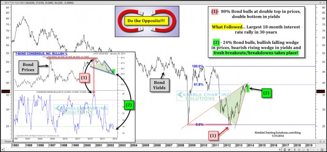
by Chris Kimble | Feb 1, 2014 | Kimble Charting
CLICK ON CHART TO ENLARGE Is it hard to go against the crowd or trend? Even after 34-years of being in the business, I still get a few butterflies in my stomach when the Power of the Pattern and sentiment line up suggesting a change of trend is at hand. In May...
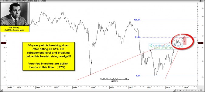
by Chris Kimble | Jan 24, 2014 | Kimble Charting
CLICK ON CHART TO ENLARGE The yield on the 30-year bond has created a multi-year bearish rising wedge and is breaking lower support of this bearish pattern above, after hitting its 61% Fibonacci retracement level. CLICK ON CHART TO ENLARGE The yield on the...
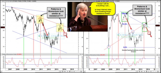
by Chris Kimble | Nov 14, 2013 | Kimble Charting
CLICK ON CHART TO ENLARGE Back in 2011, Interest rates on a 10 & 30-year basis had risen sharply, putting them up against falling resistance lines and momentum was overbought. Did Ben come to the rescue and keep rates from breaking out? Whether Ben...

by Chris Kimble | Oct 22, 2013 | Kimble Charting, Sector / Commodity
CLICK ON CHART TO ENLARGE The above 6-pack reflects a wide variety of bonds and yields. The upper left two charts highlights heavy falling channel resistance in the 10 & 30-year yield, which are now breaking support. The other 4 charts high light breakouts in...
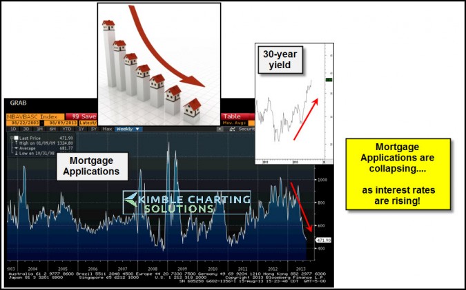
by Chris Kimble | Aug 16, 2013 | Kimble Charting
CLICK ON CHART TO ENLARGE New mortgage applications are falling like a rock of late!. Is this due to the steep rise in rates? Seen the inset rate chart above and look what has happened to applications during the window of rising rates. Home builders are already into...

by Chris Kimble | Aug 15, 2013 | Kimble Charting
CLICK ON CHART TO ENLARGE What ripple impacts would take place if interest rates rise 50% from current levels? Mortgages impacted? Government debt cost rise? Underfunded pension costs increase? The 10-year yield created a bullish inverse head & shoulders...

by Chris Kimble | Aug 13, 2013 | Kimble Charting
CLICK ON CHART TO ENLARGE A wide variety of bonds have been under pressure since their May highs. This doesn’t just apply to Government bonds! The above 4-pack reflects a cross section of bonds (Govt, High Quality Corp & Junk Bonds) that have been weak...

by Chris Kimble | Jul 24, 2013 | Kimble Charting
The Power of the Pattern shared that interest rates were ready to blast off and government bonds could get hurt on 5/3 (See post here) Since then rates are up 40% and TBF the bond short has made as much as SPY has for the Year (see TBF performance here) Could...
