by Chris Kimble | May 30, 2019 | Kimble Charting
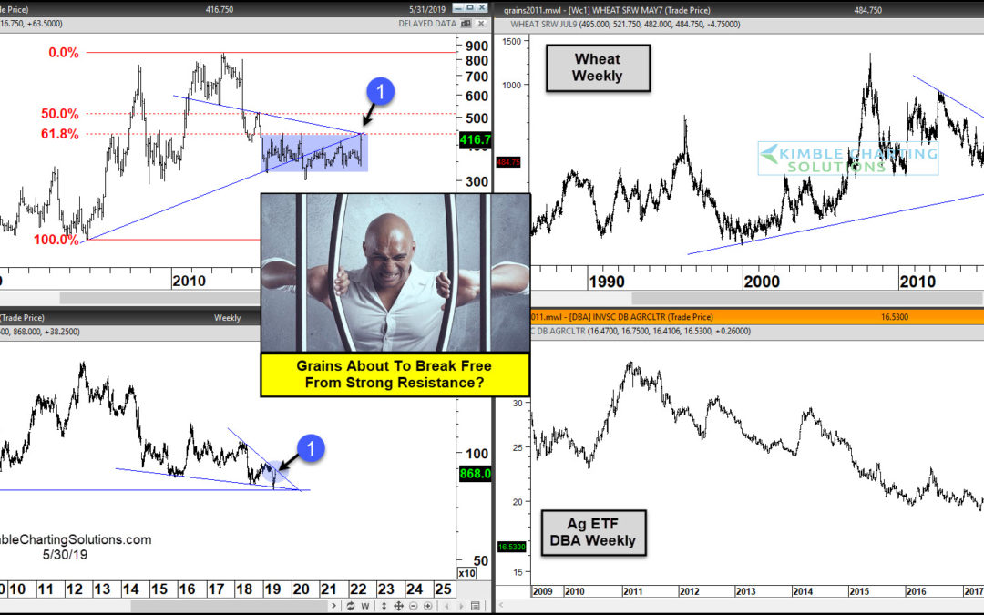
Are long-term frustrations in the Grain (Corn, Wheat & Soybean) markets about to end? In my humble opinion, what happens at each (1) will go a long way to answering this question. Long-term trends for grains remain lower for more than 5-years. Over the past couple...
by Chris Kimble | Jul 20, 2015 | Kimble Charting
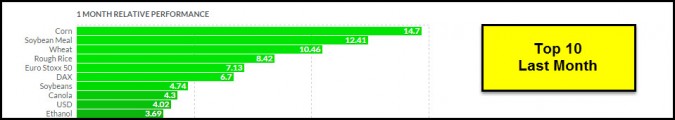
CLICK ON CHART TO ENLARGE Over the past month, the grains have done really well. Of the Top 10 assets to own the past month, the grains dominate this category! Below looks that the patterns of Wheat, Corn, Soybeans and Grain ETF JJG CLICK ON CHART TO ENLARGE The...

by Chris Kimble | Jun 26, 2015 | Kimble Charting, Sector / Commodity
CLICK ON CHART TO ENLARGE The chart above looks at Corn over the past 30-years and applies a 2-year rate of change to it. Over the past two years, Corn is down around 45%, been a rough go of it for sure! Could that lead to future opportunities? Below looks at the best...

by Chris Kimble | Nov 12, 2014 | Kimble Charting
CLICK ON CHART TO ENLARGE The table below reflects how Corn, Soybeans and Wheat has done year-to-date (not well, losing between 10% – 16%)! This type of poor performance often creates opportunities, if you like the ole boring idea of “buying low and...

by Chris Kimble | Sep 5, 2014 | Kimble Charting
CLICK ON CHART TO ENLARGE When it comes to poor performance over the last couple of years, Wheat sure comes to mind! The lower section of the chart above is the 2-year rate of change (ROC) applied to Wheat. As you can see the ROC has been this low only a few...

by Chris Kimble | Mar 3, 2014 | Kimble Charting
CLICK ON CHART TO ENLARGE Commodities have had a rough few years and key grains, (Wheat, Corn & Soybeans) went along for the ride, to the downside. I believe in the ole idea of buy low and sell higher and this complex has been of interest to me since the...

by Chris Kimble | Jan 15, 2014 | Kimble Charting, Sector / Commodity
CLICK ON CHART TO ENLARGE Ever heard of the idea of buy low & sell higher? Believe in it? If not quit reading now! If you do believe in the idea of buy low & sell higher or believe in buying assets that are out of favor, the above chart might be of...
by Chris Kimble | Dec 23, 2013 | Kimble Charting, Sector / Commodity
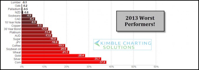
CLICK ON CHART ENLARGE 2013 has been good for stocks, the above table reflects its not been the best of years for certain assets. These are the worst performers so far YTD. As 2013 is nearing a close I wanted to share these worst performers and apply some Power of the...
