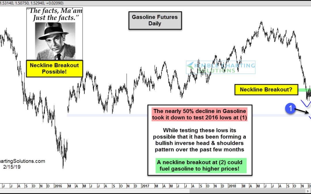
by Chris Kimble | Feb 15, 2019 | Kimble Charting
Are we about to pay much higher prices at the gas pump? Possible! This chart looks at Gasoline futures over the past 4-years. Gasoline has become much cheaper at the pump, as it fell nearly 50% from the May 2018 highs. The decline took it down to test 2016 & 2017...

by Chris Kimble | Mar 30, 2017 | Kimble Charting
Below looks at the performance of the S&P 500 Sectors, looking back 5-years. The winner for the lowest performance is the Energy Sector (-1.42%). XLE is lagging the S&P 500 by almost 70%, in just 5-years. “Time for them to rally?” CLICK ON CHART TO...

by Chris Kimble | Jan 28, 2016 | Kimble Charting
CLICK ON CHART TO ENLARGE Gasoline futures have correlated with Crude Oil over the past 18-months, both have tanked. Is the decline over with? Way too soon to tell. The above chart looks at Gasoline Futures on a monthly basis. The decline of late took gasoline futures...

by Chris Kimble | Jul 15, 2015 | Kimble Charting
CLICK ON CHART TO ENLARGE The S&P 500 has been pretty quiet so far this year, up just 3%. The same can’t be said for Gasoline or Coffee! Do you believe in the idea of “Buying Low & Selling Higher?” This post today looks at the Year-to-Date...

by Chris Kimble | Feb 28, 2015 | Kimble Charting
CLICK HERE FOR COMPLETE ARTICLE Several key stock index’s performed well in the month of February, (S&P up 5%+). The largest company in the U.S., Apple, was hot this past month, gaining over 12%. What could surprise a few is that Gas was on fire, as the...

by Chris Kimble | Feb 3, 2015 | Kimble Charting
CLICK ON CHART TO ENLARGE Gasoline ETF (UGA) has gained 12% in the past 3-days. This is the strongest 3-day rally since 2009 (left chart). The right chart graphs out the different times UGA has had large 3-day bounces since 2008. Full Disclosure…The...

by Chris Kimble | Jan 15, 2014 | Kimble Charting, Sector / Commodity
CLICK ON CHART TO ENLARGE Ever heard of the idea of buy low & sell higher? Believe in it? If not quit reading now! If you do believe in the idea of buy low & sell higher or believe in buying assets that are out of favor, the above chart might be of...

by Chris Kimble | Dec 10, 2013 | Kimble Charting
CLICK ON CHART TO ENLARGE If one has invested in the Thompson Reuters/Jefferies CRB Commodities index since 2011, its not been a fun ride as the index is down 25% over the past couple of years and has made a series of lower highs. On the opposite side over the past 18...
