
by Chris Kimble | Jan 2, 2018 | Kimble Charting
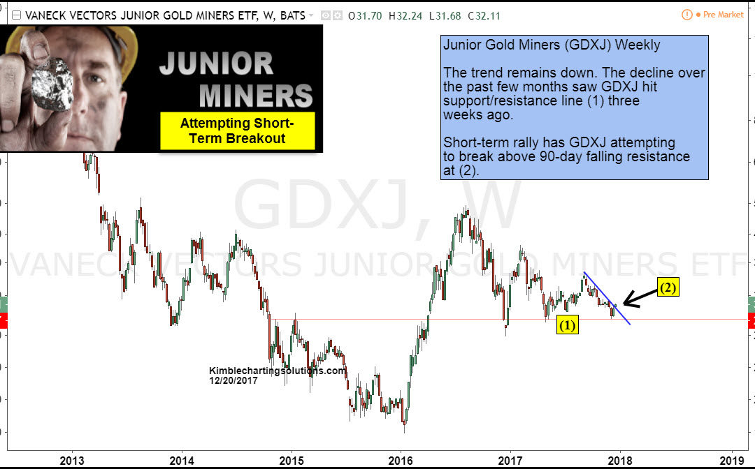
Junior Gold Miners ETF (GDXJ) has been reflecting actual and relative strength of late compared to the S&P 500. On December the 20th the Power of the Pattern shared that GDXJ had hit an important support line and was experiencing a short-term breakout. See 12/20...
by Chris Kimble | Dec 29, 2017 | Kimble Charting
The past 6 years have been difficult for gold bulls. After the 2011 market top for precious metals, gold experienced a waterfall decline followed by a “lower low” and more sideways price action. Every rally seemed to stall out. Every hope was met with “not this time”....
by Chris Kimble | Dec 20, 2017 | Kimble Charting
CLICK ON CHART TO ENLARGE Senior (GDX) and Junior Miners (GDXJ) have had a rough go of it the past year, far underperforming the broad markets. No doubt about it the trend remains lower for each. This decline over the past 14-months has taken GDXJ down to line (1),...

by Chris Kimble | Nov 2, 2017 | Kimble Charting
The 6-pack below looks at several charts in the metals sector (Gold, Gold Miners, and Steel). Each looks to be facing something similar at the same time. CLICK ON CHART TO ENLARGE Each asset or ratio above has something similar in play in the short and long-term. In...

by Chris Kimble | Sep 8, 2017 | Kimble Charting
Gold has been weaker than the US$ since 2011 highs, highlighted in Gold/Dollar chart below. The ratio is attempting to do something this week that it hasn’t been able to accomplish the past few years- CLICK ON CHART TO ENLARGE The ratio has traded sideways for...

by Chris Kimble | Aug 28, 2017 | Kimble Charting
The Gold/Dollar chart below reflects that Gold was much stronger than the U.S. Dollar (US$) from 2001 until 2011. Since 2011, the US$ has been stronger than Gold, as the ratio has declined for 6-years. Is it time for the worm to turn (Gold stronger than US$)? The...

by Chris Kimble | Jul 31, 2017 | Kimble Charting
Below looks at the Gold Futures/Silver Futures ratio over the past decade. The ratio bottomed in 2011 and started moving higher, sending a bearish message to both Gold & Silver. The ratio has rallied since the 2011 lows, where it could be creating a “topping...

by Chris Kimble | Jun 20, 2017 | Kimble Charting
Below looks at the Gold/US Dollar ratio on a weekly basis over the past decade. The ratio peaked in 2011 and has created a series of lower highs. The ratio looks to be testing a very important price point, that could be very important to Gold Bulls. CLICK HERE TO...
